Friday, May 11, 2007

Listen, bud — he's got radioactive blood!

A few gazillion dollars later, I believe it's now safe to report that Spider-Man 3 is the monumental motion picture hit of 2007.

How apropos, then, that Comic Art Friday seizes this opportunity to share the Spidey love that currently bathes the universe.

Fans of the movie series know by now that Spider-Man's lady love is one Mary Jane Watson. It wasn't always so in the comic books. At the beginning of the Wall-Crawler's existence, back in the early 1960s, Peter Parker had a crush on Betty Brant, the secretary (that's what we used to call administrative assistants in those politically incorrect times) of Peter's boss at the Daily Bugle, J. Jonah Jameson. Later, Peter fell headlong into love with picture-perfect blonde Gwen Stacy. He ping-ponged back and forth between MJ and Gwen for years, until Gwen's untimely death at the hands of Norman Osborn, the original Green Goblin. (Both Betty and Gwen turn up in the Spider-Man movies, but Betty is merely a background presence — never a romantic interest — in the series, while Gwen, who debuts in the latest film, resembles her comic book incarnation only in name and physical type.)

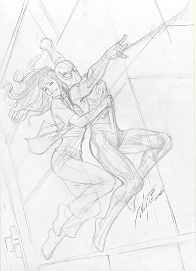
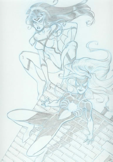
In this rough pencil sketch by Comic Art Friday regular Al Rio, Spidey and MJ take a swing through the streets of New York City.


One of these days, one of my favorite inkers is going to take this piece in hand and transform it into finished art. (He just doesn't know it yet.)

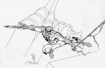
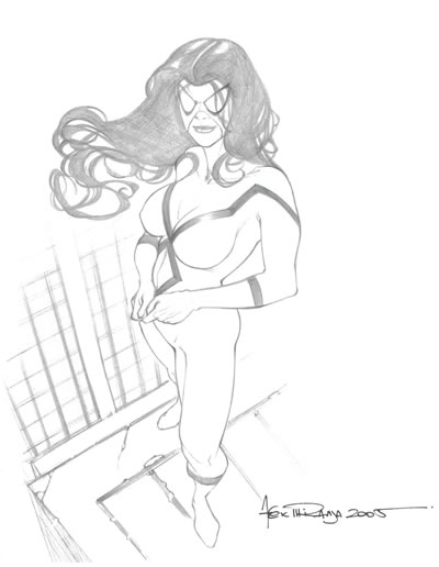
Next, our friendly neighborhood arachnid goes solo in this dynamic drawing by Space Ghost artist Scott Rosema.


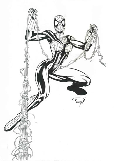
In recent years, Marvel has published a number of series set in what is popularly referred to as the "MC2 Universe," a possible alternate future (about 20 years from the Marvel Universe "now") in which Spider-Man is retired from superheroics. In the MC2 version of what's to come, Peter and Mary Jane Parker have a teenaged daughter, May (nicknamed "Mayday"), who has inherited her father's arachnid powers. Mayday Parker fights evil — much to the chagrin of her parents, who fear for her safety and wish she'd content herself with normal adolescent activities — as The Amazing Spider-Girl in a thoroughly enjoyable book by that title. Spider-Girl, written in rambunctious Silver Age style by former Marvel editor-in-chief Tom DeFalco, and capably rendered by the veteran team of Ron Frenz and Sal Buscema.

In the drawing below, another artist named Ron — Ron Adrian, best known for his work on such DC Comics titles as Supergirl, Flash: Fastest Man Alive, and Birds of Prey — presents the female offspring of Spider-Man in all her web-slinging wonder.


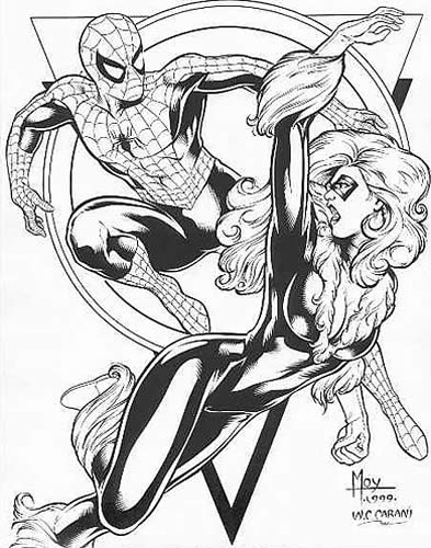
Meanwhile, back in the "real" Marvel Universe, there's another former paramour of our favorite Wall-Crawler prowling about. Felicia Hardy — better known to the world at large as the Black Cat — enjoyed an on-again, off-again relationship with Spidey for decades, usually coinciding with those dramatic moments when Peter and MJ were on the outs for one reason or another. A former cat burglar (like you would never have guessed that) and career criminal, Felicia reformed through her association with Peter, and became (more or less) a force for good. These days, she's a member of the super-team Heroes for Hire, in the current Marvel series of the same name.

Here, pencil artist Jeffrey Moy (best known for his run on Legion of Super-Heroes) and Jeff's longtime inking partner W.C. (Cory) Carani give us an eye-popping look at this tempestuous twosome.


And that, Spider-Fans, is your Comic Art Friday. Consider yourselves webbed.

Labels: , ,

Friday, April 27, 2007

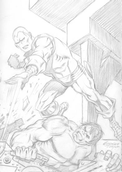
The invincible George Tuska

Today, Comic Art Friday salutes veteran comic book artist George Tuska, who celebrated his 91st birthday yesterday.


One of the genuine legends in the comic art field, Tuska's career stretched from 1939 through the 1990s. He was still drawing commissioned projects as recently as a couple of years ago. Tuska's drawing style is energetic and powerful — as I'm certain I've mentioned before, he was one of the first artists whose work I learned to recognize instantly when I was a mere comics-reading stripling.

For 10 years or so, Tuska was the primary penciler on Marvel Comics' Invincible Iron Man. The Golden Avenger remains the character with whom most readers will associate him even today. Tuska also demonstrated a then-uncommon affinity for African American characters, as one of the main artists on such series as Luke Cage, Hero for Hire (later Luke Cage, Power Man) and Black Goliath. After shifting his focus to DC Comics in the late 1970s, Tuska worked extensively on Superman, both in comic books and in the daily newspaper strip.

I currently own only one Tuska original (I've had a couple of others that have since moved on to others' collections), but it's a dandy: Tuska's signature Shell-Head engaged in pitched battle with ol' Greenskin, the Hulk.


One of the features I always loved about Tuska's Iron Man is the way he gives the character expression, even though he's wearing an inflexible metal mask. It doesn't make logical sense, but within the context of Tuska's style, the effect works perfectly.

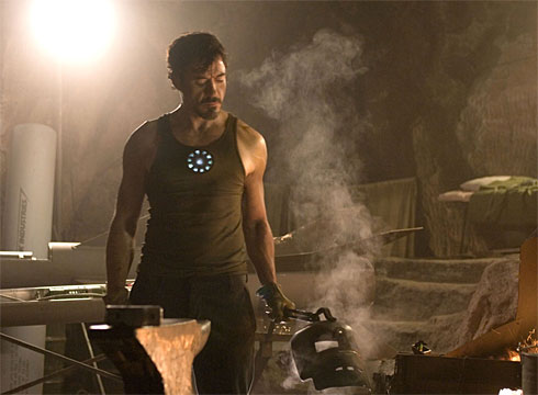
Speaking of Iron Man, USA Today published an article this week previewing the upcoming Iron Man feature film, directed by Jon Favreau (who played Foggy Nelson in Daredevil) and starring Robert Downey Jr. as Tony Stark/Iron Man. The article premiered the first publicly released photo of Downey in character:


Happy birthday, Gentleman George! And that's your Comic Art Friday.

Labels: ,

Friday, April 20, 2007

A real-life hero: Mario Kawika DeLeon, Sgt., U.S. Army

Today's Comic Art Friday is dedicated to the memory of a hometown hero.


On Monday of this week, Mario Kawika DeLeon, a 26-year-old U.S. Army sergeant from Rohnert Park, California, lost his life to a sniper's bullet while on patrol in Baghdad. Kawika — Sgt. DeLeon was commonly called by his middle name, "David" in Hawaiian — was a member of the Army's 1st Infantry Division, known in military lore as "The Big Red One." He graduated from Casa Grande High School — archrival of my alma mater, Rancho Cotate High — and attended Santa Rosa Junior College, where my daughter KM will be a student in the fall.

I didn't know Kawika DeLeon personally, but my dear friend Donna e-mailed me to say that her parents and his were close friends, back in the day. Donna herself worked for a time with Kawika's mother, Barbara. Thus, aside from the fact that we probably rubbed elbows at Wal-Mart or Costco at some time or other, Sgt. DeLeon and I are separated by a mere two degrees.

To paraphrase John Donne, the bell tolls for me.

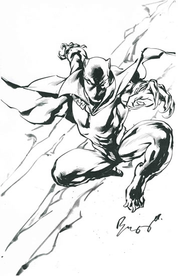
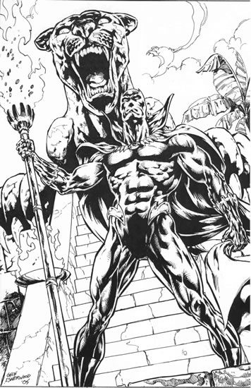
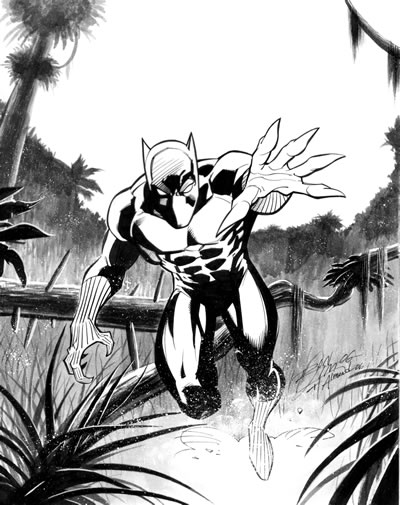
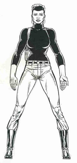
According to his obituary in the San Francisco Chronicle, Kawika was a fan of the Star Wars film franchise, the animated TV series ThunderCats, and X-Men comics. I don't have any ThunderCats art — a generation older than Kawika, I wasn't watching many cartoons in the '80s. Instead, I'll share from my art collection some images of my own favorite feline hero, the Black Panther, and my best-beloved among the X-Men, Storm, in Kawika's honor.

The quotes below are excerpted from the Chronicle's obit by Steve Rubenstein.

Mario DeLeon loved the old "Star Wars" movies, fast cars, hip-hop music, shooting pool and hanging out with his pals in Rohnert Park.

He loved his wife, Erika, and his 2-year-old son, Keoni.

And, in February, he told them he'd be home soon from his Army tour of duty in Iraq.
"He kept saying, 'Nothing's going to happen to me, nothing's going to happen to me,' Erika DeLeon said.

"He was fearless. In his mind, he was so strong and so brave. He was so sure of himself. He said he was coming back, and so we all knew he was coming back. That's how he was."
A tall, large man with what one friend described as a "goofy grin," DeLeon enlisted in the Army after graduating from high school and served for four years, including a tour in Afghanistan.

After attending college for a while, he served two years in the Air Force Reserve before rejoining the Army last year. He was sent to Iraq over the winter, and spent most of his time on patrol in Baghdad.
"He loved making everyone laugh," his wife said. "Nobody could make people laugh like Kawika. He lighted up everyone's day."

He drove a 15-year-old Nissan and he was pretty good at the motor sport technique known as "drifting," or driving sideways in a controlled slide. He and his friends enjoyed watching drifting competitions, reading car magazines, and talking about the best pro drivers and the latest tricks.
In the evenings, the DeLeons would hunker down on the sofa and watch a "Star Wars" movie — he had the complete set — or episodes of the old "ThunderCats" cartoon show, in which giant human cats battled the Mutants to save the innocents on a planet called Third Earth. In his 20s, DeLeon still enjoyed the animated shows and "X-Men" comic books he treasured as a kid.

"At first I didn't like watching those shows," his wife said. "But he was so passionate about it. He'd say, 'But Babe, everyone has to watch it.' So I did. And now I'm wearing the 'ThunderCats' sweater."
Above all, Erika DeLeon said, her husband was a gentleman.

"Sweet, polite, kind. I never met anyone like him. I wanted his son to grow up like him. Now all he has is pictures."

He is survived by his wife and son, by his mother, Barbara, and by his brothers, Gabe and Bruce. Funeral arrangements are pending.
Rest in peace, Kawika. Your sacrifice humbles us.

And that's your Comic Art Friday.

Labels: , , , , ,

Friday, April 13, 2007

This female fights back!

First, a much-overdue note of appreciation to all of you who have e-mailed with kind thoughts for my wife KJ. Her surgery went well, but her rebound is proving considerably more difficult than she anticipated. At this writing, she is still in the hospital, though the surgeon is hopeful that she'll be strong enough to come home tomorrow. Our house is a-bustle with activity right now, with a hospital bed being installed and a ramp being built and furniture being rearranged in preparation for KJ's homecoming.

Second, I'm sorry I haven't been posting much this week. But I know you understand why.

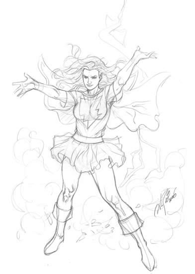
For today's Comic Art Friday, we'll salute KJ's valiant struggle toward physical normalcy with a couple of images of another of my favorite fighting women, Ms. Marvel.

As I've written on other occasions, Ms. Marvel's 1977 debut marked the first appearance in Marvel Comics of a female superhero with a physical power level to rival the company's male heavy hitters. By this point in history, DC had already had 37 years of Wonder Woman, and a couple of decades of Supergirl. By contrast, most of Marvel's front-line heroines — Invisible Girl, Wasp, Scarlet Witch — were distance attackers and defensive specialists, not pugilists. Ms. Marvel entered the scene with power to burn, and a decidedly feminist spin (at least, as feminist a spin as could be expected from middle-aged 1970s men). The cover of her premiere issue came emblazoned with the tagline, "This Female Fights Back!" And indeed, she did.

In the sketch below, artist Matt Haley — whose most prominent recent work has been the Superman Returns movie tie-in comic — sends the Woman Warrior aloft in her original classic costume.


Our second Ms. Marvel image marks Daniel B. Veesenmeyer's return to the comic art scene after a lengthy hiatus. Dan, who's actually worked more in the fields of film storyboarding and animation than in print comics, told me that this was the first superhero pinup he'd drawn in about three years. As I'm sure you'll agree, his potent rendering skills remain undimmed.


Mr. Veesenmeyer is currently working on a new addition to my Common Elements theme gallery — which, of course, you'll see on a future Comic Art Friday.

Gotta dash — it's that kind of week. Thanks for stopping by, and please keep the positive energy and prayers coming KJ's direction. Like Ms. Marvel, she's one female who fights back... even against the invisible enemy called cancer.

Labels: , ,

Friday, April 06, 2007

The wabbit, the Witch, and the wardrobe

To you those of you for whom it has value, happy Easter weekend. (And a belated good Passover to our Jewish friends.) Although in our household we don't attach any religious significance to the occasion, Easter is always a time for special memories — my daughter was born on the Saturday before Easter. (Perhaps that explains her fondness for rabbits.)

Of course, today is Comic Art Friday, and every Friday is a Good Friday when there's comic art on display.

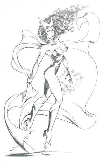
Wanda Maximoff — better known within the superhero community as the Scarlet Witch, even though her personal identity is not held secret — is one of my "Magnificent Seven," that storied septet of comic book characters whose images hold a special place in my collection. Paging through my Wanda archives, I found a couple of nifty items that we haven't showcased here previously. Today's as good a Friday as any to highlight them.

Like many superheroines of lengthy tenure, the Scarlet Witch has undergone several changes in costume over the years. Wanda's most familiar attire — and still my personal favorite — is the outfit she wore beginning in the late 1960s and throughout the '70s and early '80s: a pink full-body stocking, covered by a red basque-style bodysuit and accented with a red cape, boots, and opera gloves. Topping off the look is Wanda's signature M-shaped tiara, a subtle nod to her father Erik Lehnsherr, the supervillain called Magneto.

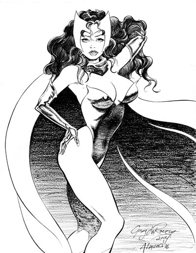
Wanda works the old-school gear like a dream in this drawing by another personal favorite of mine, veteran Green Lantern artist Darryl Banks.


Sometime in the '90s, artist George Pérez reimagined Wanda's costume to reflect her purported Romany/Gypsy heritage. (Marvel Comics vacillated for decades over whether Wanda's father Magneto is Romany or Semitic in background. I believe the current company line is that he is indeed Jewish. If you've seen the X-Men films, you know which way director Bryan Singer chose to go.) This ensemble eliminates Wanda's body stocking in favor of bare skin — because, heaven knows, we need more skin in comic books — and abbreviates her basque into a shorter, lace-up affair coupled with a flowing, bejeweled loincloth.

To me, this garb makes the Witch look less like a superheroine and more like a belly-dancing instructor, but what do I know? At any rate, artist Louis Small Jr. provides a nice representation of the Pérez look here.


Were you to ask me why Wanda merits a hallowed gallery among my Magnificent Seven, I'd say that she was the first Marvel heroine on whom I developed a crush during my boyhood comic-reading days. The Witch wasn't Marvel's first super-female; she was preceded by Susan Storm (later Richards), the Invisible Girl (later Woman), and Janet Van Dyne (later Pym), the winsome Wasp, but they were both simplistically written as either weak (Sue) or whiny (Jan) in their earliest incarnations. I preferred Wanda because she was the first Marvel superwoman with any real semblance of a complex personality, as would be reflected in her love affair with — and eventual marriage to — the mysterious android, the Vision.

Speaking of which, here's a Comic Art Friday classic worthy of a second look: Wanda and her true love Vision, powerfully penciled first by the inimitable Frank Brunner...


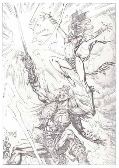
...and then embellished by the equally inimitable Geof Isherwood. This dynamic before-and-after pairing is, without doubt, the highlight of my Scarlet Witch collection.


And that, my little Easter bunnies, is your Comic Art Friday. Don't eat too many Peeps! (Assuming, of course, that "too many Peeps" is not an oxymoron. Which it may well be.)

Labels: ,

Friday, March 30, 2007

Costumes by Frederick's of Hyboria

Is it Friday already? Great Caesar's ghost, it's been a challenging week.

But, as we all know, there's nothing that perks up the spirits like some gorgeous comic art. So let's get to it.

Today's Comic Art Friday is dedicated to the memory of comics artist Marshall Rogers, who passed away unexpectedly this week at the age of 57.


Although Rogers illustrated a diverse range of comic book heroes — from the Silver Surfer to Mister Miracle — during his four-decade career, he'll be mostly remembered for his work on various Batman titles. Several bloggers have opined this week that Rogers's interpretation of Batman is second only to that of the great Neal Adams. Myself, I'd rank the late Jim Aparo next after Adams among Batman artists, but Rogers was indeed awfully good. I'd also place his take on Doctor Strange right after Frank Brunner's and Geof Isherwood's.

My heartfelt condolences to Marshall's family, and to his legion of fans.

In one of Mad Magazine's Christmas carol parodies many moons ago, the following couplet appeared in the lyrics (by writer Frank Jacobs, if memory serves) to a twisted rewrite of "Deck the Halls":
There's no reason to be nervous;
You can trust the Postal Service.
I've quoted that line facetiously more times than I can count, and it finally came back to bite me.

A few weeks ago, I received in the mail a package of new art from the preternaturally talented MC Wyman. Somewhere between Wyman's home in Pennsylvania and mine in sunny California, the minions of the USPS had dunked the package in water. I don't just mean that the package had gotten a tiny bit damp — the doggoned thing was sufficiently waterlogged to have survived a battle between Aquaman and the Sub-Mariner. Both the packing material and the artworks inside were thoroughly soaked.

As fortune would have it, Wyman's pictures sailed through the ordeal unblemished, although the art boards on which they were drawn are irreparably warped. Eventually, I'll commission one of my favorite inkers to transfer the images to new material. But for the time being, these will do.

Some time back, the proprietor of my friendly neighborhood comic book shop posed a rather startling question to me: "Why don't you have any Red Sonja art?" The query was occasioned by the fact that I'm one of the shop's most ardent Red Sonja readers, as well as a collector of original artwork featuring most of my other favorite comics heroines. But I didn't have a single Red Sonja in my galleries.

After I fumbled for a snappy answer that never came, I immediately decided that this inadvertent omission had to be addressed. Thanks to MC Wyman, it now has been. Kathy, this one's for you.


An intriguing dollop of Red Sonja history: Most comics readers presume that Red Sonja was created by Robert E. Howard, the auteur behind Conan the Barbarian. In fact, although Marvel Comics writer-editor Roy Thomas retrofitted the name of a Howard character (the differently spelled Red Sonya of Rogatino, who carried pistols instead of a sword) to his blade-slinging Hyrkanian heroine, Red Sonja as we know and adore her today was entirely the creation of Thomas and legendary artist Barry Windsor-Smith. Artists Esteban Maroto and John Buscema share the credit for devising Sonja's technically implausible, yet undeniably fetching, scale-mail costume.

Today, Sonja's monthly adventures — along with a plethora of associated miniseries and single-issue titles — are published by Dynamite Entertainment, with writer Michael Avon Oeming and artist Mel Rubi forming the key creative team.

And, since it's humanly impossible to have too many sword-packing women in metal brassieres, here's Wyman's take on another of my favorite heroines from 1970s Marvel, the Valkyrie.


That's your Comic Art Friday.

Labels: , ,

Friday, March 23, 2007

WonderCon addendum

Given that I only have time and synaptic energy to generate an abbreviated Comic Art Friday, let's dedicate today's post to the late Calvert DeForest, who passed away this week at age 85.


The diminutive DeForest became an American cultural icon as geeky, brassy-voiced Larry "Bud" Melman on David Letterman's NBC late night show. I'm not usually a fan of gimmick performers, but DeForest's gimmick worked — I always got a kick out of the guy.

RIP, Larry "Bud."

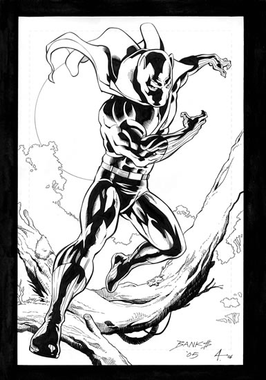
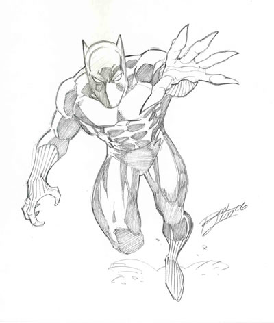
As remarkable as was the haul of newly commissioned comic art that followed me home from WonderCon three weeks ago, said haul wasn't officially completed until this past weekend. Brent Anderson, cocreator (with writer Kurt Busiek) of the postmodern superhero reimagining Astro City, completed this Black Panther drawing on the third day of the convention. Brent, who lives right here in Sonoma County, generously arranged to hand-deliver the finished art to my local comic shop last Saturday. The results more than make up for the brief wait.


I chose Brent to create the latest addition to my T'Challa gallery because my earliest recollection of his work stems from his stint as the artist on Marvel's jungle action series Ka-Zar in the late 1970s. As you can see, he hasn't lost the feeling.

In the late '80s, Brent also drew one of the most unusual superhero series ever published by either of the Big Two: Strikeforce: Morituri, the bizarre yet intriguing saga of a project to turn human volunteers into superheroes — a process which, unfortunately, also made the volunteers terminally ill. (The motto of the project was the Latin phrase Morituri te salutant -- "We who are about to die salute you.")

And that's your Comic Art Friday.

Labels: , ,

Friday, March 16, 2007

Dark and stormy Knights

Comic Art Friday bids a happy birthday to Gilmore Girls star Lauren Graham, who turns 40 today. Ms. Graham would make a pretty decent Wonder Woman, assuming that abortive film project ever gets off the ground.


Today's featured artwork is yet another installment in my Common Elements series. The linking thread in this Common Elements drawing is a shade more obvious than the last few we've displayed. Artist MC Wyman, that Marvel Comics stalwart of the mid-'90s, teams a dynamic duo of Marvel heroes: Dane Whitman, the Black Knight, and pistol-packing super-detective Misty Knight. ("Black Knights"... get it? I crack me up.)


The Black Knight has been a second-tier player in the Marvel Universe for almost as long as I've been reading comics. He made his first appearance in Avengers #47, way back in 1967, and was featured on the cover of the following issue. The Knight was one of the few super-types of that era for whom having the word "Black" in his handle did not constitute a statement of racial identity.

Since the '60s, Dane has shown up fairly regularly throughout the Marvel line, usually in association with the Avengers — although most recently he could be seen in the pages of New Excalibur, hanging out with the United Kingdom's favorite squad of mutant heroes.

Misty Knight — she of the bionic arm and ever-changing 'do — has long been a personal favorite of mine, and it's a real treat to enjoy her adventures in the current series Heroes for Hire. One of the first African American heroines in comics, Misty was originally intended as a comic book version of the type of streetwise character played by actress Pam Grier in such blaxploitation cinema classics as Foxy Brown, Coffy, and Friday Foster.

For years Misty and her business partner, Colleen Wing (together they owned the Knightwing Restorations detective agency), could often be seen battling evildoers alongside Luke Cage (in his Hero for Hire / Power Man days) and Iron Fist (with whom Misty enjoyed a tumultuous romantic relationship) under the code name Daughters of the Dragon. Now that Knightwing has morphed into Heroes for Hire, Inc., Misty and Colleen lead a team that includes such rebels as Felicia Hardy, aka the Black Cat, and Shang-Chi, Master of Kung Fu.


One of the few published artworks in my collection is Misty's character model sheet from the Official Handbook of the Marvel Universe, Master Edition. Pencil artist Keith Pollard and inker Joe Rubinstein created hundreds of these model sheets, but I'm especially pleased to own this one.


And that's your Comic Art Friday.

Labels: , ,

Friday, March 09, 2007

Dazed and WonderConfused


I haven't yet seen any official attendance figures for last week's WonderCon, but take it from a guy who was there for the first two days of the three-day event: A veritable sea of humanity (and perhaps other lifeforms as well) poured into San Francisco's Moscone Center South for the Bay Area's largest annual geekfest.

My WonderCon weekend began on Friday at 9 a.m. deep in the bowels of the convention center, where I spent two hours preshow as a WonderCon volunteer. My assignment: stuffing plastic swag bags to be handed out to attendees upon arrival. In truth, there wasn't much actual stuffing. Only two items went into each bag: (1) a pin advertising the science fiction movie The Last Mimzy (coming soon to a multiplex near you); and (2) a postcard-sized flier advertising an indie flick entitled Yesterday Was a Lie (probably coming direct on DVD to a Best Buy near you).

I was supposed to be on stuffing detail for three hours, but we ran out of bags and stuffing paraphernalia around 11 a.m. My responsibilities thus fulfilled, I gratefully accepted my complimentary admission badge, then spent the remaining hour before the convention opened waiting for my insanely hot cup of Peet's coffee to cool to potable temperature.

At last the doors opened, and I joined the throng that flooded onto the main floor. I made a beeline — as least, as much of a beeline as a middle-aged fat guy can make in the midst of a whelming crowd — to Artists' Alley.

With a handful of previous con experiences under my belt, I knew in advance that the best approach for success in acquiring new art at a comic con is a carefully crafted battle plan. Before the event, I reviewed the roster of attending artists, and developed a prioritized shopping list of artists from whom I wanted to commission drawings, along with the character I wanted each to draw. Of course, the Robert Burns rule came into effect immediately, as neither of the first two artists on my list had yet arrived by the time I reached their tables. So, I dashed about lining up other commissions while keeping an eye peeled for the latecomers. Both soon turned up, and by the time I headed off to my first panel at 2 p.m., the first several items on my list were checked off.

I spent three delightful hours listening to panel discussions moderated by the redoubtable Mark Evanier, a prolific writer for both comics and television. (Mark is also one of my blogging heroes; if you're not reading his News From ME, your life is seriously lacking.) Mark missed WonderCon last year due to a sudden illness, but he was back in form this year. Actually, he appeared in significantly smaller form this year, having recently shed 110 pounds by way of gastric bypass surgery.

I thoroughly enjoyed Mark's chats with comic writer and historian Gerard Jones (whose panel I attended at last year's WonderCon, and was kind enough to autograph my well-thumbed copies of his books The Comic Book Heroes and Men of Tomorrow), cartoonist extraordinaire Sergio Aragonés of MAD Magazine fame (one of the most personable human beings you'll ever run across), and longtime MAD editor Al Feldstein, whose Friday panel focused on his pre-MAD years as artist, writer, and editor for the notorious EC Comics of the 1950s.


By the end of Friday's festivities, I had three and one-half commissions in hand (I'll explain in a minute) and still more on waiting lists for Saturday. Friday's haul included...

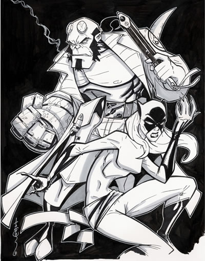
* Delivery of the Hellboy/Hellcat Common Elements artwork that Tom Hodges completed in advance of the con.


It was a treat to meet Tom and his wife (that's her elbow and purple sneaker at left) in person. I had hoped to catch Tom's panel on Star Wars art, but I was still frantically lining up commissions when the discussion kicked off at 1 p.m. Friday.

* A new Common Elements commission penciled by Ron Lim, featuring Spider-Man and the Manhattan Guardian. (The common element: Both characters worked for newspapers in civilian life: Spidey/Peter Parker at the Daily Bugle; Guardian/Jake Jordan at — not coincidentally — the Manhattan Guardian.)


I'd never attempted a CE at a con before, given the time constraints. I knew that Ron could pull it off, given that he drew another two-character (Captain America and the U.S. Agent) sketch for me two years ago at WonderCon.

Getting Ron's terrific pencil art done was only half the battle, though. On Saturday, I hoped to ask inker Danny Bulanadi (a no-show on Friday, but his representative Frank assured me Danny would be at his table all day Saturday) to finish the piece.

By the way, Ron and his wife recently welcomed a new baby to their family. Congratulations, Lims!

* This jaw-dropping depiction of Taarna by the artist known as Buzz.


I'm always delighted to see Buzz at a con, not only because I love his art — one of the most distinctive stylists of his generation, in my never-humble opinion — but also because he's one of my favorite artists to talk with. Buzz (who I'm certain has an actual name, though I have no idea what it is) has a point of view about everything under the sun, and isn't shy about sharing his thoughts about the comic industry, his fellow artists, and even world events.


Buzz's eyes lit up when I handed him the reference scan of Taarna. This was his first opportunity to draw her for a commission — he admitted having drawn her a time or two for his own amusement — and he poured his heart and soul into this artwork. This was the only piece Buzz worked on all day Friday, and the result is stunning.


* A dramatic pencil sketch of Wonder Woman, by the criminally underrated Paul Ryan.
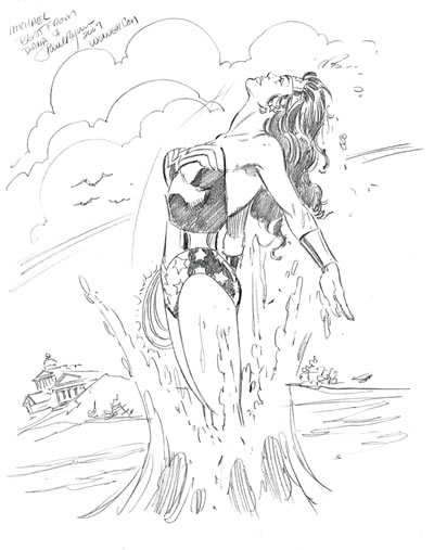


I knew from reading his Web site before the con that Paul — who's best probably known for his work on Fantastic Four — enjoys drawing our favorite Amazon. Thus, this assignment was a natural fit. I watched him start this piece several times before he finally hit on the concept he wanted to finish. It turned out beautifully. I'm always thrilled when an artist shows a character doing something visually interesting, rather than the familiar stock poses.


Paul, his charming wife Linda, and their daughter Heather were as nice as pie, to use a hoary cliché — lovely people, gracious and extremely accommodating to Paul's many fans. This picture of Paul, by the way, was taken by Heather, who just may have a budding career in photography.

So that was Friday.

Saturday — a day when seemingly half the population of the Bay Area crammed into Moscone South — found me making numerous surreptitious checks on the progress of my remaining commissions (at least, I hope the artists thought they were surreptitious), and browsing the numerous vendor stalls on the convention floor. I broke up the day with a two-block stroll over to the Westfield Center's food court for lunch — silly me for thinking a Saturday afternoon would be any less congested at San Francisco's newest and largest mall — and by catching a few excellent panels.

The two highlights among the latter were a MAD Magazine showcase with Mark Evanier hosting Al Feldstein and Sergio Aragonés...


...and a fascinating discussion of the process of translating comics to television animation. This informative and fast-paced chatfest featured the insights of one of my writing heroes, Dwayne McDuffie (Static Shock, Justice League Unlimited), along with fellow scribes Adam Beechen (Teen Titans), Stan Berkowitz (Legion of Super-Heroes), Greg Weisman (Gargoyles, the upcoming reimagining of the animated Spider-Man), and moderator Shannon Muir (Extreme Ghostbusters).


But what really counts is the art, yes? Saturday's pickups included...

* Danny Bulanadi's embellishment in ink of Ron Lim's Spider-Man / Manhattan Guardian commission.


Danny did a bang-up job inking over Ron's pencils. I took the finished piece back to Ron for his approval, and he, too, was pleased with Danny's work. (Ron also re-signed the piece in ink, so his signature would match the rest of the finished art.) Both Danny and his representative Frank were quite friendly, and lots of fun to chat with.


* Taarna, take two: This time, by the wily veteran Tony DeZuniga.


Tony's table was immediately adjacent to Buzz's. Throughout the time Buzz was working on his Taarna masterpiece on Friday, I kept glancing over at the sketches Tony was drawing, and thinking, "I'll bet Tony would do an awesome Taarna, too." And of course, he did.


The above photo was taken by Tony's lovely wife Tina, who insisted on letting some no-talent clown sneak in next to Tony for the money shot.

* A spectacular Storm by the great Phil Noto.
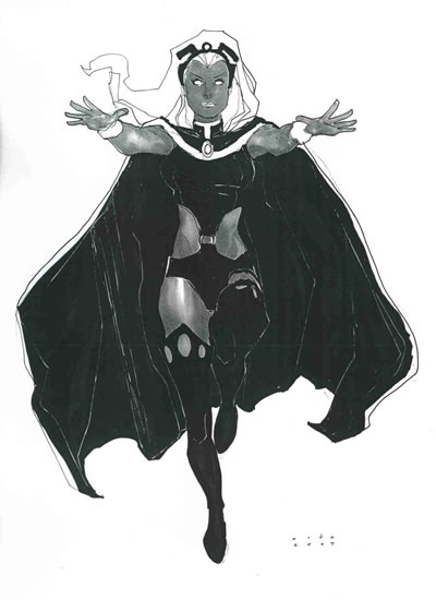


As luck would have it, though, my opening moments frenzy on Friday took me past a table where sat the talented — and always popular — Phil Noto sat, drawing board in hand. Noto hadn't been scheduled to appear at WonderCon, which was the only reason he didn't already have a massive line at his table the instant the doors opened, as he usually does. In fact, there was no one even within spitting distance of Phil's table. (Not that you'd want to spit. It's just an expression.)


I asked Phil if he was taking a commission list. When he answered in the affirmative, I could scarcely restrain my giddiness as I put in my request. On Saturday, Phil came through with a beauty.


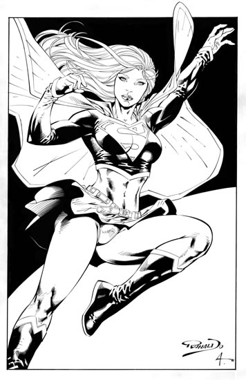
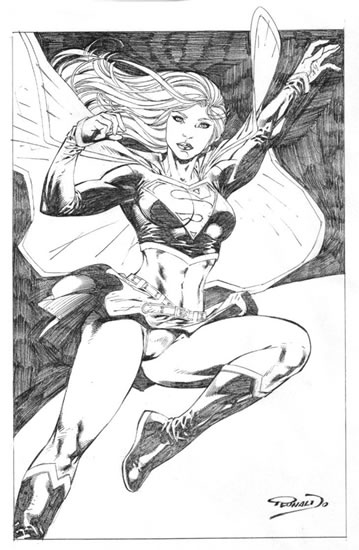
* Aaron Lopresti's gorgeous Supergirl, wearing her hip, trendy disco-era costume from the 1970s.
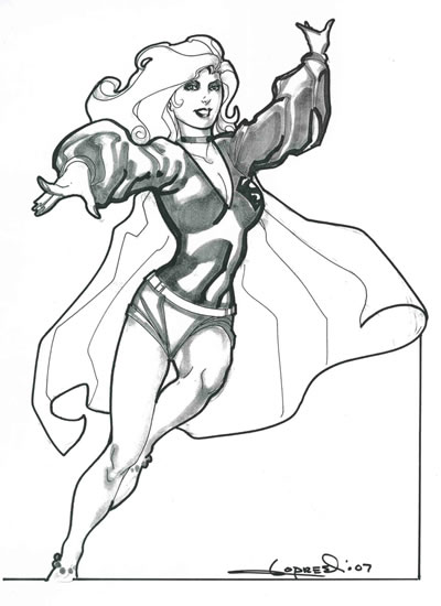


This was, I think, the third con I've attended at which Aaron was a participant. I'd never before been lucky enough to even get on his sketch list, much less actually score a commission from him. As it was, this was the very last piece he finished on Saturday evening, and I was ecstatic that he got it done.


When I asked to take his photo with the art, Aaron laughed and asked, "Should I be holding the money, too?" We mutually agreed that we could do the "money shot" without the actual cash in view. Funny guy, that Mr. Lopresti.

* A cute and vibrant Ms. Marvel, courtesy of Runaways artist Michael Ryan.


I loved Michael's recently concluded run on New Excalibur, so having him draw this piece for me gave me goosebumps. (Okay, that's an exaggeration. But it was pretty cool nonetheless.) Michael's style reminds me a lot of Mike Weiringo, another contemporary artist whose work I admire. I enjoy Scot Eaton, the artist who replaced Michael on New Excalibur (and about whose work Michael was graciously complimentary), but since I don't read Runaways, I've missed Michael's art of late. Now I won't have to.


To Michael's immense credit, he kept plugging away at this drawing even as the rest of Artists' Alley was packing up for the night all around him. When he finished, he seemed concerned that he'd drawn Carol too young-looking (in the comics, she's a woman in her early-to-mid-30s). I assured him she looked just fine to me. He shrugged and said, "I tend to draw every character young, I guess. Or at least, that's what people keep telling me."


With my portfolio bursting with fresh art, and my mind reeling with fond memories of associations new and renewed, I wearily concluded my two-day junket into the dark heart of WonderCon.

My feet still hurt.

One non-comic-related highlight of the convention: I got to meet one of my favorite character actors — Ernie Hudson, who'll forever be remembered as Winston Zeddemore in Ghostbusters. We chatted briefly about roles of his that I especially enjoyed; in particular, Hawk in the 2001 TV movie Walking Shadow, based on a Spenser novel by Robert B. Parker. I told Ernie that, as much as I enjoyed Avery Brooks's familiar portrayal on Spenser: For Hire, his Hawk more closely fit my mental image of the character from Parker's books. Ernie confessed that Parker had expressed a similar opinion. Great minds think alike.

Oh, yeah — I overheard someone saying that 300, which premiered at WonderCon, is the greatest movie ever made. I'm guessing that person has never seen Citizen Kane. Or Casablanca. Or even Dark City.

And that, at long last concluded, is your Comic Art Friday.

Labels: , , , , ,

Friday, March 02, 2007

It's WonderCon weekend!


That's right, true believers: WonderCon, Northern California's premier comic book convention, invades San Francisco's Moscone Center for three days, beginning today at noon. I'll be making the scene both today and tomorrow — taking in the plethora of colorful sights and sounds; rubbing elbows with the near-famous, the wannabe famous, and the formerly famous; and most importantly, scoring a few new commissioned artworks for my collection.

In next week's Comic Art Friday, I'll deliver a full-blown report on my WonderCon experiences. But today, let me give you a sneak peek at one of the pieces I'll be bringing home.

When I spied the name of Star Wars artist Tom Hodges on WonderCon's guest list a few weeks ago, I shot him a quick e-mail to see whether he planned to accept commissions during the con. Tom wrote back to affirm that he will, indeed, be drawing for the fans here in the Bay Area. He also noted that he had some time available before the con, and if I'd like to preorder some art, he'd complete it at home and bring it to WonderCon with him.

Never one to pass up a golden opportunity, I seized the chance to ask Tom to add a new chapter to my ever-growing Common Elements gallery. Earlier this week, Tom sent me this scan of his spectacular creation, teaming Mike Mignola's signature hero, Hellboy, with Marvel's feline Defender, Hellcat.


My first exposure to Mike Mignola's work actually wasn't connected to either Hellboy, the character for which he's best known, or even to comics at all. Several years ago, Mignola worked as lead character designer on the Disney animated film Atlantis: The Lost Empire. When I saw the movie, I was curious about the design style, which struck me as decidedly un-Disney. Upon further investigation, I was chagrined to discover that the artist in question (a Bay Area native, no less) had risen to superstardom during my most recent hiatus from the comics scene, hence my embarrassing lack of familiarity. (Much later, I remembered that Mignola had illustrated a few issues of Power Man and Iron Fist for Marvel in the early '80s, albeit in a markedly different style from his Hellboy work.)

Tom Hodges's work shows a striking amount of Mignola influence, so I knew that he'd be the perfect artist (since, well, I can't afford Mike Mignola) to draw my Hellboy-centric Common Elements piece. As you can see, my instincts were spot-on.

In contrast to Hellboy, Hellcat is a heroine whose history I know quite well. In her everyday identity of Patsy Walker, Hellcat has amassed one of the most convoluted backstories in all of comics. When Patsy first showed up way back in 1944, she wasn't a superhero — she was the star of an entire line of teenage romance and humor comics. think of her as a kind of female version of Archie. The popular Patsy continued her youthful adventures for more than two decades in a number of titles published by Timely Comics, the company that would eventually morph into Marvel in the early 1960s.

Patsy made her first appearance in a superhero story in — coincidentally enough — the first comic book I ever owned: Fantastic Four Annual #3. By the early '70s, she was popping up frequently as the lab assistant of Dr. Hank McCoy, better known as the Beast of the original X-Men. Before long, Patsy adopted the costume formerly worn by another Marvel heroine, the Cat (who by this time had transformed into the were-woman Tigra), and gave herself the code name Hellcat.

Patsy's finest exploits as a crimefighter came as a member of the Defenders, my favorite superhero team of the '70s. Originally a showcase for Marvel's three most iconoclastic headliners — Doctor Strange, the Sub-Mariner, and the Hulk — over time the Defenders became populated by minor-league heroes who didn't own their own titles — notably Nighthawk, the Valkyrie, and our girl Hellcat.

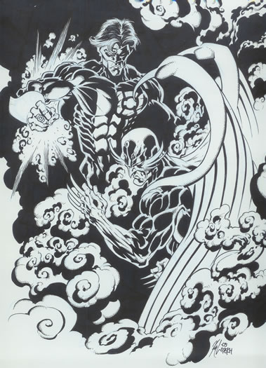
Both Nighthawk and Valkyrie have previously headlined entries in my Common Elements series. Here, Nighthawk teams with Green Lantern Kyle Rayner in a moody scene by horror specialist Kyle Hotz.


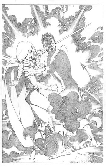
Meanwhile, Valkyrie joins the X-Men's Nightcrawler, in this gorgeous pencil rendering by Dave Ross.


Patsy and her new friend Hellboy will come home with me from WonderCon, courtesy of the talented Tom Hodges. I'm looking forward to meeting Tom in person later today.

And that's your Comic Art Friday. I'm off to the con!

Labels: , , ,

Friday, February 23, 2007

A "good girl" great is gone

Today's Comic Art Friday notes with regret the passing of award-winning comic artist Bob Oksner, who died last Sunday at the ripe old age of 90.

Although Oksner worked on a number of superhero books during his five-decade career in comics — including Supergirl and Shazam! — he'll be best remembered by aficionados for his prolific work on DC Comics' comedy titles during the 1950s and '60s, especially The Adventures of Jerry Lewis (originally The Adventures of Dean Martin and Jerry Lewis, before the duo's fabled breakup) and The Adventures of Bob Hope. Oksner also cocreated the classic series Angel and the Ape, about an unusual crimefighting partnership — a gorgeous, platinum blonde female detective, and a talking gorilla who drew superhero comics.


In addition to his monumental comedic talents and slick, accessible linework, Oksner was also legendary for his deftness at rendering the feminine form. Translated: If you wanted an artist to draw cute, buxom babes, Oksner was your guy. I dare say that the long-running popularity of the Bob Hope and Jerry Lewis comics had less to do with readers' affection for those two comedy giants (although I have it on good authority that The Adventures of Jerry Lewis sold particularly well in France) than with the fact that Oksner routinely populated both books with dozens of attractive, often minimally clad women.

Hey, you don't really think guys read Angel and the Ape just for the talking gorilla, do you?

In honor of Bob Oksner, let's look at a couple of modern examples of what we refer to in the comics biz as "good girl" art. Both of the following pencil drawings are the work of a talented Brazilian artist, Jorge Correa Jr., best known in the States as the artist on the Avatar Press comics based on the TV series Stargate SG-1. As you can see in this Wonder Woman artwork, Jorge knows his way around a classic pinup-style image.


In this pensive portrait of jungle heroine Shanna the She-Devil, Correa shows his flexibility, combining his human figure artistry with a little dinosaur action.


As a point of clarification, we'll note that Correa's Shanna is the recently reimagined version created by Frank Cho — no slouch in the "good girl" art department himself, by the way — and not the more familiar original, who first appeared in the early 1970s. Old-school Shanna or new, I think Bob Oksner would approve.

When DC phased out its humor titles in the early '70s, Oksner moved on to superhero books, often those featuring young female protagonists. His version of Supergirl is recalled quite fondly by those of us with an affinity for the Maid of Steel. I'll wager he'd have enjoyed this sweet sketch by one of my favorite Marvel artists of the '90s, MC Wyman.


RIP, Mr. Oksner. Your work — and especially your wonderful ladies — will live on.

And that's your Comic Art Friday.

Labels: , ,

Friday, February 16, 2007

Stump the artist!

Today's Comic Art Friday is dedicated to fantasy novelist Peter S. Beagle, author of — among numerous other works — the popular The Last Unicorn. The animated film based on Beagle's famous novel is celebrating its 25th anniversary this month, with a newly remastered DVD presentation from Lionsgate Entertainment.


What you may not know is that for the past quarter-century, Beagle has been involved in a legal dispute with the producers of The Last Unicorn over his rights and royalties. Although the movie is widely considered a classic — it was one of the first American animated films to be animated in Japan, and many of Japan's best-known animators worked on the project — Beagle has never received a dime of profit from the production.

Beagle's U.S. publishing representative, San Francisco-based Conlan Press, has struck a deal with Lionsgate to directly purchase copies of the new The Last Unicorn DVD for resale. Conlan's even offering autographed copies, hand-signed and personalized by Peter Beagle himself, for an extremely reasonable price. For every DVD Conlan sells, Beagle receives about half the funds. So now, at long last, there's an opportunity for Beagle — who's experienced some tough times over the years — to recoup some financial benefit from his most famous creation.


My daughter KM received her autographed copy in yesterday's mail. I've ordered another autographed copy that will soon be winging its way to my goddaughter in Maine. And it wouldn't hurt my feelings one iota if you, friend reader, dropped over to the Conlan Press Web site and ordered up a copy of The Last Unicorn for yourself, or someone special. In fact, I'd be thrilled if you dropped a note in the comments section to let me know that you did. It's a delightful film, and if you buy your DVD directly from Conlan, the money goes where it should have gone all along.

I thank you, and Peter Beagle thanks you.

I'm sure that as a fantasy writer, Peter Beagle is often asked the question, "Where do you get your ideas?" I get that same query about my Common Elements art commissions. And I answer in the same way that I imagine Peter Beagle does: "I make them up." In fact, concocting ever more mesmerizing combinations of unrelated comic book heroes tied together by some arcane connection is the second-greatest thrill — aside from admiring the art itself — I derive from my comic art collecting obsession hobby.

My greatest thrill? Coming up with a Common Element even the most expert of comic mavens can't decipher. Because I'm devious like that.

On today's featured Common Elements project, I managed to stump even the artist who drew it. I'm as giddy as a schoolgirl with a new DVD of The Last Unicorn, personally autographed by Peter S. Beagle.


Starring in this Common Elements spectacular are two of the lesser lights in the DC Comics universe: The Huntress, seen swinging into action at center stage, and Deadman, reeling into the foreground. This phenomenally designed and beautifully executed drawing sprang from the fertile mind and pencil of artist Luke McDonnell, most famed for his tenures on Marvel Comics' Iron Man and DC's Green Lantern, but a favorite of mine thanks to his work on one of my best-beloved comics from the late '80s and early '90s, Suicide Squad.

After this artwork was completed, Luke e-mailed me to ask: "The common element of this team-up escapes me; care to divulge?" After shouting "Yes!" and pumping my fist into the air in imitation of Tiger Woods, I was only too happy to fill Luke in.

The two leads in this little action drama are the only two superheroes of whom I'm aware whose first names are state capitals. Out of costume, the Huntress is Helena (as in Montana) Wayne, daughter of Bruce (Batman) Wayne and Selina (Catwoman) Kyle in an alternate timeline in which those two legends hooked up. (The current Huntress, who appears DC's Birds of Prey series, has a different backstory and surname, but she's also named Helena.) For his part, Deadman's real name is Boston (as in Massachusetts) Brand.

And before you wags write in, Black Lightning — real name: Jefferson Pierce — doesn't count. His middle name is not "City." Nor do any of the numerous superheroes whose last names are state capitals — i.e., Roy (The Human Bomb) Lincoln; Kyle (Nighthawk) Richmond. Jean (Phoenix) Grey doesn't cut it, either.

Although, now that I think about it, I believe there might be a superheroine whose first name is Madison. But I can't remember who she is.

Luke McDonnell, however, got the last word on this conversation. He stumped me with the villain who's tussling with Deadman and the Huntress here. For the record, it's the Lizard, Spider-Man's reptilian nemesis. But I didn't figure that out until Luke told me.

Well played, Mr. McDonnell.

And that's your Comic Art Friday. Remember: Save the unicorn, save the author.

Labels: , , , , ,

Friday, February 09, 2007

All our hopes are pinned upon you

Sad news this week for us Wonder Woman fanatics: Joss Whedon — creator of Buffy the Vampire Slayer, Angel, and Fireflyannounced that he is no longer attached to write and direct the proposed feature film about our favorite Amazon.

Apparently the bone of contention between Whedon and Time-Warner (which owns DC Comics and its pantheon of superheroes, including the Superman and Batman franchises) was Warner's insistence that the film be a light-hearted period piece set in the World War II era — like the first two seasons of the Wonder Woman TV series from the '70s — whereas Joss envisioned a modernized, iconic representation.

In announcing his departure from the Wonder Woman movie project, Whedon confirmed what many of us had heard via the comics industry rumor mill: He had intended to cast Canadian actress Cobie Smulders (of How I Met Your Mother fame) in the title role.


(You'll just have to envision Ms. Smulders in a golden-eagle bustier and star-spangled briefs, unless you have mad Photoshop skills.)

Alas, what might have been. But we can dream, can't we?

Since we're all now thinking of Wonder Woman — which, given that it's Comic Art Friday, is a fine subject for consideration — let's eyeball a few images from our Temple of Diana.

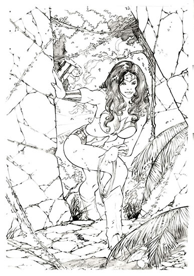
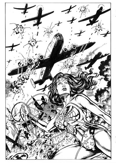
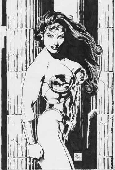
In this powerful drawing by Brazilian pinup specialist Alex Miranda, the Amazing Amazon goes premedieval on the pillars of an ancient temple.


Here, Miranda provides a more contemplative take on our heroine. Nice detail work by the artist in this scenario.


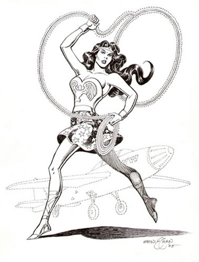
The next two images both flow from the pencil of artist Scott Jones, who works his magic under the nom de plume Shade. A couple of years back, I commissioned Scott to create a Wonder Woman image, using a couple of my favorite costume modifications — a skirt (Diana has never actually worn a skirted uniform in the comics; the skirt, however, recalls the bloomers that formed the lower half of her original outfit, back in the early 1940s) and shoes that lace up the calf (worn by Diana in the comics throughout the 1950s).


The drawing above was Scott's first attempt at this assignment. I thought the piece turned out just fine, but for whatever reason, Scott was dissatisfied with the results and offered to redraw it. His second attack produced the beauty you see below.


Now here's the exercise: Stare at each of today's images one by one. Then, quickly close your eyes and try to envision that same scene, only with Cobie Smulders in it.

I know it's a poor substitute, but it's the best I can offer.

And that, my fellow Themyscirans, is your Comic Art Friday.

Labels: , , , ,

Friday, February 02, 2007

Bring the T.H.U.N.D.E.R.

For only the fourteenth time in recorded history, Punxsutawney Phil — the famed meteorological groundhog of Gobbler's Knob, near Punxsutawney, Pennsylvania — failed to see his shadow on February 2, thus heralding an early spring.

Myself, I think it's global warming.

Every area of human endeavor has what I like to call its "linchpin lore" — that arcane yet essential information that escapes casual notice, but is treasured primarily by the genuine aficionado. Linchpin lore provides the means of separating the true experts in a field from the mere pretenders. You may know many of the general facts that have crept into the common vernacular, but until you master the linchpin lore, you can't call yourself an insider.

When it comes to Silver Age comics — that age being defined as the period beginning with the publication of Showcase #4 (the first appearance of the modern Flash) in 1956, and continuing until Jack Kirby (the artist-creator of Captain America, the Fantastic Four, the Hulk, and the original X-Men) left Marvel Comics in 1970 — T.H.U.N.D.E.R. Agents constitutes linchpin lore.


Published by Tower Comics from 1965 to 1969, T.H.U.N.D.E.R. Agents related the thrilling adventures of a group of superpowered individuals employed by the United Nations. (T.H.U.N.D.E.R. was an acronym for The Higher United Nations Defense Enforcement Reserves. Usually, one doesn't include the initial article in an acronym, but I doubt that H.U.N.D.E.R. Agents would have sold.) The series was the brainchild of, and a showcase for, legendary comics artist Wally Wood, who came to prominence as part of the EC Comics stable in the 1950s.

The primary Agents were Dynamo, whose Thunder Belt gave him superhuman strength and invulnerability, but only for short periods of time; NoMan, who housed his mental essence in an endless series of identical android bodies; Menthor, whose high-tech helmet enabled him to read others' thoughts and move objects with his mind; Raven, who — no surprise — could fly, using a rocket-powered backpack; and Lightning, whose superspeed costume shortened his lifespan every time he used it.

Although the T.H.U.N.D.E.R. Agents faced a number of evil nemeses, their most memorable foe was the Iron Maiden, a brilliant criminal with an inexplicable jones for Dynamo. I say "inexplicable" because Dynamo (real name: Leonard Brown, also the name of one of the series' writers), despite his chiseled good looks and the great strength that consumed him when he switched on his Thunder Belt, was always portrayed as something of a dimwit. Iron Maiden (whose true identity was never revealed, though we discovered on one occasion that she had red hair underneath her clunky helmet) could have done better.

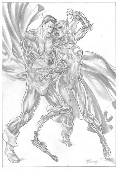
Geof Isherwood captures Dynamo and the Iron Maiden in an intense moment. A sterling example of Geof's phenomenal mastery of human anatomy — every muscle in both figures is accurately defined — this piece also exhibits the artist's skill at tonal rendering.


Members of the T.H.U.N.D.E.R. Agents cast appear more than once in my Common Elements gallery. Darryl Banks, best known for his lengthy run on Green Lantern, brings together Dynamo and Nick Fury, Agent of S.H.I.E.L.D. (Man, those acronyms were everywhere back in the Silver Age!)


Among the supporting players in T.H.U.N.D.E.R. Agents was a group of non-powered yet resourceful operatives called the T.H.U.N.D.E.R. Squad. The safari jacket-clad Squad provided technical and tactical backup for their superpowered comrades. (And, in one instance, got promoted to the A-Team — T.H.U.N.D.E.R. Squad leader Guy Gilbert became T.H.U.N.D.E.R. Agent Lightning early in the series' run.) Here, the T.H.U.N.D.E.R. Squad's resident hottie, Kathryn "Kitten" Kane, joins T'Challa, the Black Panther, for a posedown, courtesy of artist James E. Lyle.


And that's your Comic Art Friday. Watch out for groundhogs.

Labels: ,

Friday, January 26, 2007

Selena's grace, Hippolyta's strength

Comic Art Friday reminds you that this coming Wednesday, January 31, is National Gorilla Suit Day. It's time to bust out that monkey drag and bust a move. You know you want to.


Not long ago, someone browsing my themed comic art galleries e-mailed me the question, "Why Mary Marvel?" I get that query quite often, actually, when people look through my art collection. No one ever asks why I collect Wonder Woman images. I've yet to have anyone inquire as to why I have themed galleries dedicated to Ms. Marvel (though some think it's peculiar that I prefer her original costume to her current one... don't you, Bob Almond?) or the Scarlet Witch, or even Supergirl (the latter of which is dedicated to my daughter, as I've explained previously). I suppose there's a subtle yet obvious reason why I collect art featuring the Black Panther or Storm, so I never get asked about those, either.

My Mary Marvel collection, on the other hand, always seems to have people scratching their heads.

The answer is simple. To my mind, Mary Marvel represents everything that used to be great about superhero comics, and is now largely lost. Despite her enormous power, Mary remains kindhearted and innocent — as were the comics of my youth, for the most part. Mary recalls to me the wonder of superhero fantasy that I first experienced when I picked up my very first comic book — a secondhand copy of Fantastic Four Annual #3 — in those long-distant and halcyon mid-1960s: The idea that an average, otherwise unremarkable person could be endowed with superhuman abilities, and would dedicate those abilities to championing good and helping those in need.

Most superheroes embodied that fantasy, back in the day. Many lost their way in recent decades, becoming as dark-tempered and brutal as the evildoers they're supposed to be fighting. But every time I look at a picture of Mary Marvel, I remember the superhero universe as it was, and as I hope (without much reason for optimism) that some aspects of it might be again someday. Even if I have to write those stories myself.

Besides which, artist Marc Swayze's original concept of Mary Marvel — a gently feminine twist on C.C. Beck's classic Captain Marvel costume — remains one of the most elegantly simple character designs in the history of superhero comics.

Mitch Foust, one of my favorite pinup artists of the present day, does a nice job here of capturing Mary's sweetness and light — along with a soupçon of girlish flirtation — in this drawing.


One of the qualities I enjoy in Mitch's work — aside from the grace and fluidity of his pencil line — is that his women are undeniably sensual, but generally in a manner appropriate to the character. I'm pleased that his rendition of Mary retains a youthful, coquettish air that steers clear of blatant cheesecake.

Completely different in style from Mitch's piece, but no less striking, is this sketch Bay Area artist Nathan Gilmer created at a recent "Starving Artist Saturday" event at my local comic shop, Comic Book Box.


Nathan's poetic naturalism made him an excellent choice to add another Mary to my gallery. I like the fact that his Mary possesses the anatomical proportions of a genuine teenager, rather than of a Hawaiian Tropic swimsuit model. I also like the subtle touch of drama and power Nathan lent to his depiction here. The kid's got talent.

And that's your Comic Art Friday. Don't forget: Wednesday is National Gorilla Suit Day!

Labels: , , , ,

Friday, January 19, 2007

Change their minds, and change the world

Today's Comic Art Friday is dedicated to KJ, who effective this date has been Mrs. Me for exactly 22 years now. Anyone within sniffing distance of sanity will rightly wonder how a woman could survive living with a certifiable nutcase like me for that long.

Did someone say Wonder Woman? (If I am not the Sultan of Segue, no such potentate exists.)

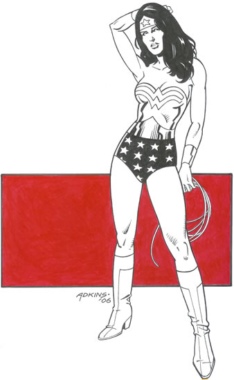
We feature a pair of nifty pinups of our favorite Amazon today, both courtesy of veteran comic artist Dan Adkins. First, a classically styled pose:


Then, this moody work that captures Diana in a weary, tension-fraught posture. Adkins beautifully conveys the frustration and resignation in her expression and body language.


Both of these pieces showcase Adkins's pristine line work and absolutely flawless inking. Seen up close and in person, his blacks are so solid that you could practically fall into them.

It's no secret that I rank Mr. A. high on my list of the most underrated and underappreciated artists in the history of the medium. He might not have been the most compelling storyteller ever — which may have been part of the reason he became better known as an inker rather than as a penciler, even though he did plenty of pencil art back in the day — but the purity of his draftsmanship stands up to anyone's. And his inking? As I said: Flawless.

The very first artwork I acquired for my Wonder Woman gallery was, not coincidentally, a portrait of Diana by Dan Adkins. This one, in fact.


It's rare that I would own three images of the same character by the same artist, in the same medium. But when you observe the different emotional qualities in each of these drawings, you'll understand why they're all essential to my "Temple of Diana."

And that's your Comic Art Friday. Thanks for stopping by.

Happy anniversary, KJ. You're a wonder.

Labels: ,

Friday, January 12, 2007

Prowling for Vipers

Today's Comic Art Friday is dedicated to the memory of legendary animator Iwao Takamoto, who passed away this week at age 81.


Like thousands of Americans of Japanese descent, Takamoto spent the World War II years in California's Manzanar internment camp. While at Manzanar, he honed his skills at drawing. After the war, Takamoto landed a job with Disney, where he worked as an animator and design artist on such classic films as Cinderella, Sleeping Beauty, Lady and the Tramp, and One Hundred and One Dalmatians.

Takamoto joined Hanna-Barbera in the early 1960s, where he designed the characters for numerous cartoon series, including Josie and the Pussycats, Wacky Races, and most memorably, Scooby-Doo. He also directed the 1973 animated feature film version of Charlotte's Web.

Mr. Takamoto will be missed, but his work lives on.

Some weeks back, I spent one Comic Art Friday pondering the whereabouts of former Marvel Comics artist M.C. Wyman. I ponder no more. Not only has the elusive Mr. Wyman resurfaced — he recently posted several new sketches for sale on eBay — but he was gracious enough to place his inimitable stamp on my ever-popular Common Elements gallery with a new commissioned artwork. Here, Wyman brings together two characters from Marvel's past: the Prowler and Viper.


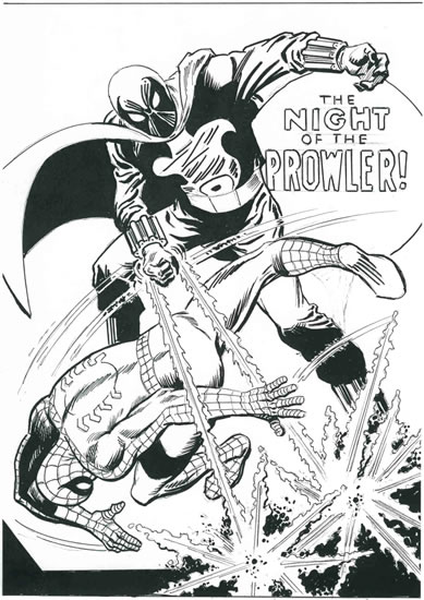
The Prowler began his costumed career as a villain, appearing first in one of the most fondly recalled comics from my youth, Amazing Spider-Man #78 (November 1969). The character made a dramatic impression on me because behind the Prowler's mask lived a young black man named Hobie Brown. At that time, African Americans were almost as scarce in comic books as at, say, a country and western jamboree. A black villain, in particular, was practically unheard of. The Prowler may have been among the first.


Hobie didn't remain a villain for long. With Spider-Man's encouragement, the Prowler quickly reformed, becoming one of the Wall-Crawler's best friends and staunchest allies — even donning the famous Spider-Man costume as a decoy on at least a couple of occasions. He has resurfaced several times over the years, most notably in a solo Prowler miniseries in 1994, and again most recently in Marvel's current megaevent, Civil War.

I've always retained a soft spot for the Prowler — so much so, in fact, that one of the very first purchases I acquired for my comic art collection was a recreation of that classic cover to Amazing Spider-Man #78. This recreation was drawn in 2004 by comics industry legend Jim Mooney, who inked the original ASM #78 art. (John Romita Sr., Silver Age Spidey artist and later Marvel's art director, drew the original pencils.) You'll notice a few subtle differences from the actual cover, but I think Mooney — who's in his mid-80s and still drawing up a storm — did a bang-up job of revisiting this landmark piece of Marvel history.


I was thrilled when MC Wyman agreed to depict the Prowler in my latest Common Elements commission. Paired with Hobie is the mysterious Viper, a longtime Marvel villainess who first surfaced in the same year as the Prowler, albeit a few months earlier (in Captain America #110, February 1969).

Known at first by the code name Madame Hydra, this empress of evil (whose real name, so far as I'm aware, has never been revealed in the comics) later took the nom de guerre Viper, and so she is called to this day. The character appeared — with a different identity and backstory — in the cheesetastic late '90s TV movie Nick Fury, Agent of S.H.I.E.L.D., starring David "The Hoff" Hasselhoff in the title role.

The astute among you have already figured this out, I'm sure. But for those coming late to the party, who may be wondering what common element the Prowler and Viper share: Think sports cars. Think Chrysler.

And that's your Comic Art Friday.

Labels: , , ,

Friday, January 05, 2007

Supergroups and Panthers we love

To usher in a brand new year of Comic Art Fridays, I thought I'd begin with a list of five currently ongoing comic series or miniseries that I'm especially enjoying right now. By coincidence, the five books share something in common — each features the adventures of a group of superheroes.
  • Uncle Sam and the Freedom Fighters. I was skeptical when I bought the first issue of this eight-volume miniseries. After six issues, I'm already dreading the impending end of the storyline. The book features updated versions of several heroes with Golden Age pedigrees: The Ray, Phantom Lady, Doll Man, the Human Bomb, Black Condor, and of course, Uncle Sam. The writing team of Justin Gray and Jimmy Palmiotti (or "Graymiotti," as they're sometimes known) has crafted a compelling plot featuring interesting twists on old character types. The distinctive, painterly art by Daniel Acuña complements the action perfectly.

  • Agents of Atlas. Another series resurrecting heroes from the distant past — in this case, the 1950s, when the company today known as Marvel Comics was known as Atlas (among other names), Agents brings together the most unlikely assemblage of superdoers since Marvel's 1970s Champions series. Ageless secret agent Jimmy Woo leads a reunited team consisting of a spaceman (Marvel Boy), a goddess (Venus), a simian (Gorilla Man), a robot (M-11), and a merwoman (Namora) through a series of scrapes narrated by a new character, S.H.I.E.L.D. agent Derek Khanata. Writer Jeff Parker and artists Leonard Kirk and Kris Justice have taken a kooky concept and spun it into gold. As with Uncle Sam and the Freedom Fighters, I'll be sorry when Agents of Atlas is over.

  • JSA Classified. Although a brand new Justice Society of America series recently hit the stands, I've grown fond of the more personal and intimate short-run stories being told in JSA Classified. The current story arc by writer Scott Beatty and artists Rags Morales and Michael Bair features an old favorite, Doctor Mid-Nite.

  • Heroes for Hire. I'd eagerly anticipated the start of this Graymiotti-scripted series, and I haven't been disappointed in the least. HFH throws together some sadly neglected Marvel characters from back in the day — including the Daughters of the Dragon (bionic-armed Misty Knight and katana-swinging Colleen Wing), the Black Cat, and Shang-Chi, Master of Kung Fu — with such newer heroes as Tarantula and Humbug. Comic Art Friday perennial Al Rio takes over the penciling chores from Billy Tucci and Francis Portela effective next issue.

  • Avengers Next. I'm not a fan of Marvel's various alternate universe series, but I decided to sample this one because Ron Lim is providing the pencils. Am I ever glad I did! Former Marvel editor-in-chief Tom DeFalco is crafting a fun, fast-paced, cheerfully old-school superhero yarn, featuring a new generation of young heroes in a possible alternate future. It's everything comics used to be, and rarely are today. As expected, the art by Lim and inker Scott Koblish is energetic and awe-inspiring.
Of course, one thing I always love about comics, and have for some 35 years or so, is the Black Panther. Let's check out some BP art.

My always wonderful hometown comic shop offers frequent "Starving Artist Saturdays," where local comic artists drop in and sketch on-spot commissions for an afternoon. Last Saturday, I dropped by to visit with the artiste du jour, a fast-rising North Bay talent named Paul Boudreaux. Paul kindly drew this gorgeous, strikingly detailed, and huge — the actual image measures 14" x 16" — T'Challa scenario for me.


And, because one Black Panther is never sufficient to satisfy our craving for all things Wakandan, here's another snazzy sketch, drawn in Kirbyesque style by former Milestone Media artist Angel Gabriele.


Go read some comics, willya? Because that's your Comic Art Friday.

Labels: , ,

Friday, December 29, 2006

Comic Art Friday: The best of 2006

We've come to the final Comic Art Friday of this year, so you know what that means:

It's time for our Best of 2006 Awards. [cue fanfare]

We had, admittedly, a lighter year in comic art collecting in 2006 than we enjoyed the previous year. Money, as the old saying goes, doesn't grow on trees, nor does the art it can finance. But as I page through the portfolios, I'm pleasantly surprised at the number of truly stellar creations that entered my galleries over these past twelve months. So let's get started, shall we?

Favorite "Common Elements" Commission, Heroes Division:
"Night Warriors" — pencils by Darick Robertson
The Night Man and Night Thrasher


A special piece, both for its amazing technical brilliance, and because it's the only artwork in my Common Elements theme gallery that I actually observed in progress. Darick Robertson graciously allowed me to peer over his shoulder one Saturday afternoon as he drew this magnificent sketch, during a signing at my local comic shop.

Favorite "Common Elements" Commission, Heroines Division:
"The Hat Squad" — pencils by Anthony Carpenter
Lady Luck and Zatanna


Anthony Carpenter's lush pencil treatment and inventive design make this piece a standout. The fact that Anthony draws gorgeous women doesn't hurt a bit, either.

Favorite "Common Elements" Commission, Co-Ed Division (tie):
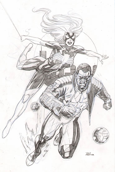
"Seconds Count" — pencils by Lan Medina
Spider-Woman II and Mr. Terrific II


Two heroes with striking appearances join forces in this drawing by Lan Medina. I love the propulsive forward energy of Lan's layout, and the athletic grace of his figures.

Favorite "Common Elements" Commission, Co-Ed Division (tie):
"Reindeer Games" — pencils by Luke McDonnell
The Comet and Vixen


I had no idea what Luke McDonnell would do with this rather whimsical combination. When I saw the completed artwork, I was blown away. The detail, both in the design and execution of this scenario, is nothing short of amazing.

Favorite Wonder Woman:
James E. Lyle (pencils and inks) and Buzz Setzer (colors)


I own several other pieces by James E. "Doodle" Lyle, including another Wonder Woman artwork I personally commissioned from him. The moment I saw this classically styled pinup, however, I knew I had to have it. One of the very few color artworks in my collection.

Favorite Black Panther:
Ron Lim (pencils) and Bob Almond (finished inks)


A double winner, this. Ron Lim, whom I always look forward to seeing at local comics conventions, drew the central T'Challa figure at San Francisco's WonderCon in February. A few months later, Bob Almond — who loves the Panther as much as I do — inked Ron's drawing and added a jungle background of his own creation.

Favorite Mary Marvel:
Chad Spilker (pencils) and Bob Almond (finished inks)


A rough preliminary sketch by "good girl" specialist Chad Spilker transformed into this eye-catching pinup on the drawing table of inker Bob Almond.

Favorite Ms. Marvel:
Buzz (pencils and inks)


Buzz is another artist I always look forward to seeing at conventions. Buzz accepted the commission for this piece at WonderCon, and delivered both it and an equally stellar Black Panther at Super-Con later in the spring.

Favorite Scarlet Witch:
Michael Dooney (pencils)


One day as I was paging through my Scarlet Witch portfolio, I suddenly realized that I'd never commissioned a Wanda from Michael Dooney. Mike was kind enough to rectify this omission by creating this beautiful drawing.

Favorite Supergirl:
Ron Adrian (pencils) and Bob Almond (finished inks)


Start with a powerful pencil image by the talented Brazilian artist Ron Adrian, then add skillful embellishment by Bob Almond, and you end up with something truly spectacular, like this.

Favorite Storm:
Thomas Fleming (pencils)


Thomas Fleming is an artist whose work I would own much more of, if only I could afford it. His awe-inspiring, photorealistic tonal pencil work must be seen to be believed. I was thrilled to acquire this incredible portrait of my favorite X-Man from him.

Favorite Solo Hero:
Dynamo — pencils and inks by Dan Adkins


Dan Adkins may have been one of the most underrated artistic talents of the Silver Age. Best known as an inker, the former assistant to the great Wallace Wood is a marvelous draftsman as well. All of his skills come to bear on this evocative ink drawing of the star of Wood's classic '60s series, T.H.U.N.D.E.R. Agents.

Favorite Solo Heroine:
Amazon — pencils by Michael Dooney, finished inks by Bob Almond


Michael Dooney had never seen Amazon — a comingling of Wonder Woman and Storm who appeared in a one-shot Marvel/DC crossover book a decade ago — before I sent him a scan and asked him to draw her. From the looks of this piece, you'd think he'd been drawing her for years. Bob Almond contributed his typically flawless finish work.

Favorite Co-Ed Pinup:
"Blackbirds" — pencils by Rags Morales
Lady Blackhawk and The Falcon


Okay, so this is really just an excuse to squeeze in another peek at one of my Common Elements theme commissions. The great Rags Morales gives a solid presentation to a couple of my favorite heroes.

Favorite Inking Makeover
"Blind Man's Bluff" — pencils by Ron Wilson, finished inks by Bob Almond
Daredevil and Doctor Mid-Nite


Bronze Age star Ron Wilson created the original pencil art for this Common Elements commission in 2005. This year, Bob Almond kicked this already awesome artwork up a notch with a superlative inking job that displays the complete range of his skills. This one is hanging on my office wall at this very moment.

Which is one of the reasons for this acknowledgment:

Comic Art Friday's 2006 Artist of the Year:
Bob Almond


Bob Almond reminds me of those BASF commercials — he doesn't so much make art as he makes other people's art better. (That's Bob on the left in the photo above; the bearded gentleman is the late, great comic artist Dave Cockrum of X-Men fame, one of many legendary comic creators we lost in 2006.) As I've observed on other occasions, Bob's gift as an inker is his chameleonic ability to match and enhance any penciler's style. No matter who the original pencil artist is, I'm always confident that Bob will find a way to bring out the very best in that creator's work.

Bob delivered a number of terrific commission projects for me this year, several of which are featured above. Every one was a revelation. Bob's also a nice guy, and fun to work with. I look forward to utilizing his talents further in 2007.

Thanks to all of the creators whose artistry and imagination enlivened my collection — and my Comic Art Fridays — in 2006. I can hardly wait to see what wonders the new year will bring!

And that, dear reader, is Comic Art Friday's Best of '06.

Labels: , ,

Friday, December 22, 2006

What happens in Vegas, stays in Vegas

Today's Comic Art Friday is dedicated to Katie Rees, the erstwhile Miss Nevada USA, who was stripped of her title by Donald Trump and his fellow pageant owners yesterday after salaciously compromising five-year-old photos of Ms. Rees surfaced on various Internet sites. (Let's make it clear that the salaciously compromising photos were five years old, not taken when Katie was five years old. Because that would be a whole other issue.)

As a general rule, I don't collect much published comic book page art. For me, a page from a comic story requires context — it doesn't possess much meaning or resonance all by itself. (I know that many comic art collectors disagree with me on this. You collect what you like, I'll collect what I like, and we'll all be happy.)

That said, I have a couple of outstanding exceptions. I own the majority of the original pages from the first issue of the 1991 Millennium Comics miniseries Doc Savage: The Monarch of Armageddon — considered by many Doc Savage aficionados to be the character's most representative appearance in the comic book medium. As a lifelong Doc fan, I enjoy having these pages, both for their nostalgic value and for the wonderfully evocative art by penciler Darryl Banks (a personal favorite) and inker Robert Lewis.

I also own several original pages from a relatively obscure comic: Web of Spider-Man #45, published by Marvel in December 1988.


This story, like the Doc Savage book, holds some personal significance for me. It's set in Las Vegas, Nevada — and if you're an SSTOL regular, you know I loves me some Vegas, baby. What could be better than combining my boyhood hero with my favorite adult playground?


I especially enjoy page two of WoSM 45 (seen above), because it contains some classic images of old-school downtown Vegas that don't exist in the real world any longer:
  • Panel 1 (top left): The old sign from the Golden Nugget Hotel and Casino (the Nugget is still there, but the sign has been updated) and the corner facade of the Lady Luck (which closed in January 2006).
  • Panels 2 and 3 (top right): The original signage and '80s vintage facade of the Horseshoe Casino (now known as Binion's, even though the Binion family no longer owns it).
  • A shuttle van from McCarran Airport, on which the name of the airport is misspelled.
Later in the story, Spider-Man faces off with his long-time nemesis, the Vulture, in the blazing hot Nevada desert. Why? Who knows? It must have seemed like a good idea at the time. Whatever the reason, it's an opportunity for the Web-Slinger to duke it out with the villain high above the desert floor...


...and to deliver one of his patented quips: "Blow it out your beak, Tweety!"


...and to flirt with attractive federal marshal Sara Glenville, who's cleverly disguised as a flight attendant. Because you never know when you might need a flight attendant in the middle of the Nevada desert. She could bring you a bag of peanuts and a Coke. (Actually, there was a plane crash earlier in the story, in which all of these people were involved. See what I mean about context?)


Giving credit where credit is due, the artists who created these images were penciler Alex Saviuk (who drew Web of Spider-Man for about seven years, and currently is the artist on the Spider-Man Sunday newspaper strip), inker Keith Williams (who teamed with Saviuk on WoSM for roughly half the former's run on the book), and letterer Rick Parker. Writer Adam Blaustein penned the scintillating script.

Remember, kids, keep your clothes on in front of cameras if you hope to be Miss Nevada USA someday. And that's your Comic Art Friday.

Labels: , ,

Friday, December 15, 2006

Getting a little Justice in Society

Before we get started, let me be the first to wish our Jewish readers and friends a happy Hanukkah, which begins this evening at sunset. May your candles burn brightly and your dreidels spin with flair over the next week.

Today's Comic Art Friday is dedicated to the late Martin Nodell, the artist who created Alan Scott, the original Green Lantern, back in 1940. Nodell passed away last Saturday at the age of 91. Outside of comics, Nodell's claim to fame lay in the fact that as an advertising illustrator in the 1960s, he was part of the creative team that developed Poppin' Fresh, the Pillsbury Doughboy.

To honor Nodell's memory, we feature Green Lantern Alan Scott in this spectacular scene, conceived and drawn by Anthony Carpenter. Alan's partner here is Saturn Girl, from the Legion of Super-Heroes.


Of course, in superheroic life, Alan Scott can usually be found in the company of his fellow members of the Justice Society of America. The JSA, comicdom's original superteam, first saw action in 1940. It continues as a vital crimebusting force more than six and a half decades later. Indeed, for this old-school comics aficionado, the JSA's adventures in JSA Classified and the recently relaunched Justice Society of America are among the most entertaining reads in comics today.

When the JSA gathers to strike fear into the hearts of evildoers, the heroes on call might include...

Power Girl, depicted here in typically fine form by artist Ron Lim, whose work is currently on view in the Marvel Comics series Avengers Next.


Power Girl began her career as an alternate-universe analog of Supergirl, whose powers she shares. Power Girl also boasts one of the more prominent bustlines in comics, a legacy that began with legendary artist Wallace Wood — when drawing the character's early adventures, Wood decided that he would draw Power Girl's bosom progressively larger in each issue until someone on the DC Comics editorial staff took notice. Several issues later, Power Girl had attained the prodigious mammary accoutrements she retains to this day.

Mister Terrific, displayed in fighting trim once again by the talented Ron Lim.


One of the most brilliant intellects in the DC Comics universe, Michael Holt — modestly known as Mister Terrific — is frequently the field leader of the modern-day JSA. Although he possesses no superhuman powers, the "third smartest man on earth" is a skilled surgeon, a martial arts master, and a technological wizard.

Liberty Belle, here paired with another patriotic heroine, Liberty the American Girl. Scott Jones, the artist who created this striking panel, signs his work with the nom de plume Shade.


The original Liberty Belle, Libby Lawrence-Chambers, derived her superhuman strength and speed from the actual Liberty Bell. Whenever the old relic was rung, Libby powered up. In the newest revision of the JSA, the character Liberty Belle is a legacy -- Jesse Chambers, the daughter of the original Liberty Belle and her husband, super-speedster Johnny Quick. Jesse formerly used the fighting name Jesse Quick, but recently adopted her mother's costume and identity.

Doctor Mid-Nite, brought to life here in dramatic fashion by artist James E. Lyle.


A physician like his teammate Mister Terrific, Doctor Mid-Nite is also one of the few blind superheroes in comics. Unlike most blind people, however, the good Doctor can see perfectly well in complete darkness. He employs special infrared goggles to help him navigate in regular light. Perhaps Doctor Mid-Nite inspired Nicholas Marshall, the protagonist of the TV series Dark Justice, whose motto was, "Justice is blind, but it can see in the dark."

If there's any justice in this society, we'll have another Comic Art Friday seven days from now.

Labels: , ,

Friday, December 08, 2006

The mysterious M.C. Wyman

It's a dark and stormy Comic Art Friday. So let's dive right in, what say?

The comic book industry is one of those fields, like many creative ventures, that tends toward transience in personnel. For every Jack Kirby or Jim Mooney whose work graces the field for decade after decade, there are dozens of artists and writers who make a brief splash, then vanish into the ether, never to be heard from again.

I like to think of M.C. Wyman as the J.D. Salinger of comics. That's probably a tad extreme, given that Salinger's impact on American prose is far greater than Wyman's on American superhero comics. But then, I'm prone to hyperbole. Humor me.


For a couple of years in the early 1990s, M.C. Wyman was a mainstay artist at Marvel Comics. He was most closely associated with The Mighty Thor, drawing about 20 issues of that title between 1992 and 1995, but he also had regular assignments on such series as Daredevil, Silver Surfer, The Avengers, and Nick Fury, Agent of S.H.I.E.L.D.

Then around 1995, Wyman just sort of disappeared from comics. I'd hear mention of him here and there from other fans, but no one seemed to know where he was or what he was doing these days. At one point a couple of years ago, I connected with the guy who had been Wyman's art sales representative for a while — even he hadn't heard from the mysterious Mr. Wyman for some time.

I never even met anyone who knew what the "M.C." stood for.

During his brief stint in mainstream comics, I always admired Wyman's work because he reminded me of my favorite Marvel artist from the Silver Age: John Buscema. Wyman had the same combination of power and elegance that Buscema's pencils epitomized, and I always wanted to ask him whether, in fact, Buscema had been a significant influence as he developed his style.

To date, I've never had the chance.


Recently, I've heard rumors that the great Wyman is back in the comics game, at least to the degree that he's drawing commissioned work again for his fans. I hope it's true. My early comic art resolution for 2007 is to obtain at least one new artwork from M.C. Wyman — specifically, a piece I have in mind for my Common Elements gallery that would be perfect for Wyman's style.

Wish me luck.

And so, friend reader, that's your Comic Art Friday.

Labels: ,

Friday, December 01, 2006

No Warbirds allowed

Today's Comic Art Friday is dedicated to World AIDS Day, the observance of which each December 1 reminds us that 40 million men, women, and children worldwide are living with HIV — and the number grows daily. Keep working for a cure.


Speaking of cures, nothing cures what ails me like comic art, especially when one of my favorite superheroes is center stage. One of the comics highlights of 2006 for me has been the resurgence of Ms. Marvel, for whom I've carried an unrequited torch since her first appearance in 1977. This year, Carol Danvers returned to headlining her own title for the first time in 27 years, as well as taking a high-profile role in one of Marvel's best-selling series (New Avengers) and its current mega-event (Civil War). I couldn't be more thrilled.

Here's the Woman Warrior striking a classic pose, from the pen of artist Gene Gonzales:


The one factor that keeps me sighing with faint disappointment over Ms. Marvel's long-overdue vault to prominence is her costume, which I often refer to as "the Warbird swimsuit." (Some editorial doofus at Marvel Comics once thought it a good idea to change Ms. M.'s nom de guerre to "Warbird" — a silly sobriquet that, thankfully, wore out its welcome after several years and got changed back. Although this costume change occurred while Carol was still known as Ms. Marvel, I still associate the name Warbird with it, as well as with everything awful Marvel has done to this terrific heroine over the years.)

Call me stuck in Retro City, but I still miss the Feminist Avenger's original outfit, as illustrated here by Michael McDaniel. I always thought this design made her look more like a superhero, and less like a beauty pageant contestant. Plus, the scarf was a nifty (if impractical) touch.


Funnybooks being the incestuous business that they are, very few characters are ever truly original. Most astute comics observers recognize that Ms. Marvel was at the outset just DC Comics' Supergirl, given a slightly more mature spin. (Ms. Marvel has always been portrayed as a woman in her late twenties to early thirties, while Supergirl is still a teenager fifty years later.) The two characters originally had almost identical superpowers, and both were spinoffs from, and once wore costumes patterned after, popular male heroes. The artist who illustrated Supergirl's adventures for many years, "Gentleman" Jim Mooney, also drew the majority of Ms. Marvel's original series. The heroines even shared a common surname (Danvers) at one point in time.

All that being said, we can certainly slip a Supergirl drawing into our Ms. Marvel-focused post. Here's a sharp ink sketch of the Maid of Steel, by longtime X-Men artist Brandon Peterson. Inker Bob Almond was kind enough recently to touch up a few unfinished portions of Brandon's piece, to give it a more polished effect.


Say, if you've got an extra simoleon or two in your pocket that isn't already committed to holiday shopping, why not make a donation today to a local nonprofit helping people with HIV/AIDS in your community? You'll be glad you did.

And that's your Comic Art Friday.

Labels: ,

Friday, November 24, 2006

Reindeer games

This being the Comic Art Friday that coincides with the unofficial opening of the Christmas shopping season, it's only appropriate that we debut an artwork with a vaguely Christmas-related theme.

The latest entry in my Common Elements series — you know the drill; pairings of otherwise unrelated superheroes who share some factoid in common — depicts a pitched battle in an urban alleyway between a Golden Age hero called the Comet, and the Vixen, best known as a member of DC Comics' Suicide Squad and, more recently, Justice League of America. Suicide Squad penciler Luke McDonnell, also known for his long run on Marvel Comics' Invincible Iron Man, created this action-packed scenario.


What do Comet and Vixen have in common? By now, you should have guessed: They're the only superheroes who share their fighting names with two of Santa Claus's reindeer.

The Comet dates back to 1940, a fertile time for the creation of superheroes. He sprang from the inventive mind of writer-artist Jack Cole, who's best remembered today as the creator of Plastic Man. The Comet's superpowers will be familiar to anyone who's ever read an X-Men comic or seen any of the X-Men movies: He emitted destructive rays from his eyes, much like the much later — but today much better known — X-character Cyclops. The Comet also holds a unique position in comics history, in that he was the first (though certainly far from the last) superhero to be killed in action. Interestingly, the late hero's brother was spurred by the Comet's murder to become a superhero himself, as the Hangman.

The Comet's original adventures were published by MLJ Comics, more familiar today under the name Archie Comics. Archie has revived the Comet a few times over the years, most notably as a member of the Mighty Crusaders, its 1960s takeoff on the Justice League.

As for Vixen, she also merits a special distinction, as the first black superheroine created by DC Comics, which for years lagged behind competitor Marvel in the introduction and promotion of heroes of color. Vixen very nearly became the first character of her ethnicity and gender to headline a comic series in 1978; her book, unfortunately, was canceled before the premiere issue was published — a casualty of a barrage of draconian cutbacks today remembered as the DC Implosion.

Like Marvel's Black Panther, Vixen — real name: Mari Jiwe McCabe — is African-born. She came to America as a young woman, gaining fame and fortune as a successful fashion model. Her powers derive from a mystical totem (shaped like the head of a fox, hence her nom de guerre) that enables her to imitate the abilities of any animal. Following stints in DC superteams Checkmate and Birds of Prey, Vixen recently rejoined the roster of the Justice League of America, to which she belonged once previously in the mid-1980s.

Artist Geof Isherwood, who first inked Luke McDonnell's pencils on Suicide Squad, then followed McDonnell as penciler on the series, places Mari front and center of the Squad's actitivies in this tension-filled scene. Joining Vixen are Suicide Squadders Bronze Tiger, Nightshade, and Deadshot.


The artist known as Buzz captures Vixen's feral temperament in this ink sketch, created at WonderCon 2005.


With that, we send you off into the seething masses of holiday shoppers. You may need both the concussive blasts of the Comet and the raw animal power of the Vixen if you're planning to purchase, say, a PlayStation 3. Stay safe out there, friend reader.

And that's your Comic Art Friday.

Labels: , ,

Friday, November 17, 2006

Extract of Almond: a few drops more

Previously on Comic Art Friday, we looked at a pair of before-and-after examples of inking commissions undertaken by one of my favorite inkers to work with, Bob Almond. Today, we'll examine another set of Bob's embellishing projects.

I have long admired the work of artist Chad Spilker, one of the best "good girl" pinup stylists in the business. Chad's busy schedule of late hasn't afforded him time to take on commission projects, so I hadn't been able to add a piece of his art to my gallery. That's why I was elated when he offered up this rough sketch of one of my favorite heroines, Mary Marvel. A preliminary test for a commission Chad drew a few years ago, this unfinished piece reflects the smooth linework and playful personality that characterizes Chad's work.


Bob Almond has proven, in previous commission projects, his uncanny ability to transform a raw sketch into a fully realized artwork. I asked Bob to photocopy Chad's sketch onto Bristol board (the heavy art paper generally used for comic book art), ink it, and add a basic background design that did not incorporate lightning. (Everybody draws Mary with lightning.) Bob chose a dramatic starfield that sets off the primary figure perfectly. You can read Bob's own comments on this project here.


I enjoy the work of Ron Adrian, a talented artist recently named the new penciler on DC Comics' The Flash: Fastest Man Alive, after stints on such books as Birds of Prey and Supergirl. This Supergirl drawing captures the finely detailed linework for which Ron is acclaimed.


This was the second Adrian commission I'd asked Bob Almond to ink. Previously, he worked his magic on a piece from my Common Elements series, featuring Adam Warlock and the Scarlet Witch. Bob did such phenomenal work on that project that I knew immediately that I wanted him to take on my next Adrian as well. Bob really brings out the power and grace of Ron's art in this piece. You'll find Bob's notes about this project here.


So, the next time someone suggests to you that all a comic book inker does is trace the original pencils, kindly kick that person in the hindquarters. Then give him or her a link to these "Almond joys."

And that, mes amis, is your Comic Art Friday.

Labels: ,

Friday, November 10, 2006

Extract of Almond

As foreshadowed last week, today's Comic Art Friday spotlights the talents of veteran inker Bob Almond. Bob recently completed a series of inking commissions for me, the results of which you'll see over the next couple of Comic Art Fridays.

Although I've showcased Bob's inking on other occasions, I don't know that I've written much about Bob himself. A lifelong comics fanatic, Bob studied art at the University of Massachusetts Dartmouth. He broke into comics professionally in 1992, as the regular inker (over the pencils of such artists as Angel Medina, Tom Grindberg, and Patrick Olliffe) on the Marvel Comics series Warlock and the Infinity Watch.


Bob went on to work on numerous other projects for Marvel, but he's most closely associated with Black Panther, on which he teamed with writer Christopher J. Priest and penciler Sal Velluto for a memorable three-year run. As a Black Panther fan, I consider the Priest/Velluto/Almond Panther one of the two greatest sequences in the character's storied history. The other? Writer Don McGregor's Jungle Action series in the early 1970s, featuring art by pencilers Billy Graham (no, not the evangelist — one of the first prominent African American artists in mainstream comics) and Rich Buckler, and inkers Klaus Janson and Bob McLeod.


Bob Almond later partnered with Sal Velluto on other titles, including DC Comics' Justice Society of America and Captain Gravity and the Power of the Vril for Penny-Farthing Press. (The two are so closely associated that many fans refer to them as an entity, "Sal 'n' Bob.") At the moment, Bob's regular gig is inking the pencils of Kevin West on the Wildstorm Comics series Nightmare on Elm Street, based on the popular Freddy Kreuger films.

Because of Bob's fond association with the Black Panther, he's always interested in inking new images of the Wakandan king. When I acquired this striking pencil drawing, commissioned from longtime Green Lantern artist Darryl Banks, Bob immediately expressed an interest in finishing the piece. How could I say no?


As you see, Bob added dimension and drama to Darryl's art with solid shadows and a bold framing element. Check out Bob's own comments on this project here.


One of the qualities I appreciate most about Bob as an inker is his amazing ability to adapt to the individual style of any penciler. As seen in the drawing above, Darryl Banks uses a bold, powerful pencil line. In stark contrast to Darryl's approach is that of Michael Dooney, a specialist in "good girl" or female pinup art. Michael's linework is fine and often quite delicate, as in this drawing of the Amalgam Comics character Amazon — a melding of DC's Wonder Woman and Marvel's Storm.


Notice how Bob Almond takes a lighter, more subtle approach when inking Dooney as opposed to Banks. Also evident here is one of Bob's trademarks — the sophisticated use of a patterned film called Zip-A-Tone to create unique effects that would be impossible to replicate by hand, such as the reflective sheen in Amazon's cape. Bob shares his technical perspective here.


We'll look at more before-and-after examples of Almond's art next week. For now, that's your Comic Art Friday.

Labels: ,

Friday, November 03, 2006

Hey, girls, gather 'round...

To those of you who dropped by earlier in the day and found yourselves asking, "Where in tarnation is my Comic Art Friday?" please accept my apologies. It's been a hectic week at SwanShadow Communications. Good for the bank account — for the blog, not so much.

But there's no need to fear: Comic Art Friday is here!

Today's Comic Art Friday is dedicated to longtime comic artist and fellow San Francisco Giants fan "Joltin'" Joe Sinnott, whose beloved wife of 56 years, Betty, passed away earlier this week.


Although his work in comics spanned the gamut of genres and styles, Mr. Sinnott is most vividly remembered as one of the better inkers (in my opinion, the very best) to embellish the pencils of perhaps the most influential artist in comics history, the legendary Jack Kirby, during Marvel Comics' Silver Age in the 1960s. Mr. Sinnott also recently celebrated his 80th birthday on October 16. My sincere condolences to Mr. Sinnott and his family in their time of grief, and belated birthday well-wishes to Joltin' Joe himself.

As I've observed on Comic Art Fridays past, inkers are the unheralded heroes of the comic art field. Long toiling in anonymity, these artists are responsible for transforming the pencil artist's drawings into camera-ready art for publication. But more than that, the great inkers lend transcendent beauty to art that, when it arrives on their drawing tables, may barely be recognizable.

Today, I wanted to share with you three pieces that were finished for me on commission by inker James Taylor. No, he's not the well-known singer of the same name. He is, however, a "handy man" with pen, brush, and India ink, as you're about to discover. James's published work can be viewed in the series Decoy and Para, from Penny-Farthing Press.

Here's an original pencil drawing of Saturn Girl of the Legion of Super-Heroes, as depicted by Comic Art Friday's favorite "good girl" artist, Michael Dooney.


Now here's that same piece again, with inks by Taylor. Notice how much crisper and sharper the image becomes, plus the almost imperceptible touches of personality Taylor adds.


Next, another Dooney creation — this time, the world's most powerful girl, Mary Marvel.


Mary again, with inks by Taylor. Sweet, huh?


Our third example is one of my special favorites: the very first Mary Marvel in my collection, drawn by the talented Michael McDaniel.


After the ministrations of James Taylor, the eye-catching result.


In upcoming Comic Art Fridays, you're going to be treated to some of the latest creative output of one of my favorite inkers to work with: Bob Almond, currently inking over Kevin West's pencils on Wildstorm's new Nightmare on Elm Street horror comic, based on the popular films of the same name. Bob just put the finishing touches on the last piece in a group of inking commissions that are simply going to astound you. I'm expecting the arrival of these pieces next week, so stay tuned.

For this week — despite the lateness of the hour — that's your Comic Art Friday.

Labels: ,

Friday, October 27, 2006

Wonder Woman Day!

In case you missed the memo, Sunday, October 29 is Wonder Woman Day.

All I can say is, it's about time.


In recognition of National Domestic Violence Awareness Month, Excalibur Comics in Portland, Oregon is hosting a celebration of everyone's favorite Amazon this Sunday. The highlight of Wonder Woman Day will be the auction of a dazzling array of original Wonder Woman art, donated by an all-star lineup of comic artists, including current All-Star Wonder Woman penciler Terry Dodson (who'll be on-site, signing autographs) and award-winning cover artist Adam Hughes. Proceeds of the event will benefit two women's shelters in the Portland area: Bradley-Angle House and Raphael House.

Since the SSTOL crew can't be on hand to celebrate Wonder Woman Day in person, we thought it appropriate to stage our own Wonder Woman Day in the Comic Art Friday tradition. I've chosen several of my favorite pieces from my Wonder Woman gallery. Some have appeared on Comic Art Friday previously, others will be making their debut here. All are worth a look.

And if these images inspire you to make a donation to a women's shelter in your local community, so much the better.

Here's one you've not seen before: A gorgeous, classically styled pinup by Mitch Foust.


If I recall correctly, this was the first piece of Mitch's art I obtained. I've added several more examples since. I'm a fan of Mitch's smooth, gentle pencil line, and his naturalistic sense of anatomy. His woman always look like real human beings, rather than escapees from some warped male fantasy.

One of the most visually arresting images in my entire art collection is this collaboration between pencil artist Michael Jason Paz and the powerful pen of inker Geof Isherwood.


As stunning as this piece was in its original pencils, Geof's inking elevated it to an entirely different level. I probably get more compliments on this work than any other single piece that I own.

Here's another example of Geof's brilliant inking, this time over Brazilian superstar Al Rio.


Al's original pencils were the first Wonder Woman art I personally commissioned. I fall in love anew with this piece every time I look at it. Geof's inking, once again, brought an already masterful artwork to dizzying new heights.

By the way, if you like Al Rio's style, I learned this morning from Al's art representative Terry Maltos that Al has just been hired by Marvel Comics to take over the penciling duties on one of my favorite current series, Heroes for Hire. It's a splendid choice by Marvel; Al's going to deliver some knockout art for that title. So be sure to check it out.

In case you were curious to see what vision of Wonder Woman Geof Isherwood might create if left to his own devices, the piece you're about to see incorporates both Geof's penciling and inking talents.


I don't believe there's an artist in the business today with a better understanding of figure anatomy, or of light and shadow, than Isherwood.

Here's another piece that I don't believe has appeared in this space before. Nicely rendered in the contemporary style, it's the work of Brazilian artist Diego Maia.


This is one of the special treasures in my Wonder Woman gallery. It's Peter Krause's take on what the mighty Diana might look like, taking a relaxing day off.


Finally, the great Darryl Banks delivers a smashing pinup that recalls the influence of Wonder Woman's original artist, Harry G. Peter, while adding some signature Banks style.


Now I'd call that a Wonder Woman Day worthy of the name, eh wot?

If you still haven't got your fill of the Amazing Amazon, you can view the rest of my Wonder Woman art at my Comic Art Fans gallery. While you're at CAF, I highly recommend a stroll through the online galleries of the world's premier Wonder Woman art collector, Joel Thingvall. Joel owns more Wonder Woman art than any human alive. His collection is nothing short of spectacular; my own pales into insignificance by comparison. You could literally spend hours admiring the work of hundreds — perhaps thousands; I'm not sure even Joel knows — of artists, all paying their respects to the Mother of All Superheroines. If you stop by, tell Joel I sent you.

And that's your Comic Art Friday.

Labels: ,

Friday, October 20, 2006

Happy birthday, Nick Cardy

Today, Comic Art Friday salutes artist Nicholas Viscardi, a.k.a. Nick Cardy, a member of the Comic Book Hall of Fame and one of the truly great talents of the comic industry's Gold, Silver, and Bronze Ages. This week, Mr. Cardy celebrates — depending upon the resource you check — his 85th or 86th birthday. Whichever figure is correct, he's been a legend in comics for a good long while.

The last time I heard, Cardy was still making occasional appearances at comic conventions in the vicinity of his Florida home. As recently as 2004, he was still turning out beautiful artwork, such as this captivating bust of my favorite Amazon.


Cardy is probably best known to modern comic book readers as the longtime pencil artist on DC Comics' Aquaman and Teen Titans. He was also one of DC's most prominent and prolific cover artists for the better part of three decades. His lush and illustrative — though never overdone — drawing style adapted perfectly to almost any character he was called upon to render. And, as typified by this cover to Aquaman #33, Cardy also drew some of the most gorgeous women in comics at the time... not that I noticed.


Aside from his Silver Age DC oeuvre, Cardy holds a special place in my comic history appreciation because of his work on one of my favorite superheroes of the 1940s, Will Eisner's Lady Luck. Aficionados recall that the artist most closely identified with Lady Luck is the great Klaus Nordling, who drew most of her adventures in Eisner's Spirit Sunday newspaper supplements. Cardy, however, also drew Lady Luck for about a year in the early '40s, and is probably the artist most associated with the feature after Nordling.

I admire Lady Luck for three reasons:
  1. I see her very much as the female counterpart of The Spirit, Eisner's greatest creation, and I suspect that Eisner created her with exactly that thought in mind. Like The Spirit, Lady Luck had no superhuman powers, but relied upon her wits and her brilliant detective skills in her battle against urban crime.
  2. Lady Luck was one of the first female characters to headline her own strip, appearing for years as the backup feature in those fondly remembered Spirit supplements.
  3. I'm fond of her marvelously quaint, classically 1940s character design — her costume consisting of a simple green cocktail dress, opera gloves, a cape, and a stylish broad-brimmed hat, with her face masked by a translucent green veil.
Sadly, I don't have a Cardy Lady Luck in my collection, although if I had the opportunity to attend a show where Mr. Cardy was sketching, I would love to have him draw her for me. Instead, we'll make do with this striking, Cardyesque pinup by one of my favorite "good girl" artists, Michael Dooney.


Lady Luck also makes a showing in one of my Common Elements commissions, a piece I've titled "The Hat Squad." Here, artist Anthony Carpenter pairs Lady Luck with DC's sorceress supreme Zatanna, who also is easily recognized by her hat.


Happy birthday, Mr. Cardy. I hope you're enjoying your well-earned retirement. Thanks for all the amazing visuals.

And for the rest of us, that's Comic Art Friday.

Labels: ,

Friday, October 13, 2006

Your one-way ticket to midnight

Today's Comic Art Friday is dedicated to the memory of artist and animator Ed Benedict, the longtime Hanna-Barbera stalwart who designed such iconic characters as the Flintstones, Yogi Bear, Quick Draw McGraw, and Huckleberry Hound. Benedict passed away in August at the age of 94, but news of his death only reached the media this past week. Like Alex Toth, who died earlier this year, Saturday mornings would not have been the same without the work of Ed Benedict.

Speaking of animation...

We're focusing today on the loudest, nastiest, most hellbent-for-leather animated film ever created — the movie that brought together fantasy comic art and cutting-edge animation in a way that no film had before and few films have since.

That's right: I'm talkin' Heavy Metal, baby.


When it exploded into theaters in the fall of 1981, Heavy Metal marked the end of an era in which animation was viewed strictly as entertainment for children. It ushered in a new age of adult-focused animation that continues 25 years later.

Part of the film's genius stemmed from the fact that it was conceived by people (specifically, producer Ivan Reitman, then best known for such live-action comedies as National Lampoon's Animal House and Stripes) with no previous experience in animation, who therefore were unburdened by preconceptions of what could and could not be done. Heavy Metal brought together an impressive a dazzling array of animation talent spanning five cities on two continents, incorporating original art and stories by some of the most innovative creators in the field at that time, under the oversight of veteran animation director Gerald Potterton (best known for his work on the Beatles' Yellow Submarine). Its effects upon animation cinema, and the fantasy genre in general, continue to resonate even now.

But mostly, Heavy Metal kicks major butt.

In case you've never seen Heavy Metal — and if you haven't, don't feel bad; a lot of people haven't, for reasons I'll explain later — the film is a series of animated vignettes representing a variety of artistic styles, nominally linked together by a common thematic device: namely, the Loc-Nar, a glowing green ball of evil that wants to destroy the universe. (Hey, this is fantasy were talking about.) Several of the individual stories were adapted from material originally published in the illustrated fantasy magazine Heavy Metal, hence the film's name. In order of appearance, Heavy Metal takes us through these startling new worlds:
  • Soft Landing (directed by Jimmy T. Murakami, from a story by writer Dan O'Bannon and artist Thomas Warkentin). An astronaut exits an orbiting space shuttle in a vintage Corvette convertible, reenters Earth's atmosphere, and drives to his house (which eerily resembles Norman Bates's abode in Psycho) in a deserted countryside.

  • Grimaldi (directed by Harold Whitaker of Halas & Batchelor Animation). The astronaut Grimaldi gets disintegrated by the Loc-Nar, which he has carried home from space in a briefcase. The Loc-Nar begins a conversation with Grimaldi's preteen daughter, setting the stage for the rest of the film.

  • Harry Canyon (directed by Pino Van Lamsweerde, with designs by comic artist Juan Gimenez). A cab driver in a futuristic version of New York city rescues a young woman from a gang of robbers at a museum. It turns out that the woman is the current owner of the Loc-Nar, which the gangsters are determined to possess for themselves.

  • Den (directed by Jack Stokes, from a story by popular fantasy artist Richard Corben). A teenage nerd discoverers a glowing green meteorite — in reality, the Loc-Nar — which transforms him into a powerfully muscular warrior and teleports him into a primeval world.

  • Captain Sternn (directed by Paul Sabella and Julian Szuchopa of Boxcar Animation, from a story by comic artist Bernie Wrightson). A roguish starship captain gets his comeuppance in a galactic courtroom, when a janitor he had hired as his patsy turns against him in a most surprising way.

  • B-17 (directed by Barrie Nelson, with designs by comics artist Mike Ploog). An ill-fated bomber pilot encounters the Loc-Nar during a World War II mission, and finds his slain crew members transformed into zombies.

  • So Beautiful and So Dangerous (directed by John Halas of Halas & Batchelor Animation, from a story by science fiction artist Angus McKie, with character designs by comics artist Neal Adams). A secretary at the Pentagon finds herself kidnapped by drug-snorting aliens from outer space, and falls in love with a robot.

  • Taarna (directed by John Bruno — now a major Hollywood special effects guru — based on the Arzach stories by French artist Jean "Moebius" Giraud, and with design work by such talented artists as Mike Ploog, Howard Chaykin, Chris Achilleos, Phillip Norwood, and Charles White III). On a bleak, faraway planet, a peaceful civilization is destroyed by a band of marauders transformed into invincible warriors by the Loc-Nar. Their murderous rampage is thwarted by a mysterious, silent female avenger riding a pterodactyl-like beast.
As anyone who has seen Heavy Metal can attest, the segments vary in tone from sublime (Taarna) to ridiculous So Beautiful and So Dangerous, from terrifying (B-17) to hilarious (Captain Sternn). It's sophomoric and aggressively puerile at times, yet when it works — which, for me, is more often than not — it's rough magic.

An additional segment, entitled Neverwhere and directed by Cornelius Cole, appears only on the DVD release. Sadly, Neverwhere — which traces the history of evil on Earth from prehistory to Nazi Germany — was deleted from the film's theatrical cut due to time considerations, depriving a generation of viewers from a piece of the most emotionally powerful animation ever created, and certainly the most brilliant visuals created specifically for this film.

For years, the entire film was little-seen — outside of midnight movie screenings and occasional, brutally edited airings on late-night cable — as a result of licensing issues over the soundtrack, which features songs by numerous hard rock hitmakers of the early '80s. (It also contains some of the greatest work ever recorded by legendary film composer Elmer Bernstein, whose score is considered a minor masterpiece by some aficionados, yours truly included.) Because of the legal wrangling, no legitimate home video version of Heavy Metal existed until nearly two decades after the film's release.

The Taarna segment is Heavy Metal's centerpiece, occupying roughly the final third of the film's running time, and boasting its most spectacular artistic achievements. Given that I'm a fan of rotoscope animation — a process in which footage is shot initially with live actors, then animated over — Taarna remains one of my giddiest pleasures in all of cinema. All of the scenes featuring the title character were created from live action footage of an actress named Carol Desbiens, who only slightly resembles her animated counterpart, but lives and breathes in her every movement. The DVD release contains several snippets of the Desbiens footage, and it's fascinating to watch the transition from live actress to ink-and-paint superwoman.

Given my fondness for Heavy Metal — and for Taarna in particular — it should surprise no one that I have a few pieces of original Taarna art in my collection, two of which you're about to view.

First, here's a classically styled Taarna pinup, drawn by master "good girl" artist Mitch Foust.


Next, artist Michael Dooney places Taarna in her element in this stunning drawing.


By the way, Heavy Metal, the magazine that inspired the film, is still going strong today. It's now owned by comics creator Kevin Eastman, who with fellow artist Peter Laird spawned the ever-popular Teenage Mutant Ninja Turtles. (Michael Dooney has worked extensively on TMNT projects over the years.) Eastman even produced an embarrassingly wretched "sequel" to Heavy Metal the film, called Heavy Metal 2000, mostly so that his centerfold-queen wife Julie Strain could serve as the model and voice actress for the new film's heroine. If you ever have the opportunity to see Heavy Metal 2000... pass.

If, however, you get a shot at the original — and you're an adult who isn't easily offended — by all means check it out. It would be the perfect way to end a Comic Art Friday, especially on Friday the 13th.

Labels: ,

Friday, October 06, 2006

Working on our night moves

As foreshadowed in last week's Comic Art Friday post, I had the honor this past Saturday afternoon of watching artistic genius at work.

Comics artist Darick Robertson, whose talents are on display in the new DC/Wildstorm series The Boys, took several hours out of his busy schedule to sketch and sign comics at my local comic shop, Comic Book Box. Eager to commission a sketch from Darick, I made it a point to arrive early enough to be first in line when he set up shop.

My efforts, as you'll see, were abundantly rewarded. Over the course of about 90 minutes, I looked on in rapt fascination as Darick created the drawing you're about to view.


In preparing for Darick's appearance, I puzzled long and hard over what hero or heroes I would ask him to draw. My first impulse was to have him add a new piece to my collection of Black Panther pinups. Then I thought, why not seize the opportunity to ask for a new entry to my Common Elements theme? Although some artists hesitate to do multiple-character drawings in a quick-sketch setting, I figured the worst that could happen would be that Darick would ask me to choose something simpler. If he did, I could always go to the Panther as my Plan B.

As I scanned my "wish list" of Common Elements ideas, however, I didn't see anything that immediately screamed "Darick Robertson" to me. Although Darick has been working professionally in comics for 20 years, the project I most associate with him is Marvel's New Warriors, a series he drew regularly for about three years in the early 1990s. After an evening of cogitation and online research, I hit upon a new Common Elements concept that would be perfect for Darick: two heroes with the shared theme of "night," who also share a connection to Darick's career.

Night Thrasher (in the foreground and to the right in the drawing above) was the field leader of the New Warriors when Darick began drawing their book. The Night Man (to the left) was a character Darick cocreated (with writer Steve Englehart) for Malibu Comics' "Ultraverse" in the early '90s. Pop culture mavens will recall that the latter was adapted for the syndicated TV series entitled NightMan, which aired from 1997 to 1999 and starred Matt McColm as the titular hero.

When I pitched this concept to Darick, he seemed genuinely intrigued. He quickly set about roughing out the drawing in blue pencil on a standard comic art board. After an initial idea failed to gel, Darick turned to me and asked, "How about if I have them fighting?" That suggestion earned a thumbs-up from me, and within moments the familiar lines of Night Thrasher's costume began to take form.

Chatting almost nonstop as his pencil flew across the page, Darick offered up a wealth of lore about his career and the comics industry in general to the fans who joined be around his drawing table. Darick said that when he was drawing New Warriors, he always wanted to redesign Night Thrasher's costume, which he thought was needlessly complex and bulky for a character who's supposed to be a stealthy night fighter — essentially an urban ninja. Due to potential conflicts with the Night Thrasher solo series that was in production during that same period, Darick was never permitted by Marvel's editorial staff to implement his proposed changes. His drawing of Thrash here reflects a few of the adjustments Darick always wanted to make, and I think he got a kick out of getting "the last word" on the subject. He also noted that it was difficult to make Thrash an interesting character — Darick described him as "the poor man's Batman" — due to these same editorial restrictions.

I was thunderstruck when, after Darick finished drawing the battling duo, he flipped the page end-to-end before signing it. The entire time he had worked on the piece, he had oriented the page on his drawing board such that the figures' heads were at the top. It wasn't until he affixed the dedication and signature that I realized that Darick intended to show the two heroes falling heads-down through the air as they fought. Amazing! That he could envision the scene in reverse orientation as he created it speaks volumes about Darick's incredible artistic sensibility.

Am I delighted with the results? Gee... you think?

Thanks to Darick Robertson for a breathtaking addition to my Common Elements collection. The scan shown here doesn't even approach the immaculate clarity and vividness of Darick's pencil art. It's no wonder that in a recent reader poll conducted by Comic Book Resources, Darick ranks as the 37th greatest comic book artist of all time.

Thanks also to the world's finest comics retailer, Kathy Bottarini, for inviting Darick to "come out and play."

And that's your Comic Art Friday.

Labels: ,

Friday, September 29, 2006

Seconds count

Today's Comic Art Friday is dedicated to DC Comics artist Scott McDaniel, the penciler half (partnered with inker Andy Owens) of the regular art team on Green Arrow. McDaniel and Owens are currently collaborating with writer Tony Bedard on a two-issue story arc in JSA Classified that began in issue 17, released this past Wednesday. Apparently McDaniel, a solid artist and by all accounts a decent fellow, is not important enough to the editorial staff of JSA Classified that his name should be spelled correctly on the cover.


We still like you, Scott.

You know what else we like? Our ever-popular Common Elements themed art series. As Comic Art Friday veterans know all too well, each Common Elements artwork pairs two otherwise unconnected superheroes who share some feature — sometimes obvious, sometimes subtle — in common. (Yes, we've explained this dozens of times before, but there are always new people in the audience. So witcher yappin'.)

The Common Elements artwork featured today teams Julia Carpenter, the second superheroine to use the code name Spider-Woman (she recently began calling herself Arachne, but that's a post for another day), with Michael Holt, the second superhero to dub himself (not too modestly, I might add) Mr. Terrific. This action-packed pencil drawing exploded from the creative genius of artist Lan Medina, best known for his work on the fantasy series Fables.


In the superhero universe, there exists a long and storied tradition of one hero assuming the nom de guerre of an admired predecessor. DC Comics (a.k.a. National Comics way back then) launched the Silver Age of Comics in part by recreating several of the company's heroes from the 1940s, most notably the Flash (arguably the first "modern" superhero), Green Lantern, the Atom, and Hawkman. Although many Americans know that Batman's sidekick Robin began life as a teenaged acrobat named Dick Grayson, only comics aficionados realize that several Robins — I can name three: Jason Todd, Timothy Drake, and Stephanie Brown — have followed in the original's tights. (Dick Grayson is still around, but he calls himself Nightwing now, and he's no longer Batman's... umm... batman.)

The cases of Spider-Woman and Mr. Terrific demonstrate that even relatively minor superheroic identities get recycled. In fact, Julia Carpenter, the Spider-Woman pictured here, was only the second of at least four Marvel Comics characters who've worn the Spider-Woman moniker. As noted above, Julia now uses the code name Arachne, in part because the original Spider-Woman, Jessica Drew, is exercising her superheroism once again after years of inactivity. Of the various Spider-Women, however, Julia has always been my favorite. She's always portrayed as a more accessible, more human personality than the aloof and mysterious Jessica, and the fact that Julia is a single mother raising a young daughter lends her an emotional reality that's refreshing in the fantastic world of costumed world-beaters.

Mr. Terrific, a relatively recent addition to the comics scene, has become a favorite of mine also. Michael Holt takes his fighting identity and "Fair Play" motif from an obscure 1940s hero whose real name was Terry Sloane. Like his predecessor, Holt possesses no superhuman powers, but is a formidably intelligent individual — the "third smartest person in the world" by his own calculation, Holt is something of a modern Doc Savage, with expertise in medicine, engineering, electronics, and various other scientific fields. In many ways, Mr. Terrific can be viewed as an alternate version of Batman: a brilliant man who uses his genius and technical wizardry to battle evil.

Incidentally, the two floating round objects accompanying Holt in the drawing above are T-spheres, robotic devices Mr. Terrific controls using mental commands transmitted through his mask. Holt's T-spheres are more or less the high-tech comic book equivalent of Swiss army knives. Each comes equipped with a camera, a laser, a holographic projector, wireless communications, a data processor, and I think maybe a corkscrew. (I suspect that Mr. Terrific got the idea for T-spheres while watching a showing of Phantasm on late-night cable TV.)

And that's your Comic Art Friday.

By the way, if you happen to live in my neck of the woods, my local comics retailer — Comic Book Box in Rohnert Park — is hosting a personal appearance and signing by superstar artist Darick Robertson (currently teaming with writer Garth Ennis on DC's The Boys) Saturday afternoon from 1 to 5 p.m. Rumor has it that Darick may take on a few commission sketches during the event. If I manage to persuade him into doing a sketch for me, you'll see it here soon.

Labels: ,

Friday, September 22, 2006

Tonight I'm gonna party like it's 5767

Happy New Year and L'Chaim to all of SSTOL's Jewish readers! (You know who you are. At least, I hope you do.)

In celebration of Rosh Hashanah — which, for the benefit of my fellow goyim, begins tonight at sunset — today's Comic Art Friday celebrates heroes and heroines of the Hebrew persuasion. If you're an SSTOL regular, you've seen both of today's artworks on previous occasions, but feel welcome to enjoy them again on this New Year's Eve/Day (depending upon what time of day you read this).

This first piece is a favorite from my ever-growing "Common Elements" series, featuring pairs of unrelated heroes who share some factor in common. On the left, one of the most influential creations in the history of comics: Denny Colt, a.k.a. The Spirit. On the right, the first mainstream superheroine to openly acknowledge her Jewish faith: Katherine "Kitty" Pryde, a.k.a. Shadowcat, of the X-Men and Excalibur.


The common element I had in mind when putting Denny and Kitty together actually isn't their religion, but their code names. Early in her superheroic career, before settling on the Shadowcat identity (though she's often referred to in the comics simply by her real name) Kitty used the nom de guerre Sprite, which (not surprisingly) derives from the same linguistic root as Spirit.

When asked about The Spirit's background, his creator Will Eisner always stated that he never specifically thought of The Spirit as a Jewish character, and certainly never intended to portray him as such. However, the legendary cartoonist and comics historian Jules Feiffer, who began his career as Eisner's assistant, has written concerning the blue-suited hero, "His name may have been Denny Colt, but you knew it had been Cohen at some point."

Probably the most identifiably Jewish heroes in comics are the two pictured in the following drawing by longtime industry stalwart Rich Buckler. Another of my Common Elements pieces, this one portrays a clash of titans: The Thing (real name: Benjamin Jacob Grimm), the rock-skinned powerhouse of the Fantastic Four, and Sabra (real name: Ruth Bat-Seraph), the national superheroine of Israel.


Although Ben Grimm, the blue-eyed, ever-lovin' Thing, has been a major star in the superhero firmament since 1961, fans weren't universally aware that he was Jewish (though his name certainly offered a clue) until 2002, when writer Karl Kesel and artists Stuart Immonen and Scott Koblish created a Fantastic Four story designed to reveal Ben's religion to the world at large. In this tale (Fantastic Four, Volume 3, Issue 56), The Thing prays the Sh'ma, a Hebrew prayer customarily offered at death, over a wounded friend from his childhood, a shop owner named Sheckerberg. Later, after Sheckerberg recovers from his injuries Ben and the man share a poignant exchange:
Sheckerberg: It's good, too, to see that you haven't forgetten what you learned at temple, Benjamin. All these years in the news, they never mention you're Jewish. I thought maybe you were ashamed of it a little.

Ben: Nah, that ain't it. Anyone on the Internet can find out, if they want. It's just... I don't talk it up, is all. Figure there's enough trouble in this world without people thinkin' Jews are all monsters like me.
Which raises a point worth considering. Anyone who knows anything about the history of comic books in general, and the superhero genre specifically, knows that the founders of the industry were young Jewish men. The costumed hero by whom all others are measured, Superman, was the brainchild of a couple of Jewish kids from Cleveland, Jerry Siegel and Joe Shuster. Likewise, most of the linchpins in the Marvel Comics canon, from the Fantastic Four to the X-Men, were created by writer-editor Stan Lee (born Stanley Lieber) and artist Jack Kirby (born Jacob Kurtzberg) — the latter of whom also cocreated (with another Jewish writer-artist, Joe Simon) Captain America in the early 1940s.

Yet, even though comics began as an industry overwhelmingly perpetuated by Jewish talent, it wasn't until relatively recently that there were any openly Jewish superheroes in mainstream comics. As we've seen, it took 40 years for Marvel Comics to officially acknowledge that one of their best-known and most beloved heroes was a Jew.

It's frightening to realize that the roots of bigotry burrow so deep into the American psyche that for decades, the authors of a popular entertainment medium couldn't promote to a general audience characters who openly shared their creators' heritage.

And that's your Comic Art Friday for this Rosh Hashanah 5767. L'Shana Tova!

Labels: ,

Friday, September 15, 2006

Of kids and comics

Today's Comic Art Friday is dedicated to Eisner Award-winning writer-artist Kyle Baker, a magnificently diverse talent who has drawn everything from superheroes (the Captain America riff Truth) to noir suspense (The Shadow) to classic literature (Through the Looking Glass) to historical drama (Nat Turner) to the Bible (King David), but is best known for humor (Plastic Man, the autobiographical family comedy The Bakers). If you pop over to his official Web site, you can enjoy a veritable potpourri of Baker's work, both in print and animation.

Kyle Baker's on my mind because of an interview published by Wizard, the fanboy bible, this week, wherein Baker laments the increasing scarcity of all-ages comic book fare:
I think it's shortsighted. I think it's wonderful that there's more variety in books and there are things like Dark Knight. I'm a big fan of Alan Moore and all that stuff, but you really do need to have some stuff for kids. And just from an economic standpoint, at the end of the day, kids spend more money on cartoon products. Spongebob makes so much more money than Superman does. They're really missing the boat. That's my opinion.
Ironically, ample evidence exists to demonstrate that all-ages comics and comic-based animation can succeed today, if marketed well. Anyone who's seen any of the various DC Comics animated series produced during the past 15 years, from Batman: The Animated Series to Justice League Unlimited, knows that it's still possible to make superhero action fantasy that's both accessible to kids and relevant to adults.

What's often forgotten about comics is that, until Dr. Frederic Wertham's book Seduction of the Innocent rocked the comics industry in the 1950s, comics weren't thought of as exclusively a medium for children. During the World War II years, comics readership was comprised not only of kids, but also of American military personnel. (Which is why, if you check out comics from the early '40s, you'll discover a level of violence in the books that didn't fully resurface until the late 1980s. In their earliest incarnations, characters such as Batman and the Spectre killed their opponents with alarming frequency.) The EC horror comics of the '50s that Wertham demonized were not intended as children's fare, even though they appeared in the same medium as — and coexisted with — Disney's classic Donald Duck adventures.

Today, the scale has skewed in the opposite direction. Comics are now almost exclusively targeted at an audience of adolescent to young adult males. Most superhero books today aren't appropriate reading for preteens. With the exception of a few survivors like the Archie Comics line, comics for kids are so thoroughly marginalized that they almost don't exist. Which means that, as the comics audience of young men ages, without an influx of new readers, the industry is slowing choking to death.

Okay, not so pretty a picture. So let's look at an artwork that celebrates comics' crossover appeal. It's a fun pinup by artist Wilson "Wunan" Tortosa (Tomb Raider, Battle of the Planets), featuring two of the stars of the animated Justice League series, Green Lantern and Hawkgirl.


The relationship between Green Lantern (real name: John Stewart) and Hawkgirl (real name: Shayera Hol) in Justice League and Justice League Unlimited perfectly illustrates the success the series achieved in melding kid-friendliness and adult sensibility. Not only does the couple share a stormy romance over the course of several seasons, they also deal with a lover's triangle (when Green Lantern becomes involved with another League member, Vixen) and even discover that they have a child together in the future (who grows up to be a superhero named Warhawk).

This, in the context of an animated show kids can enjoy, even if the relationship stuff sails over their heads, much like the Marvel Comics of the 1960s. (Never mind the fact that we see a love affair between a black man and a white woman — okay, Shayera is really an alien who looks like a Caucasian human, but then, so is Superman — and no one even bats an eye.)

Here's hoping that comics publishers figure out that, for their business to survive, they'll have to reach out not only to the fans they already have, but also to the next generation. As for those creators, such as Kyle Baker, who have already tumbled to this essential truth, may their tribe increase.

And that's your Comic Art Friday.

Labels: ,

Friday, September 08, 2006

Oh, Brazil!

It's Comic Art Friday, and it's also a swamped-to-the-gills workday for yours truly. So what say we just dive right in?

Insular as we are, we often forget that some of the premier artistic talents in comics today hail from outside the friendly confines of these United States. There are tremendous communities of comic artists thriving in such far-off locales as Brazil and the Philippines, just to name two.

Speaking of Brazil... from that Amazonian land comes this gorgeous, classically styled pinup of Ms. Zinda Blake, better known to the world by the code name Lady Blackhawk. This striking image leaps from the pen of artist Di Amorim, best known on these shores for his work on the Lady Death series.


One of my favorite Brazilian artists — I just can't eyeball enough of this man's work — is Al Rio. Al has drawn numerous titles for comics publishers large and small here in the U.S., but he's probably most closely associated with the Image Comics series Gen13 and DV8, DC Comics' Extreme Justice, and Chaos Comics' Purgatori. Al is such an amazing artist that even his preliminary sketches look fantastic — this Mary Marvel piece, for example.


Both Amorim and Rio are represented in the States by delightful gentlemen who are themselves collectors and fans of comic art. Amorim's rep is Court Gebeau at ComiCon Art, while Rio's is Terry Maltos at Al Rio Art. Each of these fellows is as pleasant to deal with as can be, and I always enjoy transacting business with them.

Of course, the fact that I always end up with some spectacular art doesn't hurt the relationships, either.

And that's your Comic Art Friday. Now back to work... if not back to Brazil.

Labels: ,

Friday, September 01, 2006

Maid of Steel

Today, Comic Art Friday salutes the Richmond-San Rafael Bridge, which first opened to automobile traffic 50 years ago today.


The Richmond-San Rafael Bridge — officially the John F. McCarthy Memorial Bridge, but in my 30 years in the Bay Area, I've never heard anyone call it that — often goes unsung in the shadow of the nearby Golden Gate and Bay Bridges, but at the time of its completion in 1956, it was one of the longest bridges in the world. The RSRB recently completed an extensive seismic retrofit, during which two workers lost their lives.

Some years ago, my car blew a head gasket on the RSRB as the girls and I were traveling to an Oakland Athletics game. We were rescued from the span by a friendly Caltrans tow truck.

So I was thinking...

Honoring a bridge that's made of steel...

...nicely sets the stage for a Comic Art Friday dedicated to the Maid of Steel.

(All bow to the King of Segue!)

One of my favorite superheroines has been enjoying a renaissance of late. Supergirl, famously killed off by DC Comics during the 1985 mega-crossover Crisis on Infinite Earths, is now headlining two — count 'em, two — regular series: a revived Supergirl book, written by Joe Kelly and illustrated (most months, anyway) by the team of Ian Churchill (pencils) and Norm Rapmund (inks); and the current incarnation of Legion of Super-Heroes, which, effective with the May 2006 issue, was retitled Supergirl and the Legion of Super-Heroes. The latter book is scripted by Mark Waid, and features the art of Barry Kitson, a talented Brit whose work bears some similarity to that of longtime Justice League penciler Kevin Maguire.

Since Supergirl is undergoing a major upgrade and renewal — not unlike, say, the Richmond-San Rafael Bridge — what say we rock a little Kara Zor-El today?

Supergirl, old school: This cute pinup by Michael Dooney reminds me of the Supergirl of the 1960s, when the legendary Jim Mooney (no relation to Michael Dooney) was her primary artist.


Back in the day, Supergirl was cute and fun and every bit as interested in boys as she was in beating up bad guys. In fact, during much of Mooney's run as artist, Supergirl was as much a romance comic as it was a superhero book.

Supergirl, new school: This pen and ink drawing by Brandon Peterson reflects a more modern sensibility. Peterson's take on the Last Daughter of Krypton bears the stamp of artist Jim Lee, probably one of the two or three most influential comics artists of the past 15 years.


It's interesting that even though Peterson's drawing style shows a 21st century edge, he chose to depict Kara in her classic '60s era costume, as did Dooney in the picture above.

Supergirl, flight school: This fun artwork by Ty Romsa shows Kara in her element, soaring above the clouds with the greatest of ease.


Romsa's portrayal of Supergirl is cutting-edge, employing a sleek modern style as well as Kara's current midriff-baring costume. Romsa's Kara also resembles (though probably unintentionally) actress Helen Slater, who played Supergirl in a 1984 feature film costarring Academy Award winner Faye Dunaway and seven-time Oscar nominee Peter O'Toole.

And that's your pre-Labor Day Weekend Comic Art Friday. I'll be grilling large hunks of dead animal flesh this weekend. How about you?

Labels: ,

Friday, August 25, 2006

Wherever a people cry out for justice

How appropriate that on Comic Art Friday, San Francisco Chronicle pop culture scribe Peter Hartlaub publishes this intriguing article about comic book writer Orlando Harding, who has created a new superhero series based here in the Bay Area. I won't be at all offended if you go check it out before we get started.

Back now? Excellent.

One of the signal events in the comics world this week was the relaunch of DC's venerable Justice League of America title. The JLA's 1960 debut popularized the concept of superhero teams, an inescapable trope in modern comics. The JLA wasn't the first collaborative effort on the part of superheroes — that distinction goes to the JLA's 1940s predecessor, the Justice Society of America, now enjoying a renaissance in one of my favorite current reads, JSA Classified. However, it took the JLA's all-star cast and kinetic style to take the superteam theme to the next level. The JLA's Silver Age success helped inspire rival Marvel Comics's top writer-artist duo, Stan Lee and Jack Kirby, to create a whole slew of super-squads in the early '60s, including the Fantastic Four, the Avengers, and those uncanny X-Men.

As Justice League's relaunch approached, the fandom buzz centered around which heroes would be members of the new League. Practically every character in the DC Universe pantheon has been a JLA member at some point in the last 45 years, so the list of candidates was lengthy. But now we know that the revamped roster includes (no surprise here) DC's Big Three — Superman, Batman, and Wonder Woman — charter member Green Lantern (the Hal Jordan version), plus Arsenal (the character who used to be Green Arrow's sidekick, Speedy), Black Canary, Black Lightning, Hawkgirl (a popular member of the Justice League's various animated incarnations), the Red Tornado, and the Vixen.

Looks like a pretty interesting Justice League. I'm a mite surprised that there isn't a character with mystical powers (i.e., Zatanna) in the group, but overall, these are solid choices. I'm especially pleased to see both Black Lightning and Vixen — the latter being one of my favorite DC characters — in the mix. DC has always lagged behind Marvel in both its creation and promotion of non-Caucasian superheroes — the reason the John Stewart version of Green Lantern appears in the animated Justice League is that DC really doesn't have any prominent black heroes, and Stewart was the most recognizable concession the series producers could make toward diversity. Thus, it's encouraging to see DC's first marquee African American hero, alongside the character who almost became the company's first black heroine to headline a series (a planned Vixen book was canceled, along with a slew of other DC titles, in a late '70s cost-cutting measure historically known as the DC Implosion), as key elements of DC's most recognizable superteam.

In celebration, let's take a second look at some Comic Art Friday classics featuring Vixen and Black Lightning.

First up, supermodel Mari Jiwe McCabe — better known to the crimefighting world as the vexing Vixen — as depicted in the inimitable style of the artist known as Buzz.


In this dynamic artwork from my Common Elements gallery — which Comic Art Friday veterans know showcases team-ups of unrelated superheroes who share some feature in common — Black Lightning partners with the sai-swinging assassin Elektra. The artist is longtime Green Lantern stalwart Darryl Banks.


Back to our gal Mari, seen here with her teammates Bronze Tiger, Nightshade, and Deadshot from the classic, much-missed series Suicide Squad. The sumptuous tonal rendering leaps from the pencil of Geof Isherwood, who illustrated the Squad during the latter half of their run.


The new Justice League of America series is being written by accomplished crime novelist Brad Meltzer, and illustrated by the talented Brazilian artist Ed Benes, most recently the penciler of DC's Birds of Prey. Based on the first issue, the book looks like a worthwhile read. Your Uncle Swan says check it out.

And that's your Comic Art Friday. (Kudos available to the first reader who identifies the source of today's headline.)

Labels: ,

Friday, August 18, 2006

Oh, hot moo!

I had to chuckle earlier this week when I read the furor online over Marvel Comics' announcement that the remaining issues of its currently running blockbuster series, Civil War, will be delayed due to missed deadlines on the part of the series' creative team (specifically artist Steve McNiven).

Man, are the Marvel Zombies ever irate over this!

For cryin' out loud, people, we've got soldiers fighting and dying in an ill-advised, unwinnable war in Iraq; terrorists trying to blow up planes with baby bottles and hand lotion; missiles flying between Israel and Lebanon; an AIDS pandemic in Africa; Kate Hudson and Chris Robinson breaking up; and the Giants in last place in the National League West. And you're up in arms because a comic book is shipping late?

Get a grip, geeks.

Speaking of geeks, for comics trivia geeks such as myself, Official Handbooks are like manna from heaven. No story to dredge through, just page after page of delicious esoterica.

I'll explain. Official Handbooks of the Marvel Universe — that's what Marvel Comics calls their version; the DC Comics equivalent is Who's Who in the DC Universe — are special edition comics published solely for the purpose of providing readers with background data on the various characters featured in a particular comics line.

Usually, Handbooks are produced as a series of regular-sized comic books, internally alphabetized like a mini-encyclopedia. Each book contains a series of brief individual articles summarizing the histories of several superheroes and supervillains, often accompanied by statistical and demographic information about each character. (For a better idea of what I'm describing, check out the Marvel Directory, an excellent — albeit unofficial — online knockoff of the Handbook.)

Way back in the early '90s, Marvel published the grandpappy of Official Handbooks — the unequalled end-all and be-all of superhero trivia — formally titled Official Handbook of the Marvel Universe, Master Edition. OHOTMU:ME, as it came to be known in comics fandom, dispensed with the articles altogether, in favor of tables of stats and three-way (front, side, back) views of each character. Some 300 different good guys and bad guys, good girls and bad girls, were pictured over the 36 issues of OHOTMU:ME. Best of all, the loose pages were hole-punched for storage in a ring binder, rather than bound into comic book format.

The most remarkable element of this astounding monument to geekocity is that a single pair of artists drew all 300-plus character pages: Keith Pollard — one of the most underappreciated talents in comics history, in my never-humble opinion — laid down the pencil art, while industry veteran Joe Rubinstein contributed the finished inks. The end result was a cherished document that Marvel artists could use as a reference for years to come, and that fanatics willing to shell out a serious chunk of change could slaver over to their hearts' content.

A while ago, I was privileged to obtain three of the original pages from OHOTMU:ME when Keith Pollard liquidated his stockpile. Let's check out the haul.

First up: the controversial Battlestar (published in OHOTMU:ME, Volume 19).


I say that Battlestar was controversial because... well... because he was. Originally introduced as a sidekick for Captain America (as one might guess from his Cap-inspired costume), Lemar Hoskins was first given the superhero code name Bucky, in honor of Bucky Barnes, the teenager who accompanied Cap on his adventures during World War II.


Unfortunately, writer Mark Gruenwald, who created the character, was apparently unaware that the word "buck" is an insulting slur when applied to an African American male. Gruenwald (who passed away in 1996, not that I think that's connected or anything) promptly backtracked, renaming the character Battlestar — and even addressing the nomenclatural faux pas directly in the Captain America storyline — but the damage was already done. Poor Lemar never caught on in popularity, and he mostly disappeared from view. He popped up some time later as a member of Silver Sable's crew of mercenaries, the Wild Pack, before vanishing completely for several years. Battlestar recently resurfaced as one of Cap's operatives in the aforementioned Civil War.

Next, here's the beautiful but dangerous Misty Knight (published in OHOTMU:ME, Volume 10).


One of the rare noncostumed superdoers in the Marvel Universe, gunslinging Misty pairs with fellow detective Colleen Wing, a martial arts specialist, as the Daughters of the Dragon, known professionally as Knightwing Restorations Ltd.


Misty, whose right arm is bionic (courtesy of Tony Stark, a.k.a. Iron Man), has been romantically associated with both Iron Fist (not to be confused with Iron Man) and Luke Cage (sometimes known as Power Man) over the years. She and partner Colleen recently starred in a short-run series entitled (not surprisingly) Daughters of the Dragon. The duo is set to team up with several other Marvel second-stringers in an upcoming series called Heroes for Hire.

Finally, all hail the fearsome Drax the Destroyer (published in OHOTMU:ME, Volume 24). Note that this page is pencils by Keith Pollard only — Joe Rubinstein inked a photocopy for publication. One of these days, I plan to have Joe ink the original to completion.


Another C-list hero who exists perpetually on the fringe of big-time doings in the Marvel Universe (i.e., Infinity Watch; Infinity Crusade; Infinity Gauntlet; Infinity 2: Electric Boogaloo), Drax began life as a normal human being, until the day he was shanghaied by a couple of cosmic types from Out There Somewhere and transformed into a superpowered avenger consumed with bloodlust for Thanos, one of Marvel's major supervillains. Typically, Drax hung out with such spacefaring types as Captain Marvel (the Marvel Comics version, not the "Shazam!" guy) and Adam Warlock.


Last year, Drax was featured in a Marvel miniseries. (Which I didn't read. Sorry.) Lately, he's shown up in the Annihilation crossover event. (Which I also didn't read. Again, sorry.)

In case you're wondering how Pollard managed to keep over 300 figures in perfect proportion, I'll let you in on a little secret: He had help. A series of basic body-type templates were developed, then copied onto the blank comic art pages in non-photocopy blue ink. (You can see faint traces of these templates in the finished art above, in particular the rear view of the Drax model sheet.) According to Pollard's notes on the pages themselves, Battlestar and Drax were both body type "C" (as in "Criminentlies, those are huge muscles"), while Misty was body type "H" (for "Hottie," perhaps?).

And that's your Comic Art Friday. Don't stress out waiting for your next issue of Civil War, all right? I worry about your blood pressure.

[Additional note: I understand that Keith Pollard will be attending the Baltimore Comicon September 9 and 10 — his first convention appearance in many years. If you're a fan of Keith's work — and who isn't? — and you happen to live in the Baltimore/Washington area, stop over and tell Keith hello. Another great "classic Marvel" artist, Ron Wilson, will be seated at the table next to Keith's. Tell Ron I said hi, too.]

Labels: ,

Friday, August 11, 2006

The power of Gold

On this fine August Comic Art Friday, we salute Hollywood talent agent turned professional poker player Jamie Gold, who dominated a record field of 8,773 to win the Main Event of the 2006 World Series of Poker.


Gold flopped a pair of queens on the final hand of the tournament to crack Paul Wasicka's pocket 10s to capture the coveted championship bracelet, plus a $12 million grand prize. Becoming the reigning world champion of poker likely means that Gold, a protégé of two-time WSOP Main Event winner Johnny "The Orient Express" Chan, will never have to work in Tinsel Town again.

Speaking of gold...

If you were searching for artifacts made from the glittering stuff among the ruins of an ancient civilization deep in the Amazon rain forest, you'd want Lara Croft, Tomb Raider, leading your expedition.

Of course, if she did, you'd probably get bushwhacked by a humongous killer robot packing multiple automatic projectile weapons, as happens in this action scene created by the brilliant Brazilian illustrator Diego Maia.


There would, however, be no cause for alarm. Lara Croft laughs in the faces of humongous killer robots packing multiple automatic projectile weapons. Then, she brings them down. She brings them down to Chinatown. She makes them cry like little Catholic schoolgirls. Then, when she's done pummeling them into submission, she'll pack up their loot, jet back home to Croft Manor, and chill with her pet tiger, just like in this sweet portrait by hungry young hotshot Ty Romsa.


Just don't ever take Lara to the World Series of Poker with you. If some Hollywood wannabe cracks her pocket 10s by catching a lucky queen on the flop, she'll pistol-whip him within an inch of his pathetic life, then kick his pasty white butt all the way back to Malibu.

Because that's how the Tomb Raider rolls.


In the immortal words of 1998 WSOP Main Event Champion Scotty "The Prince of Poker" Nguyen, "You call this one, and it's all over, baby."

And that's your Comic Art Friday. May all your cards be live, and your pots be monsters.

Labels: , ,

Friday, August 04, 2006

Good girls do

We're sending out our sincerest Comic Art Friday get-well wishes to Doug Fieger, lead singer of '70s power-pop wonders The Knack, famed for the classic radio staple "My Sharona." Fieger is recovering from surgery he underwent yesterday to remove two tumors from his brain. (There appears to be little basis for the rumor that listening to "My Sharona" actually causes brain tumors. Although, given that President Bush downloaded the song to his iPod, there might be something there.)

Remembered less enthusiastically than "My Sharona" is The Knack's 1979 follow-up hit, "Good Girls Don't," a song that became famous mostly for the extensive bowdlerization required to make its none-too-subtle lyrics suitable for radio airplay. Today on Comic Art Friday, we salute the good girls who do. (Battle evil, that is. What did you think we meant?)

Back in the day, the easiest way for female costumed crusaders to make a name for themselves was to borrow a name (and costume theme, and often superpowers) from an established male hero. Hence, we got Supergirl and Batgirl and several iterations of Spider-Woman. One of the few heroines who ultimately managed to eclipse her masculine inspiration in popularity is Ms. Marvel, who began her career as a blatant clone of Marvel Comics' Captain Marvel (not to be confused with the Captain Marvel of "Shazam!" fame, whose adventures were originally published by Fawcett and who now appears in DC Comics).

When she first appeared on the scene in 1977, Ms. Marvel wore a costume closely modeled on that of Captain Marvel, right down to the red-and-blue color scheme and sunburst insignia on the chest. She added a few feminine variations, including a flowing scarf (one of the few superheroines to wear this accessory, for reasons that should become plain at the drop of the name Isadora Duncan) and, originally, a cut-out midriff. It's this costume in which she's portrayed by artist Michael Dooney in the drawing seen here.


As the years went by, some genius in the Marvel editorial department decided that the divine Ms. M. needed a makeover. Artist Dave Cockrum, given the redesign assignment, apparently thought Ms. Marvel was the name of a beauty contest the character had won. Thus, he gave her a costume that looked like a pageant swimsuit, complete with sash. Tsunami Studios artist Robert Q. Atkins portrays our heroine in this, her most familiar uniform, below.


Kidding aside, Ms. Marvel's latter-day costume is consistent with Dave Cockrum's easily identifiable sensibility. It's reminiscent of Cockrum's original costume design for the X-Men's Storm, shown here in a pinup by "good girl" specialist Mitch Foust.


Speaking of good girls who do, I don't know whether Sharona Alperin, the girl who inspired Doug Fieger to write "My Sharona," sent flowers to Doug's hospital room, but she should. She's done all right for herself.

Probably better than Doug.

Labels: ,

Friday, July 28, 2006

I Love the '70s: Superheroine Edition

Today's Comic Art Friday is brought to you by the DuPont Corporation, inventors of polyester... for reasons that will soon become apparent.

Ah, the 1970s. We may never again see as maddeningly uncertain or as bizarrely self-possessed a period in American history. Although I was born in the 1960s -- 1961, to be exact -- culturally speaking, I'm a child of the '70s, because that's the decade in which I came of age. I spent those giddy years of my hormonal adolescence trotting the globe, living variously in Europe (on the Greek island of Crete), Southeast Asia (on the Philippine island of Luzon), and North America (on the virtual island of California). That's not even counting that interminable year I endured in Abilene, Texas. But my therapist doesn't allow me to talk about that.

I also spent those years reading comic books. Hundreds, perhaps thousands, of comic books.

Thanks to the then-burgeoning Women's Liberation movement, the '70s were a fertile time for superheroines in comics. In a field long dominated -- and for a number of years in the '50s, exclusively populated -- by Wonder Woman, suddenly hyperpowered babes in spandex (and sometimes less) were everywhere. Many in this new generation of superwomen were merely distaff versions of existing male superheroes, as the Batgirl introduced in the 1960s had been. Others, however, including Storm of the newly revived and revamped X-Men, brought fresh powers and personalities to the superhero party.

Let's examine a couple of these great superheroines who premiered during the Me Decade. And you can bet your last money it's all gonna be a stone gas, honey.

As we've noted, one of the motivations for introducing female superhumans in comics was to replicate the success (and capitalize on the trademarks of) existing male heroes. Spider-Woman, introduced by Marvel Comics in 1977, is one such example. Desperate to preserve every possible ramification of copyright on their signature character, Marvel created a female version of Spider-Man in the person of the mysterious Jessica Drew. Aside from her wall-crawling ability and a vague similarity of costume -- the latter of which is evident in this pencil pinup by Brazilian artist Alex Miranda -- the new Spider-Woman was a very different breed of arachnid from her masculine predecessor.
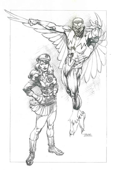
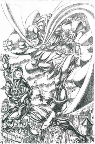
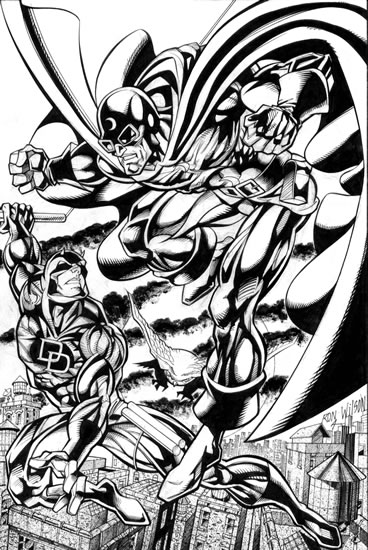


The funny thing about Spider-Woman is that Marvel, having played the trademark preservation game once, couldn't leave well enough alone. Succeeding years found the company spawning not one, not two, but three more characters named Spider-Woman. In this striking tableau by Michael Dooney, we see Jessica partnered with her immediate successor in the Spider-Woman role, Julia Carpenter, who holds the distinction of being the first unwed mother superheroine in mainstream comics. (It's a tough job, but someone had to do it.)
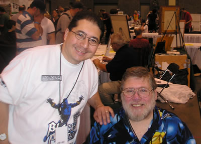


Although her first published appearance (Uncanny X-Men #130) is dated February 1980, the heroine known as Dazzler actually showed her lovely face during the waning months of 1979, thanks to the vagaries of comic book numerology. Truth to tell, the character had been on the drawing board for several years before that, making her a genuine heroine of the '70s.

Conceived via an odd partnership between Marvel Comics and pop music label Casablanca Records, Dazzler -- a.k.a. Alison Blaire -- was originally intended to be a tie-in with a real-life musical act. As the legend goes, Casablanca planned to market a disco performer (you remember disco, don't you?) who would appear in concert and on record as Dazzler, while at the same time the fictional character appeared on the four-color page in an ongoing Marvel Comics series. At one point, model/actress/singer Grace Jones was considered a likely candidate for the role. For this reason, the comic book Dazzler was depicted, in an early concept iteration, as African-American. When the deal between Jones and Casablanca fell through, the superheroine became a redhead (sometimes pictured as strawberry blonde).

By the time Dazzler actually saw publication, Casablanca was out of the picture, as was pretty much the whole disco phenomenon. The comic book heroine, however, enjoyed an early burst of popularity, due at least in part to her interesting array of superpowers -- Dazzler transforms sound waves into a powerful (dare I say dazzling?) light energy. The fact that Marvel decided to cast Dazzler as a mutant, just as the X-Men were becoming the company's most lucrative franchise, didn't hurt her prospects either.

Unfortunately, as was true of the disco music that inspired her, Dazzler's moment in the spotlight (no pun intended) was short-lived. By the end of the 1980s, she had been relegated to relative obscurity in the Marvel universe. It wasn't until the debut of the current New Excalibur series in 2005 that Ms. Blaire returned to some modicum of her former prominence.


An interesting note about artist Phil Noto, who contributed the Dazzler image seen above. Noto's career path forms something of a reverse curve from that of many artists in the comic book field. Whereas many artists, including Captain America and X-Men cocreator Jack Kirby, enter the animation field after toiling in published comic books, Phil Noto spent more than a decade as an animator for Disney before crossing over into print. Today, he is one of the most sought-after cover artists in the industry, as well as a popular guest at comic conventions.

Now go enjoy your Friday, before I'm tempted to deck myself out in a lime green leisure suit, put on my platform shoes with live goldfish in the heels, pick out my Afro, and spend the rest of the afternoon spinning Kool and the Gang platters. You definitely don't want to stick around for that.

Labels: ,

Friday, July 21, 2006

All in color for a dime — make that 39 cents

Today on Comic Art Friday, we celebrate the United States Postal Service, which on this historic date is releasing a new set of 20 first-class stamps featuring the heroes and heroines of DC Comics.


Half the stamps display closeups of 10 of DC's best-known characters; the other half reproduce actual comic book covers starring these same 10 superheroes. The images have been thoughtfully chosen, and represent a nice mix of classic and modern art styles.

What better way to ensure that your mail arrives safely, than to assign a superhero to ride shotgun on the envelope?

This is also the weekend for Comic-Con International, the world's biggest comic book convention, held annually in San Diego. One of these Julys, I'd love to attend CCI, despite the fact that crowded places give me the willies. (And I don't mean Mays and McCovey.) Everyone who's anyone — and everyone who wants to be someone — in the comics industry comes to San Diego for this event, which frequently affords the opportunity to see and hear creators who don't appear in many other venues.

But since we're not milling with the masses at CCI, what say we enjoy a little comic art magic right here at home?

I don't collect much color art. As much as I enjoy the vibrant realism of color in a published comic book, I prefer to view original art in its pristine black-and-white state, whether in graphite or in ink. In fact, my entire collection contains only three color artworks...and guess what we're going to look at today?

When it comes to classically styled images of supermen and women, few artists can outdraw the talented James E. Lyle. In this stunning Wonder Woman pinup, James's gorgeous ink lines are complemented by a lush painted treatment, rendered by color artist Buzz Setzer. The finished piece recalls the great masters of vintage pinup art.


One of the qualities I find most appealing in James Lyle's work is the naturalism of his figures. The people James draws look like real human beings, albeit idealized and heroic. Here's an example of how James approaches the same subject — Wonder Woman again — from a different point of view, and with another stylistic twist.


Now, check out another artist's colorful take on our Amazing Amazon. Here's a Comic Art Friday favorite by Dan Veesenmeyer.


As we did with Lyle, let's see how Veesenmeyer treats his subject in a simple pencil line drawing.


Wherever your activities take you this weekend, enjoy the boundless color and beauty of life. That's what we celebrate here every Comic Art Friday.

It's just that, most of the time, we celebrate in black and white.

Labels: ,

Friday, July 14, 2006

I'll be superamalgamated!

It's a bright, sunny Comic Art Friday, so let's kick things off by celebrating five current comics series that make entertaining summer reading:
  1. Green Arrow. I know a lot of fans aren't enamored of former Real World housemate Judd Winick's writing style, but I like his flair for characterization. Winick does a splendid job with Green Arrow, my all-time favorite DC Comics hero, and is developing a compelling story arc for the Emerald Archer's alter ego, Mayor Oliver Queen, in the current "One Year Later" themed books. Scott McDaniel's crude, blocky artwork doesn't exactly thrill me, but I'm finding it less irritating as the issues pass.

  2. 52. I was prepared to hate this weekly "event" series — with the gaggle of writers and artists contributing, I was certain that the product would be muddled and inconsistent — but it's become one of the highlights of my weekly comic shop run. It's the first book I read when I get home each Wednesday.

  3. Supergirl and the Legion of Super-Heroes. Artist Barry Kitson's whimsical style is growing on me. The recent addition of Supergirl to the mix gives the storyline a fresh spin, because you know I loves me some Supergirl. (And at least this book comes out on schedule each month — something that can't be said for the current Supergirl series. Grrr...)

  4. Hero Squared. Writers Keith Giffen and J.M. DeMatteis are at their witty, sardonic, madcap best in this clever series from Boom! Studios. It's the tale of a twentysomething slacker who discovers that his mirror image in a parallel universe is a mighty superhero, while his girlfriend's opposite number is the hero's archvillain. It's always a fun read. Warning to those not familiar with the Giffen/DeMatteis oeuvre: This book contains at least five times as much dialogue as you'll find in any other comic series currently in print. I love that aspect of it, but if you prefer pretty pictures to endless word balloons, Hero Squared is not the series for you.

  5. Beyond. A new Marvel Comics miniseries, written by one of my favorite comics scribes, Dwayne McDuffie, and illustrated by a talented artist, Scott Kolins. After reading just the first issue, I'm already anxious to see the direction McDuffie and Kolins will take this odd riff on Marvel's Secret Wars concept from back in the '80s.
Speaking of odd riffs on old concepts...

About a decade ago, Marvel and DC collaborated on a collection of one-shot books until the umbrella of Amalgam Comics. The idea of Amalgam was that in a parallel universe, all of the superheroes would be characters whose powers and costumes represented a combination — an amalgam, if you will — of established personalities from the DC and Marvel universes.

Some of the Amalgam creations were pretty cool, and made perfect sense from a creative perspective: Super-Soldier, who combined the attributes of Marvel's Captain America and DC's Superman; Dark Claw, a blend of DC's Batman and Marvel's Wolverine; and Doctor Strangefate, the avatar for Marvel and DC's respective mystical heroes, Doctor Strange and Doctor Fate. Others stretched the "amalgam" notion beyond the point of lunacy, like Iron Lantern (Green Lantern meets Iron Man) and Lobo the Duck (DC's ultraviolent space assassin Lobo melded with Marvel's seriocomic Howard the Duck).

The best of the Amalgam heroes, in my never-humble opinion, was Amazon. This character brought together the best qualities of two of the greatest heroines in comics history, Wonder Woman and Storm. Knowing that artist Michael Dooney is a fan of both of these superwomen, I knew that he'd be the perfect choice to revisit Amazon for my heroines gallery.


The word "superamalgamated" was, of course, a catchphrase made famous by Dr. William Harper Littlejohn, aka "Johnny," one of the "Famous Five" associates of the legendary pulp hero Doc Savage.

I've been a Doc Savage fanatic ever since I first discovered Doc and his team by way of the paperback reprint series published by Bantam Books back in the 1970s. I consider Doc one of the premier heroic archetypes in the history of published fiction, and present as evidence the fact that so many characters that have come along after Doc have been modeled to some degree after him. Superman creators Jerry Siegel and Joe Shuster, for example, borrowed many of Doc's traits — including his name (Doc's given name is Clark, as is Superman's), his nickname (Doc was known as the Man of Bronze, Supes as the Man of Steel), and his arctic Fortress of Solitude (Siegel didn't even bother to rename it) — when they devised their landmark superhero.

Comics publishers have attempted on numerous occasions to translate Doc Savage to the four-color medium, with middling success. For my money as a hardcore Doc aficionado, the best of the comics were the miniseries published in the early 1990s by Millennium. The writers and artists (among the latter, a pre-superstar Adam Hughes) who worked on the Millennium books took great pains to deliver a treatment worthy of, and reasonably faithful to, the spirit and style of the original pulp novels.

The first Millennium miniseries, Doc Savage, Man of Bronze: The Monarch of Armageddon, written by popular novelist Mark Ellis, was illustrated by an artist who's become a personal favorite of mine: Darryl Banks. This series was, if I'm not mistaken, Darryl's earliest published work in comics. Some time ago, Darryl graciously allowed me to purchase his stockpile of original pages from the first issue of DSMoB:TMoA, representing about two-thirds of the complete book.

This stunningly designed splash page is the book's opening image:


Next, a spectacular page showing Doc's Empire State Building headquarters, juxtaposed alongside the Man of Bronze and his Famous Five:


Finally, one of my favorite pages in the book is this sequence of images at the Hidalgo Trading Company, the mysterious warehouse where Doc stores his fabulous array of vehicles, including a submarine, an autogiro (a combination airplane and helicopter), a seaplane, and a dirigible:


If you're not superamalgamated by now, shame on you. Because that's your Comic Art Friday.

Labels: ,

Friday, July 07, 2006

Out of the inkwell, part two

Today's post comes your way courtesy of the Indian subcontinent, without whose fine ink products the comic art displayed herein would not have been possible. (Okay, so India ink doesn't really come from India. Just play along. It's Friday.)

Previously on Comic Art Friday, we took a before-and-after look at a pair of pencil drawings given fresh new vibrance by the deftly wielded pens and brushes of ace inker Bob "Jordan" Almond (so dubbed because beneath his colorful candy coating, he's one tough nut — plus he's, like, the Michael Jordan of embellishers). The heroines — specifically Mantis and her fellow Avenger, the Scarlet Witch, held court in last week's installment. This week, the heroes take center stage.

Presented first is this pencil sketch of my superhero idol, the Black Panther, created earlier this year at WonderCon by the charming and talented Ron Lim.


Bob Almond was the first and only inker I considered to finish this piece. Bob enjoys a special connection to the Panther, having been one-third of arguably the greatest creative team (along with writer Christopher J. Priest and pencil artist Sal Velluto) ever to chronicle T'Challa's adventures. (From a nostalgic perspective, I'm also partial to the trio who worked on an earlier Black Panther series back in the '70s — writer Don McGregor, penciler Billy Graham, and inker Bob McLeod. However, the Priest/Sal/Bob triumvirate took the mythos of the Panther to even nobler heights, and over a far longer period of time, during the late 1990s and early 2000s.) During Bob's run on Black Panther, he twice won the Squiddy Award as the best inker in comics, as voted by fans.

I left it to Bob to come up with an interesting background to enhance Ron Lim's unadorned Panther. Using a striking blend of ink wash techniques and artistic effects, Bob transformed a simple figure sketch into a completed artwork with amazing depth and realism.


Comic Art Friday regulars will recognize this next drawing as being from my semi-legendary Common Elements series, in which I commission artists to team two otherwise unrelated superheroes who share some — wait for it — common element. In this instance, '80s stalwart Ron Wilson — best known for his lengthy run as resident penciler on Marvel Two-In-One, starring the ever-lovin' blue-eyed Thing — was asked to match comics' two most famous blind heroes, Daredevil and Doctor Mid-Nite. It's fair to say that Ron slammed this assignment out of the park.


You can see by the intricate level of detail in Ron's creation, as well as the original artist's distinctive style, that Bob had his work cut out for him inking this piece. Adding to the challenge was the fact that Bob had never before inked an example of Ron's work, Mr. Wilson having pretty much vanished from the comics scene by the time Mr. Almond arrived therein.

But then, I don't believe Bob ever saw an inking challenge to which he could not rise. Witness the finished product...


Go ahead. Stand. Applaud. Cheer. Stomp. Hug your neighbor. It's okay. Really. I totally understand.

And that, you crazy kids, is your Comic Art Friday.

Labels: ,

Friday, June 30, 2006

Out of the inkwell, part one

Today's Comic Art Friday is dedicated to Blue Diamond Growers, the makers of those tasty Smokehouse Almonds. I wish I had a can right here, right now.

Speaking of almonds, the work of inking specialist Bob "Smokehouse" Almond (so dubbed by yours truly, because everything he does is smokin') will already be familiar to those of you who drop by regularly for Comic Art Fridays. In previous CAF installments, we've presented several scintillating before-and-after studies showing Bob's domination of the embellisher's craft, taking simple pencil drawings and transforming them into fully rendered masterpieces.

Lucky for all of us, Bob recently completed a fresh batch of inking commissions. We'll admire two of these today, and two next Friday. Bob's a busy guy, in constant demand both from publishers and collectors, so I'm excited that he was able to fit these projects into his schedule. I think you'll agree the results are well worth the wait.

Let's look first at this scrumptious pencil sketch by one of our perennial Comic Art Friday favorites, Michael Dooney of Teenage Mutant Ninja Turtles fame. Mike's subject is Mantis, an unusual character who figured prominently in Marvel's Avengers during the '70s.


A unique blend of the ubiquitous Asian martial artist heroes who arose in the wake of the Bruce Lee phenomenon (Mantis was Vietnamese by birth, if I recall correctly) and the telepathic/empathic heroines (Saturn Girl, Jean Grey, et al) who've always made popular comics fodder, Mantis went through this bizarre story arc where, at one point, she was revealed as the Celestial Madonna (not to be confused with the pop singer who came later), mother-to-be of "The One," deliverer of the universe. She also provided the third leg (ahem) of a love triangle between the Scarlet Witch and the Vision — a challenge Wanda eventually fended off handily.

My favorite factoid about Mantis, the one that endeared her to me more than any other, is the fact that she hung around with a race of intelligent plant people from outer space (hey, it's a comic book) called the Cotati — who just happen to share their name with the town next door to mine. I've never seen any plant people in Cotati — mostly just aging hippies and other bohemian types — but I keep looking. (For the record, I've never seen Mantis there either. Again, I keep looking.)

Now here's Dooney's Mantis, after the tender ministrations of Mr. Almond's pen and brush.


I'm advised by Mr. Dooney himself that Bob's approach to inking this piece very much resembles what his own might have looked like. For that reason, he's quite pleased with the results. Considering that pencilers often dread seeing how an inker will interpret their work, I think Mike pays Bob one of the highest professional compliments possible.

Speaking of the Scarlet Witch — and I was, wasn't I? — here's a pencil sketch of Wanda by Greg LaRocque, a prolific artist whose work was inescapable in comics from the mid-'80s through the '90s. Greg illustrated several Marvel titles ranging from Web of Spider-Man to Power Man/Iron Fist, though he's probably best known for his work on DC's The Flash.


As you can see, LaRocque's original pencil drawing was rather unrefined. So much so that I thought at one point about selling it, as it just didn't seem to fit with the quality of the other art in my Scarlet Witch collection. (No negative reflection on Greg's work intended, by the way. This was probably just a quick sketch he dashed off in a few minutes at a convention, and was never supposed to accurately represent his finished art.)

Bob Almond, however, asked to take a shot at rehabilitating the piece. I was hesitant at first, but given that Bob's fondness for Wanda equals my own, I knew he'd try his best to make something of her portrait. Here's the final result. Amazing, yes?


In contrast to the Dooney Mantis, where Bob's primary task is to faithfully mirror and enhance the quality of a clean, finished drawing, here the inker has to take a rough outline and bring forward the completed, fully dimensional image LaRocque probably envisioned as he sketched. The transformation is phenomenal — a perfect example of how a skilled inker can totally transform unfinished pencils. Now I have an artwork, the product of two great talents, that I'll be proud to display.

Next week on Comic Art Friday, the big boys take over. Stop by in seven and check out how Almond delivers the goods embellishing a trio of muscular heroes. And an owl. (You'll just have to come back and see.)

Until then, unless you're the Human Torch, keep your fireworks safe and sane.

Labels: ,

Friday, June 23, 2006

It's too darn hot

I don't know what the weather's like in your corner of the planet on this Comic Art Friday, but here in northern California's Wine Country — also known as God's garden spot, courtesy of local legend Luther Burbank — it's hot.

As Matthew Broderick put it in Biloxi Blues, it's like Africa hot.

We've broken into triple digits Fahrenheit each of the last two days, and might well do likewise today. That's just too darn hot.

If I could fly, I'd soar skyward to find an altitude where the air is cooler. That's what Supergirl does, according to this fun scenario by Dennis Crisostomo. (Dennis, a member of the ever-growing cadre of talented young artists from the Philippines, is best known here in the States for his work as an inker, especially over the pencils of Carlo Pagulayan on Marvel's Emma Frost series.)


But since I can't fly, I'll probably just kick back with my boots off and chill as best I can. That's how my girl Mary Marvel rolls after a long, scorching day battling the forces of evil, in this tranquil portrait by up-and-coming artist Charles Hall.


I'm especially fond of Charles's deft use of cross-hatching, a skill that has fallen out of favor in modern comic art. I think Bernie Wrightson, best known for his seminal work on DC's Swamp Thing, was the last of the great cross-hatch specialists in mainstream comics.

Another Charles Hall masterwork below — a reflective moment with Ms. Marvel, who's probably wondering why it's so all-fired hot already when it's only two days into summer.


That's your Comic Art Friday. Time for my date with an electric fan and a tall, frosty mug of sweet iced tea. Y'all be cool.

Labels: ,

Friday, June 16, 2006

X-Women

The other day, my daughter KM and I ventured to our local multiplex and took in the latest installment of the X-Men film series, X-Men: The Last Stand.

Surprise: I didn't hate it.

I had almost expected to find the movie vile beyond tolerance, given that it was directed by Brett Ratner, a filmmaker who had previously not made a single film I enjoyed, and who had in fact made a couple (Rush Hour, one of the worst action comedies of all time, and Red Dragon, a pointless and ugly remake of a pretty decent picture called Manhunter) that I positively loathed.

X-M:TLS, on the other hand, was entertaining, in its own helter-skelter way. It suffers from bombastic overload — Ratner has either never heard the phrase "Less Is More," or, having heard it, immediately forgot — and a veritable tsunami of characters all clamoring for screen time. Consequently, the film is far busier and noisier than it needs to be, which leads to a lack of opportunity for the audience to connect with the personnel. The end result is a movie with all the emotional depth of a potato chip. When you can kill off three major characters and not generate a damp eye or tugged heartstring anywhere in the house, you've gone horribly awry. And yet, the whole enterprise is so much fun — phone-directory cast and all — that I enjoyed myself anyway.

I can understand why some latter-day fans of the X-Men comics would be put off by what Ratner and his screenwriters, Simon Kinberg (Mr. & Mrs. Smith) and Zak Penn (Elektra), did to a couple of their beloved heroes. Speaking as a guy who read his first X-Men story three years before Brett Ratner was born, I had a blast. I'll look forward to the DVD.

But it's Friday, isn't it? Silly me.

Let's look at some comic art, shall we?


One of the characters more prominently featured in X-M:TLS is my favorite of the latter-day X-Men: Kitty Pryde, known variously over her career by the code names Ariel, Sprite, and Shadowcat, but more often simply by her own name. Artist Christopher Rich-McKelvey gives Kitty a sultry touch in the pencil artwork above.

Kitty appeared briefly in the first two X-films — in X-Men, she had a couple of brief onscreen appearances (played by actress Sumela Kay) but no dialogue; in X2, she was the person (now played by Katie Stuart) to whom Professor Xavier referred when he told the President of the United States, "I know a little girl who can walk through walls." In the latest installment, Kitty — this time portrayed by Ellen Page (Hard Candy) — Kitty not only gets to show off her powers, but plays a pivotal role in the plot.

I've always liked Kitty for the same reason I like Mary Marvel and Supergirl. So many superhero characters are hardened, violent young adult men that those who possess distinctly different qualities — such as femininity and innocence — become all the more compelling by contrast. Even though the (mostly) adult males writing her adventures haven't always known exactly how to portray her, Kitty has managed to maintain a fair amount of the girlish charm with which she was first introduced. I thought young Ms. Page did a nice job bringing Kitty to life, and if there's a fourth X-Men film, I hope we get the third Kitty back again.


Prominent again in the third X-film, as she was in the previous two, is Jean Grey, the telekinetic member of Xavier's happy band. Younger fans who only know Jean from the films and the more recent comics may be surprised to learn that she originally battled evil using the code name Marvel Girl, and that she started out as probably the weakest, least interesting X-Man. (Blame those adult male writers again.) Over the years, however, Jean grew and developed — both in personality and in power — until she became the most awe-inspiring member of the team.

In the picture above, artist Geof Isherwood clothes Jean in one of the costumes she wore back in the day when she still called herself Marvel Girl. Joining her is another "Marvel Girl," Mary Marvel.

No Comic Art Friday featuring X-Women would be complete without a shot of Storm, who plays a stronger, more central role in the third film. (This thanks to the producers wisely bending to the will of Academy Award-winner Halle Berry — what Halle wants, Halle gets, and what Halle wants is more face time). Here's a Comic Art Friday classic by the legendary Ernie Chan: Storm meets Thor wannabe Beta Ray Bill.


If you haven't yet seen X-Men: The Last Stand, by all means treat yourself to a ticket. If you don't expect Tennessee Williams, you'll have a terrific time.

Oh, and be sure you don't bolt from the theater until after the credits roll. There's a little surprise (a "credit cookie," as it's known in cinema lingo) at the tail end of the last reel that you won't want to miss.

And that's your Comic Art — and Comic Movie — Friday.

Labels: ,

Friday, June 09, 2006

This Witch doesn't melt

On our last Comic Art Friday, we cast an affectionate gaze toward the mother of all superheroines, Wonder Woman, who began a new chapter in her published life this week. Today, let's take a similarly fond approach to the character I consider Marvel Comics' "opposite number" to our favorite Amazon — Wanda Maximoff, better known to the world as the Scarlet Witch.


In general, Marvel outstripped rival DC comics in promoting the interests of female super-doers back in comics' Silver Age (basically the 1960s, although the era technically began in the mid-'50s). During a time when DC really had only Wonder Woman on the distaff side of costumed capery, Marvel created several historic heroines: Susan Storm Richards, the Invisible Girl/Woman of the Fantastic Four; Jean Grey, Marvel Girl (later Phoenix) of the X-Men; Janet Van Dyne Pym, who as the Wasp was a charter member of the Avengers, and the Scarlet Witch, who joined the Avengers as the Wasp's replacement.

Perceptive readers will note, however, that Marvel's early heroines were never solo stars, but team players with unimposing, second-rate superpowers — invisibility, telekinesis, shrinking to insect size, and the ability to manipulate the probability of events. It wasn't until the creation of Ms. Marvel in the late 1970s that Marvel had a female character with the Herculean power level (and headliner status) to match Wonder Woman.


Although Sue, Jean, and Janet preceded her to the comics page, I've always thought of Wanda as Marvel's first truly great heroine. She began her career as a villain, a member of the self-styled Brotherhood of Evil Mutants, so she came equipped with a bit of an edge. She was required to play the hapless damsel in distress less often than her female colleagues. She called herself a Witch — none of that wimpy "Girl" business in her nom de guerre. Her father was Magneto, one of Marvel's greatest villains. She wore that crazy face-framing M-shaped tiara. And she married an android out of true love. How cool is that?


Today, Wanda has pretty well established herself as one of the most powerful (if not necessarily the most mentally stable) characters in the Marvel Universe. I only wish the writers would treat her more kindly — she's taken an undue amount of abuse in recent years. Artists seem to love her, though. Witness the gorgeous presentations above from (starting at the top) pencilers Michael McDaniel, Kirk Lindo, and Jeffrey Moy.

That's your Comic Art Friday, kids. School's out for summer, so don't play ball in the house.

Labels: ,

Friday, June 02, 2006

Comics' noblest heroine

Today, Comic Art Friday gets all giddy about the debut of the new Wonder Woman monthly comic, scheduled to make its debut next Wednesday at a comic retailer near you. I was one of the handful of loyalists still reading the previous Wonder Woman series, which was canceled a few months ago.

I haven't been pleased with most of what DC Comics has done to everyone's favorite Amazon over the past couple of years. (Both Diana and one of the great Marvel heroines, the Scarlet Witch, have really been subjected to a pounding by their publishers recently. What's up with that?) But the early buzz on the new WW series, written by Allan Heinberg and illustrated by the husband-and-wife artistic team of Terry and Rachel Dodson (Terry does pencils, Rachel does inks), has me hoping for the best.


I was particularly pleased to read the excellent review Terry Dodson gave to the industry weekly Comic Shop News last month. He really seems to understand how Wonder Woman should be portrayed. Dodson's comments about his visual interpretation of the character made me stand up and applaud (an act that startled some of my fellow diners at the Chinese buffet where I was reading this interview over lunch):
Something we're trying to avoid is making her overtly sexy. We wanted her attractive, but not overtly sexy. Something that I've worked out costume-wise in that regard is making her briefs not as brief, taking them away from the high-rise bikini to more of a brief. I've also made the part of her upper costume which covers her chest larger, and I've made the symbol across her chest bigger to cover up more over her cleavage. All of those I did because she's a noble person, but she is walking around in a very small outfit, so it has to be balanced. It's just minor things, but I'd like to think that there's a little more sense of her nobility coming through because of them.
You go, Terry! It's high time we get Diana back to being the world's most powerful heroine and away from being a cheesecake calendar girl with superpowers.

In celebration of the new Wonder Woman series, I've culled from my gallery a selection of classically styled pieces showing the Amazing Amazon in action.

This stunning splash page was the very first Wonder Woman artwork I personally commissioned. The original pencil artwork, which I've displayed here previously, represents the superlative talent of Al Rio. Inker Geof Isherwood then took the piece and kicked it up about a half-dozen notches with his dazzling embellishment. The costume Diana wears here is the version she wore throughout the 1950s, with the eagle bustier, bicycle shorts, and calf-laced shoes.


This incredible battlefield scene was created by penciler Michael Jason Paz, who's actually better known in comic art circles as an inker (most recently on Maze Agency for IDW). The finishing inks were once again supplied by one of the true geniuses in the business, Geof Isherwood.


Finally, another dramatic battle scene, this one sketched and inked by artist Leonard Kirk. Leonard, best known for his work on such DC titles as Supergirl and JSA, has just begun work on a terrific-sounding series for Marvel called Agents of Atlas, featuring some historic characters from the 1950s.


If you were in dire straits, wouldn't you want Wonder Woman coming to your rescue? I know I would.

And that's your Comic Art Friday.

Labels: ,

Friday, May 26, 2006

It's a bird! It's a plane! It's Super-Con!

As mentioned on our previous Comic Art Friday, I whiled away last Saturday at Super-Con, a fine and fancy comic book convention held at the Oakland Convention Center. It was a terrific con — much more comfortable and leisurely than the always jam-packed WonderCon, held at San Francisco's Moscone Center in late winter. (In fact, Super-Con takes place in the venue WonderCon outgrew a few years ago.)

The one genuine bummer of the day was the fact that I forgot my camera. Otherwise, I'd have photos to share from the event. Alas, you'll have to make do with my rambling prose. And some comic art, of course, which we'll get to in a few paragraphs.

I arrived at the convention center shortly before the 10 a.m. starting time, early enough to be one of the first 250 attendees. This meant that my first bonus of the day was a limited-edition print by artist Chris Marrinan — a wicked cool black-and-white drawing featuring Wolverine, Batman, Wonder Woman, Spider-Man, and a couple of other superheroes. Alas, even such timely arrival proved insufficient to net me a spot on the sketch list of the enormously popular Adam Hughes, a list that had just closed moments before I reached the line. Adam and his boon companion Allison were, however, both gracious and apologetic. Next time, maybe I'll be luckier.

At WonderCon in February, I commissioned a Ms. Marvel drawing from the amazing artist known as Buzz. A couple of weeks ago, Buzz had advised me that he would deliver the completed art in person at Super-Con. The man held up his end of the bargain in sensational fashion, not only turning out a beautiful piece for me, but even supersizing it from 11" x 14" to 14" x 17" at no extra charge. Is that customer service, or what?


As we were exchanging e-mails about the Ms. Marvel commission, Buzz asked whether he could start another piece for me that he could finish at the con. That inquiry resulted in this dynamic pinup for my Black Panther collection. It was a kick stopping by Buzz's table periodically during the day to watch this drawing take form.


Not many comic artists ink with a brush these days, and Buzz's incredible technique gives his work a stylized, highly distinctive look. These two new pieces nicely complement the Vixen artwork Buzz did for me at WonderCon last year.

While Buzz finished my Panther, I sat in on two excellent panel discussions. Artist Thomas Yeates -- assisted on an impromptu basis by writer-artist Al Gordon -- gave a fascinating presentation called "From Script to Panel." Tom handed out a couple of pages of author Kurt Busiek's script from an issue of Dark Horse Comics' Conan series, on which Yeates had created basic layouts for the series' regular artist, Cary Nord, to finish. Then Tom walked us through the steps, drawing on an easel pad, of his process of translating Busiek's scene descriptions and dialogue into pictures. I learned a ton about sequential storytelling during that hour.

I also attended a panel about comic book cover art, conducted by artists Adam Hughes, Phil Noto, and Dan Brereton. For me, the most interesting facet of this lively discussion was the bit about iconic covers as opposed to what I think of as narrative or storytelling covers -- the kind I grew up on in the '60s and '70s, especially on Marvel Comics books. All three artists opined that their foremost job as cover artists is to make their book stand out from the dozens of choices on the comic shop wall. Their best way to do that is with a strong image, even when that image may not directly and specifically reflect an event that occurs inside the book. (All three, however, noted that their approach is to use that strong image to represent the interior content, but more by capturing the flavor of the story than by literally representing something that happens in it.)

The artists observed that back in the day, most comics were sold in spinner racks, so the reader only saw the cover after he or she had already made the decision -- based on the title -- to pull the book out of the rack. Narrative-focused covers made more sense then, because they were designed to appeal mostly to people who were interested in the book anyway. Today, every cover is usually fully visible on the wall of a comic shop, and more readers are captured by the image on the cover than by the title of the book. As Dan Brereton put it,
"Customers in the comic shop are faced with hundreds of covers, all screaming at them. As a cover artist, your job is to make your cover scream the loudest."
I had never really thought of the situation that way. I now better understand the philosophy behind iconic covers -- it's another reflection of how the industry has changed since my comics-reading heyday in the '60s, '70s, and early '80s.

One other artwork found its way into my collection during the day — this pinup of DC Comics' Mr. Terrific, drawn by one of my favorite artists, Ron Lim. Ron was excited to do this piece, because he hadn't drawn Mr. Terrific before. The piece turned out terrific. (Ron made that joke himself. I'm just repeating it.) Ron is a super-nice guy, and I enjoy talking with him almost as much as I enjoy his art. His style is very much a throwback to the classic artists of the '70s and '80s, so I dig what he does. Any opportunity to have Ron draw a new piece for me makes Uncle Swan a most happy fellow.


In between panels and waiting for my art to get finished, I chatted with a few of the artists I'd met before. Ernie Chan had for sale on his table a gorgeous piece that was a takeoff on the Storm/Beta Ray Bill Common Elements commission he did for me -- this one replaced Bill with Thor, and changed the perspective, but I recognized it immediately. I was tempted to buy it as a complement to my piece, but I'd spent enough cash already. I also rummaged through a few comic dealers' bargain bins looking for cheap back issues of Suicide Squad (I'm trying to complete my set of issues on which Geof Isherwood was the penciler) and Black Panther (from the run of issues written by Christopher Priest, and illustrated by the penciler/inker team of Sal Velluto and Bob Almond). Plus, I wandered around enjoying the often bizarre sights that always accompany a con.

Super-Con's the last convention in the Bay Area until WonderCon next March. I'll have ample time to plan my next assault on Artists' Alley, and to save up for it.

Sorry I couldn't take you all with me. But don't you sort of feel like you were there?

Labels: ,

Friday, May 19, 2006

Wizardress of Weather

Yes, true believers, it's another Comic Art Friday.

Today, I'm eagerly looking forward to spending tomorrow at Super-Con, the second of our Bay Area comic book conventions this year. WonderCon, the giant San Francisco convention in February (actually, it's in March next year), has grown by leaps and bounds over the past couple of years, but now Oakland's more intimate Super-Con (which used to be known as Golden State Con) is developing into a significant event in its own right. Adam Hughes, probably the industry's hottest cover artist, is the major headliner. I'm going to go hang out, pick up a new drawing or two, paw through some bargain bins, and basically just enjoy a day surrounded by my fellow comics geeks. If you behave, I'll bring back pictures to show you next Friday.

Speaking of next Friday, that's the day the third X-Men film, X-Men: The Last Stand, hits a cineplex near you. In anticipation of this milestone, I'm breaking out a couple of drawings of my favorite X-Man, Ororo Munroe, better known to the world as Storm. (Yes, I said X-Man, when I know full well that Storm is technically an X-Woman. Get over it.)

First, here's a stunningly detailed pencil piece by Tom Fleming, who's more familiar to comics readers as a painter of covers for such series as Elektra and Vampirella. He's also done a ton of illustration work for the World Wrestling Entertainment empire. Like Lucky Charms cereal, Fleming's take on Ororo can best be described as magically delicious.


Here in the 21st century, Storm is portrayed in films by an Academy Award-winning actress, and has recently been featured in two Marvel Comics miniseries — last year's Ororo: Before the Storm chronicled her childhood as a thief on the streets of Cairo, and the presently running Storm features the writing talents of best-selling novelist Eric Jerome Dickey. Ororo also figures prominently in the current Black Panther series, as she and the king of Wakanda are about to be married.

In light of all of the above, it's easy to forget that when she first appeared in the resurrected X-Men comic back in the mid-1970s, Storm was something of a novelty. There weren't any other prominent superheroines of color back then. (Come to think of it, there really aren't many now. There's Storm, and there's... well... Storm.)

The whole advent of the multinational, multicultural X-Men of today actually makes a rather humorous story. Marvel's executives wanted to expand the company's presence in foreign markets, and wanted a team of superheroes to whom readers in other countries could relate. Writer Len Wein and artist Dave Cockrum were handed the assignment of repopulating the then-dormant X-Men with some heroes with international flavor. Imagine the publisher's shock when Wein and Cockrum filled the roster with a heroine from Kenya (Storm), heroes from half-Communist Germany (Nightcrawler) and still-Soviet Russia (Colossus), and an American Indian (Thunderbird, killed off in the first issue). Not exactly what they had in mind.

Anyway, back to Storm. Here's a very different take on the wizard princess of weather by the Brazilian artist Di Amorim, most familiar in this country for his work on the Lady Death comic. This Storm means business!


The Amorim piece I recently acquired via a trade with a fellow collector up in Washington state. I'd admired this artwork in his online gallery for a while, and we were able to negotiate a mutually beneficial swap that enabled me to add it to my collection. Thanks again, James!

Lastly, just because I love it, a piece you oldtimers have seen before. From my Common Elements series, here's a majestic Storm in traditional African attire, partnered with Michael Moorcock's albino swordsman Elric of Melniboné — a dynamic scenario envisioned and executed by the prodigiously talented Geof Isherwood.


That's your Comic Art Friday. If you see me wandering the exhibit floor at Super-Con tomorrow, stroll up and say "Hey." I don't bite. Hard.

Labels: ,

Friday, May 12, 2006

The hat squad

Today's Comic Art Friday is brought to you by Real California Cheese. Why? Because everything is better with cheese. Even comics.

Just one artwork for you this week, but it's a honey. More accurately, it's a couple of honeys, posing for artist Anthony Carpenter's lushly penciled entry in my Common Elements series. That's Lady Luck — Will Eisner's two-fisted female counterpart to The Spirit — on the left, and Zatanna — backward-speaking sorceress supreme — on the right.


One of the earliest masked superheroines in comics, Lady Luck is long overdue for a revival. Created by Will Eisner as a backup feature for the Spirit Sunday newspaper supplement in 1940, Lady Luck (also known as poor little rich girl Brenda Banks) appeared weekly alongside Eisner's better-known hero for seven years. During most of that time, her adventures were illustrated by Finnish-born Klaus Nordling, a brilliantly skilled artist who was also one of Eisner's ghosts on The Spirit during World War II.

A second-generation superhero, Zatanna was the daughter of Zatara the Magician, one of the many knockoffs of Mandrake the Magician, who pioneered the whole magician-as-action-hero genre. Zatara's offspring first appeared on the scene in 1964 and has been a mainstay of the DC Comics pantheon ever since. She's often described as the bane of comic artists due to the painstaking crosshatching required to render her trademark fishnet stockings.

The common element here? Both heroines wear hats, of course.

Labels: ,

Friday, May 05, 2006

Free Comic Book Day is tomorrow!

Here's a Comic Art Friday public service announcement.


Tomorrow, May 6, is Free Comic Book Day. Comic book shops across the nation will be giving away free — yes, free — comics, just for the asking. Now, you can't just cruise in and pick up any book off the rack. The free comics are unique editions created especially for Free Comic Book Day by various comics publishers. Among the possible selections:
  • An X-Men and Runaways teamup saga from Marvel Comics.
  • Justice League Unlimited #1 from DC Comics.
  • A 65th Anniversary edition from Archie Comics.
  • A Donald Duck special from Disney Comics.
  • A Simpsons sampler from Bongo Comics.
  • A double-sided book featuring Star Wars and Conan stories from Dark Horse Comics.
  • Another flipbook, this one by IDW Publishing, includes stories from Transformers and Beast Wars.
  • A showcase book from Image Comics contains short scenes from such series as Spawn, Savage Dragon, and one of my current favorites, Invincible.
  • For manga lovers, Tokyopop will offer a 120-page, three-story sneak preview edition.
Several other publishers, large and small, are giving away special offerings also. You'll find something for every conceivable reader taste and age group.

Do yourself a favor and drop by your friendly neighborhood comics retailer tomorrow, and pick up a free comic. Take a kid with you, and introduce him or her to this amazing storytelling medium. Maybe you can even browse the racks and buy something while you're there. You'll be glad you did. Remember, as your Uncle Swan always says, "If it's free, it's for me."

Sad to say, original comic art rarely — all right, never — comes my way for free. Pretty much every artwork you see featured here at SSTOL cost me a fistful of hard-earned simoleons, which means you should (a) feel sorry for me and send me money to support my addiction, and (b) be relieved that I don't collect the really expensive stuff.

Fortunately for me — and, indirectly, for you — I keep happening upon supremely talented artists whose work I can acquire without auctioning off body parts. One such artist is pinup specialist Michael Dooney, whose work is beautifully represented in the three sterling examples seen below.

First, Dooney takes on the mutant weather goddess Storm (the character portrayed by Halle Berry in the X-Men films, for those of you more conversant with cinema than comics).


Next, Dooney's dignified portrait of the Valkyrie, that stalwart of everyone's favorite non-team, the Defenders. Note the fine detail on her scabbard, and on the paving stones beneath her feet.


Saving the most spectacular for last, here is Dooney's stellar envisioning of one of the great heroines in all of comics, Wanda Maximoff, the Scarlet Witch. The artist truly outdid himself on this one.


Now, don't these gorgeous images make you want to run out tomorrow and glom onto some free comics? Then go, my little poppets, and enjoy. You can tell the staff at your local comics retailer that your Uncle Swan sent you. (That won't mean anything to them, but maybe they'll think you're feeble-minded, take pity on you, and give you an extra free comic. It couldn't hurt.)

Labels: ,

Friday, April 28, 2006

Journey to the dark side

I began last week's Comic Art Friday by listing five things that made me happy about comics. This week, let's consider five things about comics that really make me grumpy...
  1. Iconic covers. Back in the day, the purpose of a comic book cover was to give the potential buyer some idea of what was going on inside. You could pick up a comic, look at the cover, and get a pretty fair sense of what the story would be about. Today, many covers present a generic pinup of the main hero or heroes that conveys nothing about the story. A few months ago, Marvel Comics published an issue of New Avengers with an eye-catching, splashy image of several characters posing together... and not one of those characters actually appeared in the story. What's up with that?
  2. Variant covers. Comics companies these days are fond of publishing the same issue with several different covers. The idea is that a real collector will pick up one of each variation, even though the story inside is identical in each. But for someone like me, who just wants to read the book, variant covers only create confusion: I don't recognize that cover. Have I already read this? (The current Red Sonja series by Dynamite Entertainment — an excellent read, by the way — does this to me every month.) The day I accidentally buy two copies of a book because of a variant cover, some editor will be receiving a scathing e-mail from yours truly.
  3. Senseless graphic violence. I'm not opposed to violent behavior in superhero comics — after all, these are stories about powerful beings walloping the tar out of each other. But unnecessary gore irks me. DC's Infinite Crisis, which I am otherwise enjoying a great deal, is a chronic offender. So far, we've been treated to seeing a female character named Pantha getting whacked in the head so hard that her skull exploded, and a villain known as the Psycho-Pirate having his mask and eyeballs punched through the back of his head via the eye sockets. I could have lived very comfortably without either of those images, thank you very much.
  4. Books that can't maintain a schedule. The time was that you knew exactly when the next issue of a particular series would appear on your local store's rack. Today, so many books run behind schedule — usually due to an artist who can't meet deadlines — that a series that's supposed to be monthly might go for seven or eight weeks without a new issue. Get it together, people. Time's a'wastin'.
  5. Great artists on the sidelines. Every week, when I open a new comic filled with embarrassingly lackluster artwork, I'm angered that so many fantastic artists aren't working on regular series right now. That such talents as Geof Isherwood, Darryl Banks, Al Rio, Keith Pollard, Arvell Jones, and Ron Wilson (just to pick half a dozen names) aren't penciling a new comic every month, or that Bob McLeod and Bob Almond aren't inking a new book every month, makes your Uncle Swan cry.
Since we're clearly in a bit of a dark mood today, let's look at a couple of artworks that make tremendous use of shadows. Here's a striking portrait of Supergirl, drawn and inked by the Brazilian artist Renato Italo.


In my opinion, Italo is still feeling his way as an artist — his design sense is sometimes a little awkward, as you can see even in this outstanding effort — but I love the power and heft of his inks. This piece is unusual, in that we rarely see Supergirl portrayed in this way — she's one of the sunnier characters in the DC Comics pantheon, even despite her tragic death in Crisis on Infinite Earths 20 years ago. (She's back now, and doing well, thanks.) It's refreshing to see a moodier, more reflective take on her.

Now, let's view the work of a master. Dan Adkins is probably one of the 15 or 20 best inkers who ever worked in comics, and this dramatic pinup of Dynamo, one of the heroes from the classic 1960s series T.H.U.N.D.E.R. Agents (on which Adkins was both an artist and writer) proves that he still has the touch.


By the way, T.H.U.N.D.E.R. Agents is a property in desperate need of resurrection. Created by the legendary Wally Wood, along with Adkins and others, for Tower Comics in the mid-'60s, T.H.U.N.D.E.R. Agents remains a fond memory for those of us who were reading comics way back when. Although T.H.U.N.D.E.R. Agents and its related series lasted only about a year and a half, they set the standard for exciting art and fun superhero stories that didn't take themselves too seriously. I'd love to see Dynamo and his cohorts cavorting through the pages of a monthly comic again.

And that's your Comic Art Friday.

Labels: ,

Friday, April 21, 2006

A Flash of Crystal

Today's Comic Art Friday is brought to you by five things about comics that made me happy this week.
  1. Seeing Ralph Dibny, the Elongated Man, on page one of Justice #5. Ralph reminds me of the days when superheroes didn't have to be cranky and vicious. May his tribe increase.
  2. Mike Deodato Jr.'s spectacular art in New Avengers #18. Back when Deodato was just another guy imitating Jim Lee, I wasn't a big fan of his work. Now that he has evolved into his own clear, dramatic style, I'll read almost anything he draws. And I really like Joe Pimentel's inking over Deodato's pencils.
  3. Kurt Busiek's gorgeously lyrical scripting, on display yet again in Conan #27. I am really going to miss Busiek when he leaves the book in a couple of months, to be replaced by Timothy Truman (who drew this most recent issue). Every time I read a Busiek Conan adaptation, it's like rediscovering Robert E. Howard, to whose work I was addicted in the early '70s.
  4. Having Ms. Marvel back in her own title. I just wish the rest of the book lived up to the promise of the amazing Frank Cho covers. And I wish Carol would switch back to her original red and blue fighting togs — I've never warmed to the dark blue bodysuit with the lightning bolt down the front.
  5. My local comic book shop. Every time I walk into the Comic Book Box, owner Kathy and her faithful lieutenants Ted and R.J. make me feel right at home. The racks are always perfectly (if somewhat idiosyncratically) organized, and on those occasions when I struggle to locate something, Kathy and crew are ready to assist. They also make sure that, if a title I read sells out before I arrive, it's restocked quickly. Kathy, Ted, and R.J. genuinely enjoy chatting about comics with the people who shop in the store — I learn a lot about the latest doings in various storylines just by eavesdropping. Every comic book reader should have as pleasant a place in which to spend his or her cash.
But you came here to see some art, didn't you? All righty then. Let's crack into the archives and find a couple of classic commissions from my "Common Elements" gallery. Here's a snazzy juxtaposition by industry veteran Christopher Ivy.


That's the Flash on the left, and behind him (because everyone's always behind the Flash), the Crimson Avenger. They're paired here because of the color red, which the Flash mostly wears, and which the Crimson Avenger is named for, even though his costume contained very little actual crimson for most of his lengthy career. (I suspect that the Crimson Avenger served as the inspiration for the character Blue Raja in Mystery Men — a hero who, despite his name, doesn't wear much blue.)

The Flash was one of my favorite DC Comics characters when I was younger. I enjoyed his adventures even though he duked it out with some of the silliest supervillains in comics history — losers like Captain Cold, Mirror Master, Weather Wizard, and Gorilla Grodd. (You had to be alliterative to fight the Flash back in the day.) Most of these bad guys became so thoroughly identified as Flash villains that they came to be known as his "rogues' gallery," and he battled them over and over again.

I was delighted when, in the fall of 1990, the Flash starred in his own live-action, prime-time TV series. The TV Flash wore the name of Barry Allen, the Flash of my youth, but had powers more consistent with those of Wally West, who's been the Flash since Barry died in 1985. At the time, the show was the most expensive hour of television produced weekly, due mostly to the special effects (pretty decent for their time) used to show the Flash in action. Most of the scripts were reasonably well-written (longtime comics creator Howard Chaykin was the show's lead scripter) and remained true to the tone of the comics. The whole series was recently released on DVD — if you were thinking about buying me a present anytime soon, that Flash box set would be a worthy choice.


Another Common Elements duo: Kole, who spent a brief time as a member of the Teen Titans in the early '80s, and Crystal, who at various times has been a member of three Marvel Comics superteams — the Inhumans, the Fantastic Four, and the Avengers, with whom she was soldiering when she wore the costume depicted here by artist Michael McDaniel.

Like the aforementioned Barry Allen Flash, Kole was among the characters DC Comics killed off during 1985's Crisis On Infinite Earths. Unlike many of the Crisis victims, Kole has pretty much stayed dead — a duplicate Kole popped up briefly in a Titans story a few years ago, but that's been it. Too bad — she's a beautifully designed character who had a good deal of potential. But nothing's forever in comics.

Crystal, on the other hand, never disappears for long, even though she's never been a real mainstay in the Marvel lineup. She's one of those heroes best suited to plying her trade as a second-stringer rather than as a headliner. Her stint with the Avengers marked the first time in her career that she occasionally got to step out into the spotlight (she was even featured on a few covers during her Avengers tenure) and attract some attention. She's currently married to Pietro Maximoff, better known as Quicksilver — Marvel's answer to the Flash.

See? I can find a common element anywhere.

Have a safe weekend, speed demons.

Labels: ,

Friday, April 14, 2006

You're a wonder, Wonder Woman

Today's Comic Art Friday is dedicated to my good friend Donna, who's celebrating her (muffled) birthday today in the Land of Large Lobster. You go, girl!

Since Donna has always reminded me of the mighty Princess Diana, better known as Wonder Woman (not only do they have similar first names, but they share a certain physical resemblance too — both are tall, sturdily constructed brunettes), I thought a few selections from my WW pinup gallery would serve as an appropriate tribute.

First up, a sleek convention sketch by the whimsically named Casey Jones. (Yes, I'm sure he's endured enough "ridin' in the cabin" jokes to last a lifetime.) Casey's clean, light, animation-influenced penciling style brings a fresh look to our favorite Amazon.


Next up, this striking ink portrait by Wellington Diaz. I love the detail in this one, especially the Greek columns in the background. Diaz captures Diana's essential strength in his bold lines.


I don't collect much color art, but when I saw Dan Veesenmeyer's classic pinup with Diana in her early Silver Age costume, I just had to add it to my collection.


As anyone who knows me well could tell you, I'm terrible at remembering numbers, and dates are no exception to that rule. The only reason I can remember Donna's birthday each year is because it falls on the day the RMS Titanic hit that ill-placed iceberg in the North Atlantic. Unlike that famous ship, however, Donna has time and again proven herself unsinkable. If you cross paths with her today, bid her a fond birthday greeting.

Labels: ,

Friday, April 07, 2006

The Eisners and the Comics Hall of Fame

Let's kick off today's Comic Art Friday post by congratulating all the nominees for the 2006 Will Eisner Comic Industry Awards. The Eisners are comics' equivalent of the Oscars, recognizing excellence in the field of sequential art. As usual, I haven't read most of the nominated works — only so many hours in the week, plus, not a lot of superhero books make the list — but I have no doubt that all of the nominees are deserving of plaudits.

I always look closely at the Eisners' Comics Hall of Fame nominations, because most of the names are people whose work I know and admire. This year's candidate pool (voters can choose as many as four) contains an august group of worthies. I could make a plausible case for almost every nominee. But if I had a ballot, I'd be throwing my support behind:
  • Matt Baker. His career was relatively brief, and his body of output small in comparison to some others. But in the 1950s, Baker's name was synonymous with what came to be known as "good girl" art. He drew some of the most beautiful female forms and faces that ever graced a comic book page. Every pinup artist working today owes a debt of gratitude to him. Baker was also the first prominent African American artist to work in mainstream comics, though most of those who admired his work during his heyday had no idea that he was black.

  • Ramona Fradon. One of the relative handful of female artists who have lent their talents to the superhero genre, Fradon was, like Matt Baker, a pioneer. Her smooth, no-frills style helped define the character of Aquaman for a generation. She also cocreated Metamorpho, the Element Man, and for a decade worked on the Brenda Starr newspaper strip. Hearing Fradon interviewed by fellow artist Scott Shaw! was, for me, one of the highlights of this year's WonderCon.

  • Mort Meskin. A phenomenally talented illustrator mostly active during the 1940s and '50s, Meskin could draw anything from superheroes to war stories to jungle adventures to romances. As a result, he never became identified with a single character or series specifically. Meskin's eye for light and shadow was truly amazing. He was also one of the best panel designers of his time.

  • Robert Kanigher. One of DC Comics' most prolific writer-editors, he helped shape pretty much every character in the DC Universe into the forms we recognize today, and created or cocreated dozens of familiar heroes and heroines. He wrote the story that introduced the new Flash (Showcase #4, September 1956), ushering in the Silver Age of Comics. Not limited to the superhero genre, Kanigher was also well known for his work in war comics.
Seeing as this is Comic Art Friday, let's admire a couple of works by artists whose names might well appear on the list of Eisner Hall of Fame nominees someday.


Dan Adkins was one of comics' premier inkers beginning in the 1960s and continuing through the '80s. He started his career as an assistant to the legendary Wally Wood, then developed into a stalwart on his own. Adkins's hallmark is a clean, fluid line.

The original pinup above, featuring a nameless young woman packing a pistol, demonstrates Adkins's flawless draftsmanship as well as his expert inking.


George Tuska, whose career in comics began in the late 1930s, was one of the first artists I learned to recognize by sight when I started reading comics. His distinctive and dynamic style has a look all its own.

Tuska is best remembered as the main artist on Iron Man in the early 1970s, though he worked on numerous other series also. Here he pits old Shellhead against his former fellow Avenger, the rampaging Hulk.

I may never be elected to the Bloggers' Hall of Fame, but give me this, friend reader: I make Comic Art Friday happen for you, week after week. That's worth something, isn't it?

Labels: ,

Friday, March 31, 2006

Blinded by the light

Today's Comic Art Friday is dedicated to Sharon Stone, whose sequel Basic Instinct 2 opens in wide release today. Whether Ms. Stone does likewise, you'll have to pony up nine bucks to discover. Or wait for the DVD.

I haven't featured the work of Geof Isherwood, my 2005 Comic Art Friday Artist of the Year, lately, so it's high time. Geof has created several amazing additions for my Common Elements gallery (for any newbies present, Common Elements is a series of commissioned works pairing otherwise unrelated superheroes who share some feature in common). This amazing piece matches the Golden Age hero known as the Ray with Marvel's disco queen, Dazzler.


What I love about this drawing is the way it demonstrates Isherwood's mastery of anatomy. Too many artists in the comics field today learned their craft — such as it is — by aping the work of other artists. As a result, their figures look like bizarre caricatures of the human form rather than realistic representations of it. In Isherwood's work, we see the eye of an artist who has drawn from live models, studied the anatomy of the human body, and knows how the parts fit together. Look at the musculature of Isherwood's Ray — if you pulled out a copy of Gray's Anatomy (the reference book, not the television drama), you'd see that every sinew, every tendon, is biomechanically accurate. Geof's Dazzler has realistic proportions, a chest that falls naturally, hips with authentic curvature, and arms and legs formed like those of a real woman in top physical condition. You could count on the fingers of one hand the active comic artists who command that level of detail, and have the skills to put it on paper.

This particular Common Elements piece I conceived specifically with Isherwood in mind. One of my favorite comic artists of all time is Lou Fine, who worked out of Will Eisner's studio in the late 1930s and early 1940s (Fine was one of the artists who filled in on The Spirit Sunday supplements while Eisner was in the Army during World War II). Much of Fine's comic book work was created for Quality Comics, and the Ray was one of the handful of superheroes (the Black Condor and Doll Man were others) with whom he was most closely identified. I see a great deal of Lou Fine's expert draftsmanship and attention to accuracy in Geof Isherwood's art, so I thought it would be a capital idea to have him draw one of Fine's best-remembered characters.

And that's your Comic Art Friday.

Labels: ,

Friday, March 24, 2006

World's Mightiest Girl

I'm dedicating today's Comic Art Friday to my daughter KM, who turns 17 tomorrow. A more kind, caring, sweet-spirited and wonderful young woman you will not find, search though you may. Happy birthday, Punkin.

If KM were going to be a superheroine, she'd probably be Supergirl. Or maybe Buffy the Vampire Slayer. But if I were casting her as a superheroine, I'd assign her the role of Mary Marvel. Mary had the knack of becoming superhuman without losing any of her native sweetness or youthful innocence. A rare feat, in comic books as in real life. It's a challenge I'd hope my daughter could master.


Mary's spunk and charm are captured beautifully in this marvelous drawing by one of my favorite pinup artists, Michael Dooney. Dooney's style deftly unites the long-past heyday of glamour illustration with a modern sensibility. His female characters always look fresh and joyful, and nothing at all like the Teenage Mutant Ninja Turtles Dooney is probably best known for drawing. I never tire of asking him to draw my favorite heroines. He did a masterful job with Mary.

Another brilliant portrayal of the World's Mightiest Girl is turned in here by the brilliant Brazilian artist Al Rio. Like Michael Dooney, Al Rio is renowned for his skill at drawing beautiful women. Rio's style, though, is slickly modern, influenced by great pinup artists including Vargas, and comic book stylists such as J. Scott Campbell and Art Adams.


What else can I say except... "SHAZAM!"

Labels: ,

Friday, March 17, 2006

The Irishman Without Fear

It's St. Patrick's Day here at SSTOL. None of my biological heritage is Irish so far as I'm aware, but on March 17, everyone has at least a touch of the Emerald Isle in 'em. Besides, you should hear me recite the entire script from an early '80s commercial for Killian's Irish Red in a pitch-perfect brogue. You'd swear I was a son of the old sod.

Plus, I've seen The Commitments about a dozen times. Say it loud: I'm Irish, and I'm proud.

Being that it's St. Paddy's, what more fitting way to celebrate than with a piece of comic art featuring an Irish-American superhero? Enter Daredevil, aka Matthew Murdock, the Man Without Fear, here depicted in action by the unmistakable pencil of artist Trevor Von Eeden.


Daredevil holds a special place in my heart, because he's one of only two superheroes I ever dressed up as for Halloween. My mother, a skilled seamstress in her day, hand-sewed my DD costume entirely from scratch (no pun intended), horned cowl and all. Originally she intended to attach a tail to the seat, not understanding that I wanted the costume to represent a comic book hero, and not the popular image of Satan himself. Mom never quite understood my fascination with comic books, and would have preferred that I not read them, thinking they would somehow corrupt my brain, infest my soul, and keep the Allies from winning the war. Or something.

(Another Halloween, I got to be Spider-Man. That costume, sadly, was one of those shiny store-bought jobs with the plastic face mask. But I digress.)

Daredevil was a favorite of mine because I saw him as something of an underdog. He was blind, for one thing. (Though not the first blind superhero in comics. Doctor Mid-Nite, a member of the Justice Society of America in the 1940s, had DD beat by a couple of decades.) Second, DD was portrayed in Marvel Comics as something of a low-rent Spider-Man, only without any of Spidey's powers other than his navigational "radar sense." (In case you were wondering how a blind superhero got around.) He swung from buildings like Spider-Man, only with a spring-loaded billy club containing a grappling hook. His costume looked suspiciously similar to Spider-Man's. (The most familiar version of DD's fighting suit was designed by the great Wally Wood.) And his rogues' gallery contained a lot of characters that seemed like also-rans in the Spidey villain sweepstakes.

For a while in the '70s, Daredevil endeared himself to me further by picking up a hot girlfriend who was also a superhero — Natasha Romanoff, the Black Widow, seen below in a pinup by Garry McKee — and moving to my favorite city, San Francisco. Alas, neither the relationship (which resulted in the retitling of DD's book temporarily, to Daredevil and the Black Widow) nor the move West turned out to be permanent.


In the late '70s and into the early '80s, artist and writer Frank Miller took DD in a dark new direction, presaging in many ways the path down with Miller would later take Batman. The grim, gritty DD never really appealed to me — the real world is grim and gritty enough, without my fantasy life having to follow that trend too — but it's the Miller styling of Daredevil that has endured in the comics and in popular culture via the film version starring Ben Affleck.

Along the way, Daredevil picked up a new girlfriend-slash-adversary, the assassin Elektra. She turned out to be one of the early avatars of the "bad girl" genre of comics, focusing on beautiful women with a darker edge. As a character, Elektra was beautifully designed by Miller and intriguingly conflicted. She continues to be popular today, despite the lackluster portrayal given her by Jennifer Garner in both the Daredevil film and its sequel Elektra. Here, the woman wielding the twin sais is given a minimalist treatment by the fantastically talented Brian Stelfreeze of Atlanta's Gaijin Studios.


Daredevil's perseverence despite long odds — his book hovered on the brink of cancellation for many years at Marvel — proves that Matt Murdock possesses the luck of the Irish. And on St. Patrick's Day, isn't that what we all hope for?

Labels: ,

Friday, March 10, 2006

Thinking inking

Today's Comic Art Friday is brought to you by Almond Joy. You can have half, and still have a whole. What a concept.

Speaking of Almond Joy, I was chatting with noted comic book inker Bob Almond just the other day. Bob, as my fellow comic art collector Damon is fond of saying, is the man who puts the "king" in "inking." Truly one of the underappreciated talents of the industry, Bob is a splendidly skilled inker whose chameleonic style enables him to mesh seamlessly with almost any pencil artist. In fact, I have yet to see the penciler whose style Bob can't enhance, without altering the original's intent.

Take, for example, this commissioned piece from my Common Elements series, penciled by a superb artist from Brazil named Ron Adrian. Ron brings together one of my favorite heroines, the Scarlet Witch, and spacefaring man of mystery Adam Warlock in a spectacular scenario.


Pretty awesome drawing, yes? Hard to imagine what could possibly be done to make this look any better. (Some of you may be thinking, "You could color it." No. Original comic art is not colored. Comic books are colored. There's a difference.) I might have reached that same conclusion. But then I sent Adrian's pencil art off to the aforementioned Mr. Almond, who returned this fantastic finished artwork.


That thump you just felt was your jaw hitting your chest. Go ahead, pick it up before you drool all over yourself.

As Bob mentioned on his Web site, his first professional inking assignment in comics was a series featuring Adam Warlock, entitled Warlock and the Infinity Watch. Bob's affinity for character detail is evident here, as he catches an item or two -- such as the "soul gem" embedded in Warlock's forehead -- missing in the original pencil art. Bob and I share a fondness for Wanda Maximoff, the Scarlet Witch, and he renders her with tender loving care here.

Readers unfamiliar with the comic art creation process may be surprised to learn that some artists actually specialize in embellishing in ink drawings that other artists begin in pencil. (To Comic Art Friday regulars, this is old hat. However, we've expanded our audience exponentially these past few months, so quite a few new folks have joined us. Hello, new folks!) Bob Almond is one of many such talented creators, and, in my humble opinion, one of the best.

Another inking specialist who's a favorite of mine is Josef Rubinstein. Joe has been in the business for more than three decades, starting when he was a teenager laboring under the legendary Neal Adams. Like Bob Almond, Joe's skill enables him to adapt to almost any pencil artist's technique — a good thing, because over the course of his career, Joe has inked over practically every prominent penciler who's been active during that 30-year period.

One such penciler is Mike Grell, who contributed this pencil pinup of Tamara D'Orsini, the female lead from his space opera sci-fi series Starslayer.


Now here's that same Grell pinup, completed in ink by Joe Rubinstein:


There goes that jaw again. You really ought to get that checked out.

If you look closely, you'll notice that even in this relatively clean and simple drawing, Joe brings out numerous tiny details that are either absent from or minimal in the pencil original — fine points of muscular structure and skin texture. It's that well-honed sensibility that makes the great inkers truly masters of their art. I'd classify Messrs. Rubinstein and Almond in that lofty category. I bow in their general direction.

And that's your Comic Art Friday.

Labels: ,

Friday, March 03, 2006

Blackbirds singing in the dead of night

Today's Comic Art Friday is dedicated to the San Francisco Giants' record-busting outfielder Barry Bonds. I don't know what could possibly be more comic — or more artful, in its own La Cage Aux Folles sort of way — than the home run king tricked out as Paula Abdul for a spring training American Idol spoof.


Speaking of American idols, the latest addition to my Common Elements series of art commissions is this striking pinup by the talented Rags Morales, best known for his work on the Identity Crisis and Wonder Woman series, and currently the penciler on Detective Comics, featuring Batman. Here Rags — whose real first name, I'm told, is Ralph; a name that fairly cries out for an alternative handle — pairs Captain America's longtime fighting partner, the Falcon, with the adventuring aviatrix known as Lady Blackhawk.


I can remember vividly in 1971 when the Falcon began sharing billing with Captain America in the Star-Spangled Avenger's comic book. At the time, a superhero of color having his nom de guerre actually incorporated into the logo of a comic was a rare and auspicious event. That the Falcon was being so honored right alongside one of the legendary icons of the Marvel Comics universe made the recognition all the more remarkable. Yes, he was ostensibly Cap's sidekick, but in 1971, we were taking whatever incremental advances we could lay our mitts on.

What I also remember about the Falcon was how unusual it was in that day and age for a black superhero not to actually have to incorporate the word "black" into his fighting name. Back in the day all the black superheroes were Black Something-Or-Other, like the Black Panther, and Black Lightning, and Black Goliath — as though if these character were not so denominated no one would figure out that they were black. I always rather suspected that the main reason the Falcon wasn't the Black Falcon was because Quality Comics, back in the 1940s, already had a character called the Black Condor, and he wasn't even black. Nor was the Black Canary of DC Comics, who was in fact blonde. But whatever the reason Marvel Comics had for making the leap, it meant a lot to many of us as young comics readers to simply have the Falcon be the Falcon, and not have to qualify himself in terms of his skin color.

The real problem with the Falcon at first was the way that comic book creators in that less-enlightened day and age, most of whom were of the Caucasian persuasion, found it convenient to characterize an individual as black. For one thing, every black character in comics in the '70s had to be somewhat outraged about racial matters. The Falcon was no exception to the "angry black guy" rule. White writers also insisted on making every black character speak with a rather bizarre version of street argot that didn't accurately represent the speech of anybody living on the planet, much less urban African-Americans. Again, the Falcon was no exception what I like to call the "Sweet Christmas!" rule, at least at first. The final indignity was the apparent nervousness in the comic book industry of portraying black characters who had genuine superpowers. As originally designed, the Falcon couldn't even fly, much less have any other kind of paranormal abilities. He was just a medallion-wearing black guy who could handle himself in a fistfight. It took a couple of years before Falc actually got a costume with wings that worked, so that he could live up to his name.

One step at a time, though. Little by slowly, the Falcon developed into a rather interesting character. Certain writers imposed some needless and silly backstory on him in later years, but most of this folderol has been ignored by the better scribes, such as Christopher Priest, who have handled the Falcon's adventures since. While the Falcon remains even now in the shadow of the great Captain America, he has matured into an integral part of the Marvel universe. (Albeit without his own comic title, but that's a gripe for another day.) There's something to be said for progress.

The Blackhawks, of which Lady Blackhawk was the lone female member (not to mention a latecomer to the party, having been added to the group nearly two decades after their introduction), were another set of comics heroes whose name included the word "black" even though the none of the members actually were. Originally, the Blackhawks were an international group of World War II fighter pilots, led by a Polish citizen using the code name Blackhawk. Over the course of time, many efforts were made to transform the Blackhawks into superheroes, but those efforts were rarely successful. Today, Lady Blackhawk is pretty much the only member of the Blackhawks one ever sees, though she now usually appears in association with the all-female fighting team Birds of Prey. One look at her costume design will tell you why the lovely lady aviator remains popular.

And that, my little blackbirds, is your Comic Art Friday.

Labels: ,

Friday, February 24, 2006

The name is Barda. Big Barda.

After last Friday's boffo photo essay about WonderCon 2006, my creative well is running a trifle dry this Comic Art Friday. So I have just one new image to present today.

Speaking of the Winter Olympics — and we were — if I needed a female athlete on my Olympic squad, summer or winter, an excellent choice would be Barda Free, aka Big Barda, the powerfully physical bride of the original Mister Miracle, Scott Free.


Because when you're taking on the Russians and the Germans, a hypersteroidal woman wearing scale-mail armor and packing a Mega-rod is a good person to have on your team.

Comics über-creator Jack Kirby wasn't known for his outstanding depictions of female characters, but when he introduced Big Barda as a key player in his Fourth World saga in the early 1970s, the King made up for such watered-down superwomen as the Wasp and the Invisible Girl. Barda kicked butt, took names, and gave no quarter. She was one of the first superheroines who could not only go mano a mano with galaxy-class tough guys, but relished the opportunity.

Modern-day stylish Michael McDaniel does the Female Fury proud in the above portrait.

And that — short and sweet, like an Olympic figure skater — is your Comic Art Friday. Now go watch some curling or something.

Labels: ,

Friday, February 17, 2006

What it was, was WonderCon


Previously on Comic Art Friday, I made note of the fact that I was spending last Friday at WonderCon, the comic book convention held annually in San Francisco. Here's a synopsis of my day in the big city.


Unlike last year, when it poured buckets, this year the weather was spectacular for WonderCon Weekend. The event moved this year to a different venue within San Francisco's sprawling convention complex, Moscone Center, and seemed a little cozier. (Translated: It felt more confined than last year.) One bonus was that the new building is immediately adjacent to the mammoth Fifth and Mission public parking garage, so finding a parking space was a breeze, and the stroll to the convention center was mercifully short for a middle-aged fat guy with chronically sore feet.


It was my perception that there were fewer exhibitors this year, though probably a few more ticket-buyers. Friday is always the day of least attendance, though, and I understand that the joint was packed to overflowing on Saturday. (In fact, the fire marshals closed the front doors for a time, because there were more people inside than the fire code allows.)


There were definitely fewer dealers selling art, and most of those seemed to be selling page art almost exclusively, as opposed to the pinup-style art I mostly collect. Anyway, I was on a strict budget this year, so I didn't browse too much.


I had only a few specific goals for Friday. There were three artists I wanted to get commissions from. (The list had actually been a couple of names longer, but two of the artists I planned to hit up scratched from the program.) I managed to connect with all three.

The artist known cryptically as Buzz asked if he could take the commission (a Ms. Marvel) and mail me the piece later, since he didn't want to do a rush job on it in the short time available. We struck an agreement for him to do that. Fortunately, I had in my portfolio the scrumptious Vixen piece Buzz did for me at WonderCon '05, and he obligingly posed for a photo with it.


I walked away with my other two wish list items, courtesy of the talented Alé Garza and personal favorite Ron Lim. Because it was the weekend before Valentine's Day, and because I'm looking eagerly forward to these heroes' costarring appearances in an upcoming Marvel Comics miniseries debuting next week, I decided to ask Alé to draw Storm of X-Men fame...


...and Ron to draw T'Challa, the Black Panther.


I had been looking forward to meeting the legendary Ernie Chan and thanking him in person for the four great commissions he completed for me during 2005. As soon as I walked up to Ernie's table and told him my name, he not only identified me, but remembered exactly how many commissions he'd done for me and what the subjects were. Here you see Ernie with two of his artworks -- that's Hawkeye and Lady Rawhide on the left, and Storm and Beta Ray Bill on the right.


The fellow in the background is Tony DeZuniga, another terrific artist originally from the Philippines, as is Ernie. I also picked up Ernie's new sketchbook, entitled Wench and Co., which is mostly pinup art in the sword-and-sorcery vein (no surprise, for the guy who did all those great Conan the Barbarian books).


I met and had a very enjoyable talk with a young writer named Raven Gregory, who is currently scripting a series for Image Comics entitled The Gift. As Raven explained the book's premise, it sounded a little like Marvel's New Universe or the Milestone Media universe -- what would happen if everyday, average people suddenly got superpowers? It sounded interesting, so I bought the trade paperback that incorporates the first three issues and asked Raven to autograph it.


I've since read issues one and two, and found the storyline quite compelling. Raven's writing style is literate and graceful, and the art by penciler Tyler Kirkham and inker Marco Galli packs a wallop.

I sat in on two excellent interview sessions. Cartoonist Scott Shaw! (yes, it's spelled with an exclamation point) interviewed Ramona Fradon, one of the relatively few well-known comic book artists of the feminine gender. In the 1960s and '70s, Ramona worked at various times as lead penciler on Aquaman, Metamorpho (whom she cocreated), and Plastic Man. Post-comic books, she spent a decade as the artist of the daily comic strip Brenda Starr, which was created and originally drawn by another outstanding woman artist, Dale Messick.


Interestingly, Ramona admitted that she hated drawing Aquaman — even though that's one of the characters for whom she's best known — because she disliked action comics in general and the superhero genre in particular. She enjoyed Metamorpho and Plastic Man because they were less action-oriented, more comedic and fun.


Ramona also wasn't thrilled about her brief stint working for Marvel Comics in the 1970s, because the so-called "Marvel Method" of comic creation (the writer gives the artist only a rough outline of the story, and the artist designs all of the pages him/herself instead of having a script to follow) didn't appeal to her. She did, however, concur with my observation that Metamorpho may have been the first DC Comics hero to incorporate the Marvel approach to more human characterization.

I was thrilled to hear Gerard Jones discussing his book Men of Tomorrow, about the origins of the comic book industry in general and of Jerry Siegel and Joe Shuster's creation of Superman in particular. It was probably the best comics-related book I read last year, so I was looking forward to his session. Jones did not disappoint.


I also took my well-thumbed copies of Men of Tomorrow and The Comic Book Heroes (my favorite book on comics history, ever) for Gerard to autograph, which he did, most graciously and with a touch of humor.


There was a DC Comics panel in the late afternoon that I thought about sticking around for, but my dogs were barking and I had a rumbly in my tumbly. So, in the immortal words of Aquaman, I said, "Tadpole, let's head for home." Unfortunately, Aqualad — whom Aquaman often addressed as "Tadpole" — was nowhere to be seen, so I had to make the long trek to Sonoma County by my lonesome.

All in all, an enjoyable day. I'm already looking forward to next year's con.

Labels: ,

Friday, February 10, 2006

Wonder of wonders!


What would be more appropriate than to have this particular Comic Art Friday dedicated to WonderCon, the San Francisco comic book and fantasy convention, seeing as how that's where I'm spending my day today?

And since I'm off to WonderCon, what would be more appropriate what a bit of Wonder art? So let's crack open the archives and see what Wonders we can unearth.


We might start with Wonder Girl, depicted here in uncharacteristically voluptuous fashion by penciler MC Wyman and inker Keith Williams. For the record, this is the original Wonder Girl of the comics, also known as Donna Troy — not the current Wonder Girl, a blonde named Cassandra "Cassie" Sandsmark, or the bogus Wonder Girl of the 1970s Wonder Woman television series, whose name was Drusilla and looked remarkably like a young Debra Winger. Donna Troy long ago shed her Wonder Girl persona in favor of her own name (which is not, in fact, her real name, but that's a long story for another time) and a more dramatic costume.

Artist MC Wyman is something of a mystery figure. I've met plenty of people who admired his brief career in the mid-'90s, but almost no one (including his former art representative) seems to know much about him — including his whereabouts these days. Too bad, really, because I like Wyman's art quite a lot. His style reminds me of one of my favorite artists from the Silver Age of comics, John Buscema.

Keith Williams, by contrast, is one of those inkers who has worked on almost everything in comics at one time or another. In fact, just last week I picked up the preview issue of the new Buckaroo Banzai comic from Moonstone Books, and there's Keith Williams, striving mightily to spin gold out of some plug-ugly pencil art by some no-talent named Stephen Thompson. For more than a decade, Williams has been the regular inker on the long-running Phantom comic strip for King Features.


Where there's a Wonder Girl, there must surely be a Wonder Woman. The Golden Age-styled rendition above is the work of the amazing Ernie Chan. One of the many outstanding comics artists who hail originally from the Philippines, Ernie has created several fantastic commissioned pieces for me during the past year. This year, he is one of the artists in residence at WonderCon, and I'm looking forward to at long last meeting him in person to thank him for all of the beautiful art he has contributed to my collection, and to my comics-reading memories.

A funny story about Ernie Chan: For several years in the early '70s, at the beginning of his American comics career, Ernie's work appeared under the byline "Ernie Chua," apparently due to a typographical error on his immigration papers. Brian Cronin, over at the exceptional comics blog Comics Should Be Good, tells the complete story of the Chan/Chua debacle, and quite a story it is.

But enough stories. I'm headed for WonderCon, from which I hope to bring back an interesting story or two of my own to share with you.

What better way to spend a Comic Art Friday, than surrounded by comic art and the people who create it?

Labels: ,

Friday, February 03, 2006

No time for love, Lady Croft

Today's Comic Art Friday takes note of yesterday's grand opening of the Hooters Casino Hotel in Las Vegas. The new House of Hooters is really just a revamping of the old San Remo Hotel, which sits just off the Las Vegas strip behind the Tropicana. Tight orange hot pants, spicy chicken wings, and... well... hooters will be on display in abundance.

Speaking of Hooters, let's take a quick peek at the action heroine that video games made famous: Lara Croft, Tomb Raider.


I never got into the Tomb Raider video game -- back when I was actively playing video games, the state of the art was Asteroids and Space Invaders, not buxom babes -- but I did enjoy the two Lara Croft: Tomb Raider movies starring Angelina Jolie, especially the second one, The Cradle of Life. The popularity of both video game and films led Lady Croft to a fairly successful run in comic books, most famously a series from Tow Cow Productions that in its later issues featured covers by Adam Hughes.

My small gallery of Lara Croft pinups is something of an anomaly in my collection, because, just as I never played the video game, I never read any of the comics either. One of the earliest pieces that I acquired when I started collecting comic pinup art was the Lara pencil sketch seen above. It was originally penciled by Dan Jurgens, and later beautifully inked by Joe Rubinstein. Jurgens, a popular artist who turned his hand to scripting, was the primary writer of the Tomb Raider comic series.

I bought this pinup for no better reason than I was captivated by Jurgens's interpretation of the character. In fact, I liked it so much that I ended up acquiring a few other Lara pieces to go along with it. For example, this powerful splash panel by the talented team of penciler Ariel Padilla and inker Ernest Jocson, in which Lara busts a few caps in some werewolves.


You can catch more of Padilla and Jocson's work in the current Maze Agency miniseries from IDW Publishing. Maze Agency, about the adventures of a female private detective and her crime reporter boyfriend, is one of the few "fair play" mystery series in the history of comic books. Each issue presents a self-contained mystery novella written by series creator Mike Barr and illustrated, in this present incarnation, by Padilla and Jocson. If you like mysteries -- even if you're not a comics fan -- Maze Agency is well worth sampling.


Then there's this stylish scenario penciled by Noah Salonga, whose art will be featured in an upcoming issue of Dynamite Entertainment's Red Sonja series. (A series, by the way, that I highly recommend to fans of the sword and sorcery genre. Although Dynamite frustrates me no end by making me choose from among multiple variant covers every issue. Grrrr.)

Frankly, if I were going on a tomb raid, I'd rather spend the day looking at the pistol-packing Lady Croft than, say, Indiana Jones. Your mileage may vary. But then, that's what makes Comic Art Friday.

Labels: ,

Friday, January 27, 2006

Who's next?

Today's Comic Art Friday is dedicated to the memory of the astronauts of Space Shuttle Challenger, who lost their lives in horrifyingly spectacular fashion 20 years ago tomorrow. We still remember.


Many years ago, Dave Marsh's entertaining tome entitled The Book of Rock Lists included a catalog of performers who had been dubbed, at one point in their careers, "the next Bob Dylan." (Several of the names on the list were actually Dylan's own, thanks to his many reinventions and recreations of himself.) The point of the exercise is that one of the worst things that can happen to anyone's career is an unrealistic comparison.

Take, for example, the case of baseball player Chili Davis. When Davis, then a flashy young Jamaican-born outfielder for the San Francisco Giants, began his major league career in the spring of 1981, he was immediately dubbed by some in the sportswriting community, "the next Willie Mays." The reality quickly set in that Chili was not, in fact, the next Willie Mays. When you get right down to it, Willie Mays was a unique entity unto himself, with a singular assemblage of skills that may never be recreated in another baseball player. Thus, there likely will never be another Willie Mays. What got lost in the furor was the fact that, although he was not the next Willie Mays, Chili Davis turned out to be a pretty darn good Chili Davis.

Which brings us to Ty Romsa, whom some call "the next Adam Hughes."


Frankly, I don't believe Ty Romsa is the next Adam Hughes. But then, I don't think any of the dozen other guys being touted in various corners as "the next Adam Hughes" are the next Adam Hughes either. I'm not sure we need a next Adam Hughes. The current Adam Hughes is doing just fine, thank you very much.

I do, however, think that Ty Romsa is turning into a pretty darn good Ty Romsa.


And that, really, should be enough for anyone.

Including Ty Romsa.

(Indeed, my interaction with Ty during the creation of the art on display here revealed him to be a very modest, unpretentious, down-to-earth young man. I know he doesn't consider himself the next Adam Hughes. I don't even believe he wants to be.)

Labels: ,

Friday, January 20, 2006

Brothers' beam bash

We're dedicating today's Comic Art Friday to the late, great Wilson Pickett.

I don't know whether the Wicked One was a comic art fan, but I'd like to think that if he was, he'd have appreciated this splendid contribution to my Common Elements gallery by MD "Doc" Bright.


Bright entitled this masterwork "Brothers' Beam Bash," as it pits two great African American heroes, War Machine and Green Lantern John Stewart, against one another in a battle of repulsor rays versus power ring.

What these two mighty champions share in common, aside from ethnicity, is the fact that both followed in the footsteps of other heroes who preceded them.


War Machine — real name, James "Rhodey" Rhodes — was originally the personal pilot of industrialist Tony Stark, better known as Iron Man. On several occasions, when Stark was either absent, injured, or fighting his ongoing battle with alcoholism, Rhodes donned the armor and identity of the Golden Avenger. In time, Rhodes — who ultimately advanced to a top management position with Stark Enterprises — established his own superhero persona in the armor of War Machine.


John Stewart first appeared in 1971 as a backup Green Lantern behind Hal Jordan. An educated professional — an architect by trade — Stewart nevertheless assumed the stereotypical posture of the "angry black superhero" that became a staple of '70s comics. Fortunately, subsequent appearances found Stewart maturing into a confident and competent character worthy of the Green Lantern mantle. Today, Stewart is familiar to TV animation fans as the Green Lantern who appears in the Cartoon Network series Justice League and Justice League Unlimited.

And that's the truth, Ruth.

Labels: ,

Friday, December 23, 2005

I'll be old-school for Christmas

Today's Comic Art Friday is sponsored by America's retailers, who remind you that the stores are still open and eager to clean those final few Christmas simoleons out of your wallet.

I was the guy they had in mind when they coined the term "old-school."
  • When it comes to music, I'm old-school — I sing in a barbershop quartet, for crying out loud; music doesn't get more old-school than that. The only music station I ever turn on in my car is one that plays the "classic rock" of the '60s, '70s, and early '80s.

  • When it comes to movies, I'm old-school. I believe Citizen Kane remains the pinnacle of cinematic achievement. Double Indemnity and Casablanca are two of my ten favorite films of all time. I'd still rather spend two hours reliving The Maltese Falcon or North By Northwest than enduring ninety percent of today's Hollywood product.

  • When it comes to comics, I'm old-school. I like my heroes and heroines heroic, not antiheroic. I want to be able to tell the protagonists from the antagonists most of the time. I prefer to see heroes who look for reasons not to kill the villains, rather than excuses for cold-blooded murder.
Since the holidays are supposed to provide a season of joy and harmony, a time for reflection on the past and hope for the future, on this pre-Yuletide Comic Art Friday we're going to revel in some old-school art that reminds me of the way comics used to be, back in the day — when the good guys were truly good, or at least were trying to be, and when the bad guys merely wanted to rule the world, not sodomize the hero's teenage sidekick or rape and murder his wife.

If there's one creator in the comic world today whose stylistic vision epitomizes old-school, that creator is Steve Rude. "The Dude," as the Brobdingnagian artist is known to his fans, has perfected a simple yet muscular visual approach that recalls such giants of the Silver Age as Jack Kirby (cocreator of such icons as Captain America, the Hulk, and the Fantastic Four) and Steve Ditko (cocreator of Spider-Man and Dr. Strange). In fact, if a contemporary filmmaker wanted to make a biopic about Kirby, and needed an artist to create new illustrations modeled after Kirby's distinctive style, Rude would get the first call.

Although he has worked on a variety of projects for the major comics publishers, Rude is most closely associated with Nexus, a spacegoing superhero series he cocreated with writer Mike Baron, and which has been published intermittently by various comics companies since the early 1980s. Nexus owes at least a modicum of debt to Saturday morning television's Space Ghost, the Alex Toth-designed character of whom Rude is an avowed fan.

Faced with a rare opportunity to obtain a commissioned piece from Rude, I went as old-school as one could get: I asked him to draw that paragon of goodness and virtue, Mary Marvel. And did the Dude ever deliver! His motif of mighty Mary dodging a fusillade of retro-styled missiles is the stuff of pure genius.


Beginning in the late '70s and throughout the '80s, Ron Wilson emerged as one of Marvel Comics' most dependable "go-to" artists. Ron penciled covers for The Avengers, Captain America, Daredevil, Iron Man, The Incredible Hulk, and Power Man, among numerous other titles, and was the primary interior illustrator on Marvel Two-In-One, featuring the adventures of the ever-lovin', blue-eyed Thing and a parade of guest stars.

When I was approached recently with the chance to work with Ron on one of his first-ever commission assignments, I knew immediately which of my Common Elements concepts I wanted him to draw. Borrowing inspiration from a pair of his classic '80s Daredevil covers, I asked Ron to team The Man Without Fear with comics' original blind hero, Doctor Mid-Nite.


Showing that he hasn't lost a step from his heyday as a Marvel cover creator, Ron delivered this stunning scenario featuring the two sightless supermen, plus the good Doctor's owl companion, Hooty. Although he has been pursuing other career opportunities for the past decade or so, Ron has clearly kept his drawing reflexes razor-sharp.

See? Doesn't that feel good? Old-school comic art. Nothing grim, dark, or psychosexual. No bizarrely exaggerated anatomy or needless gore. Just talented artists depicting good guys and good girls in spandex costumes, defending truth, justice, and the superhero way.

Lord knows, we could use a lot more of that these days.

Labels: , ,

Friday, October 07, 2005

Towers of Power

Today, Comic Art Friday reminds you that October is National Breast Cancer Awareness Month. As the husband of a five-year breast cancer survivor, I can't stress enough how desperately the world needs a cure for this pernicious disease. If you have a few extra dollars burning a hole in your pocket this week, consider making a donation to the Susan G. Komen Breast Cancer Foundation — good people doing good work in support of women.

Of every eight American women, one will develop breast cancer in her lifetime. That one could be your wife, mother, daughter, grandmother, friend, lover… or yourself. Learn to self-examine. Discuss your personal risk factors with your doctor. And urge all the women in your life to do likewise.

Speaking of breasts...

When the conversation turns to the subject of breasts in comics, sooner or later the focus points (no pun intended) to Power Girl.

In today's post-Comics Code industry, female characters with imposing grillwork appear at almost every turn. But in the kinder, gentler days of comics' Bronze Age — the 1970s — most superheroines sported a sleeker, nothing-above-a-C-cup look. Power Girl was a noteworthy exception. From her debut in the pages of DC Comics' mid-'70s revival of the original superteam, the Justice Society of America, unto this very day, Power Girl has always been drawn with a set of mammary appendages that would make a porn starlet jealous.

Credit for PG's most prominent design feature goes to Wally Wood, one of comics' greatest artists and co-creator of Power Girl (along with writer Gerry Conway — now one of the producers of Law & Order: Criminal Intent — and pencil artist Ric Estrada). Wood, a man possessed of both a talent for depicting the feminine figure and a wicked sense of humor, decided that he would give his creation increasingly abundant bosoms every time she appeared, until someone on the DC editorial staff took notice and ordered him to stop. According to legend, several issues passed before Wood's editor finally said, "Woody, what the heck are you doing to Power Girl?"

But Power Girl's Brobdingnagian breasts remained.

The twin towers of Karen Starr (Power Girl's secret identity) are fully in evidence in this pinup by longtime Legion of Super-Heroes artist Jeffrey Moy. She's teamed here with the man who gave Nicolas Cage his name: Luke Cage, Power Man.


Give a group of knowledgeable fanboys the task of naming the artists who draw the cutest girls in comics, and Jeff Moy will likely appear on many of the resulting lists. Although he mostly works in the video game industry today, Moy's long run on the Legion saga remains a fond memory for aficionados of that venerable supergroup.

Here's Karen again, this time rendered by the charming pencils of up-and-coming talent Brian Shearer, creator of the delightfully clever GravyBoy series.


I like the way Brian manages to lend Power Girl a certain buxom quality without robbing her of her athleticism or making her look disproportionately top-heavy, as many artists are wont to do. Brian's subtly whimsical style works nicely with a character whose appearance started as an artist's inside joke.

We round out our Power-fest with this gorgeous portrait by Robb Phipps, here borrowing a page from the sketchbook of the reigning king of "good girl" artists, Adam Hughes.


It's worth mentioning that Power Girl was originally intended to be an alternate-universe version of Supergirl. Over the years, PG's backstory has suffered from the mucking about of a host of writers, such that it's now completely unclear who she really is or what her origins are. Fortunately for Power Girl fans, writer Geoff Johns and artists Amanda Conner and Jimmy Palmiotti are making an entertaining attempt to resolve poor Karen's continuity problems in the current storyline of JSA Classified, a comic I recommend with enthusiasm to fans of Power Girl, and of classically styled superhero stories in general.

That's your Comic Art Friday. Remember: October is National Breast Cancer Awareness Month. Spread the news to the women you love.

Labels: , ,